Release
Notes
July 21, 2015
4.0.7
1.0.5
It has been a busy couple of weeks this time around as we added 4 new elements to Cornerstone in addition to some performance improvements, usability improvements, and bugfixes. How about we start with the fun stuff first? Everybody always wants the fun stuff first.
Beginning with elements, we have added support for Gravity Forms, so you can now easily drop in your generated forms without having to do any copying and pasting. Similarly, our MailChimp Extension received support in the form of a new element, so any opt-in forms that you have created in that Extension while using X can now be placed with an element as well (woohoo)!
We also have 2 brand new elements in the form of our [x_feature_box] and [x_feature_list] shortcodes! They pack quite a punch and come with a lot of features to give you maximum control over the output of the shortcode. Seriously, these puppies have more options than you can shake a stick at (although don't do that, that's mean) and we are really looking forward to seeing what you create with it. Below are some examples to give you a little sampler of what is possible with these shortcodes (make sure to watch the video as you don't want to miss out on the animations)! After that we have a quick rundown of the options available for the two shortcodes.
And here is a simple image to see everything in action. Remember, these are just a tiny fraction of the possibilities allowed by this shortcode. The combinations are truly endless!
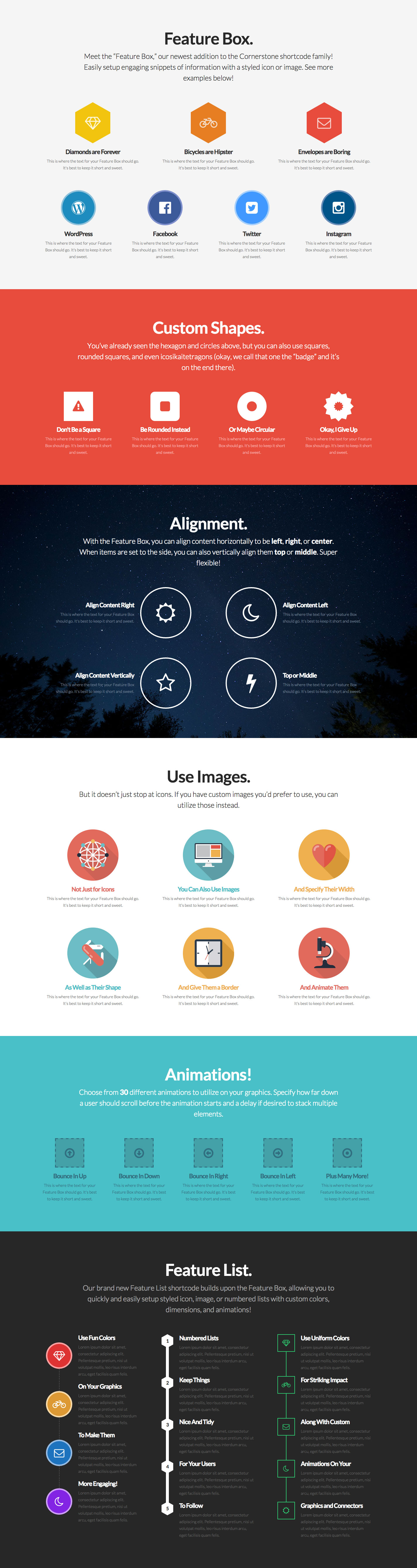
Feature Box
- id – Include a custom ID if desired.
- class – Include a custom class if desired.
- style – Include custom inline styling if desired.
- child – Set to
trueif utilizing the Feature Box inside of the Feature List shortcode. - graphic – Choose between
iconorimagewhen used as a standalone shortcode or a child. You can also choosenumbersif used as a child. - graphic_size – Input the size of your graphic.
px,em, and%are all acceptable units. - graphic_shape – Choose between
square,rounded,circle,hexagon, orbadge. It should be noted that you cannot use a border if you are using the hexagon or badge shapes. - graphic_border – Input a border style for your graphic if desired (e.g.
border-width: 2px; border-style: solid; border-color: #272727;). Again, this will not work if using the hexagon or badge shapes. - graphic_color – Specify a color for your graphic.
- graphic_bg_color – Specify a background color for your graphic.
- graphic_icon – If using
iconas yourgraphic, this is where you will input the name of the icon from the Font Awesome library that you want to use (e.g.envelope-o, et cetera). - graphic_image – If using
imageas yourgraphic, this is where you will input the URL to your image resource. - graphic_animation – Specify the animation you would like to use on your graphic if desired (the list of available animations can be found after the Feature List's parameters).
- graphic_animation_offset – Input the percentage offset from the top of the screen when the animation should occur. There is no need to input the percentage sign, simply the number value (i.e.
75would mean that the animation occurs when the element is 75% from the top of the browser window). - graphic_animation_delay – Input a number in milliseconds for the animation to be delayed if desired. This is great for creating a tiered effect as your animations can come in at different times.
- title – Input the title to appear for your Feature Box.
- title_color – Input an optional color value for your title (will default to your theme's settings if nothing is set).
- text – Input the text to appear for your Feature Box.
- text_color – Input an optional color value for your text (will default to your theme's settings if nothing is set).
- link_text – If link text is entered, a link will appear at the end of your content.
- href – Input the URL for your link.
- href_title – Specify the title for your link.
- href_target – Set to
blankif you would like your link to open in a new window. - align_h – Choose between
left,right, orcenterhorizontal alignment. - align_v – If your
align_hparameter is set toleftorright, you can specity a vertical alignment here oftopormiddle. - side_graphic_spacing – Input the size of the spacing between your graphic and text when using a
leftorrighthorizontal alignment.pxandemare acceptible units. - max_width – Specity a max width for your Feature Box if desired (defaults to
none). - connector_width – If used as a child, you can specify the width of the connector between items here.
pxandemare acceptible units. - connector_style – If used as a child, you can specity the style of the connector between items here.
solid,dashed, anddottedare acceptible inputs. - connector_color – If used as a child, you can specify the color of the connector between items here.
- connector_animation – If used as a child, you can specify the animation of the connector between items here.
Feature List
- id – Include a custom ID if desired.
- class – Include a custom class if desired.
- style – Include custom inline styling if desired.
- animation_offset – Input the percentage offset from the top of the screen when the animation should occur. There is no need to input the percentage sign, simply the number value (i.e.
75would mean that the animation occurs when the element is 75% from the top of the browser window). - animation_delay_initial – Input a number in milliseconds for the animation to be delayed if desired. This is great for creating a tiered effect as your animations can come in at different times.
- animation_delay_between – Input a number in milliseconds for the animated elements to be set apart. (e.g. if set to
300, each graphic in the list would come in 300ms apart from one another).
Animation Values
- jello
- pulse
- rubberBand
- swing
- tada
- wobble
- flip
- flipInX
- flipInY
- fadeIn
- fadeInUp
- fadeInDown
- fadeInLeft
- fadeInRight
- bounceIn
- bounceInUp
- bounceInDown
- bounceInLeft
- bounceInRight
- rotateIn
- rotateInUpLeft
- rotateInUpRight
- rotateInDownLeft
- rotateInDownRight
- zoomIn
- zoomInUp
- zoomInDown
- zoomInLeft
- zoomInRight
X Update Information
Things were pretty quite in the X camp this time around as a lot of our energy was focused on bringing new features and improvements to Cornerstone. That being said, we didn't want Cornerstone to have all the fun, so we have a few little items here as well.
We made some improvements to the onboarding process with this release of X as we discovered a minor bug causing our upgrade migration script to run on new installations, which could render some settings as empty. Now that this has been taken care of, everything should be much cleaner for new users utilizing X by avoiding these little discrepancies. Additionally, we've also taken some time to improve the way dropdowns are handled within the theme, making them much smoother in the process.
Finally, our bundled version of Visual Composer has been updated to v4.6.1 and is good to go for those using it!
Conclusion
Whew! Now that all of that is out of the way, we can begin to wrap things up here for the time being. We've not only included some minor performance improvements into this release of Cornerstone, we also have a great new usability feature that highlights an element in the preview pane if hovering over a sortable control or breadcrumb in the editor. This greatly improves the feedback of the builder to help you know what you're about to interact with before making an action. Additionally, we made some improvements in working with additional third party plugins, including CSS Hero! Well, that about covers everything for now. Until next time, everybody!
Changelog
- X 4.0.7 - August 26, 2015
- Updated: WordPress v4.3 support.
- Updated: BuddyPress v2.3.2.1 support.
- Updated: bbPress v2.5.8 support.
- Updated: WooCommerce v2.4.6 support.
- Updated: Visual Composer v4.6.2 support.
- Updated: Revolution Slider v5.0.4.1 support.
- Bugfix: A few minor updates throughout theme files.
- X 4.0.6 - August 1, 2015
- Bugfix: Fixed [vc_row_inner] and [vc_column_inner] templates and integration.
- Cornerstone 1.0.5 - August 1, 2015
- Feature: New parameters added to Creative CTA element.
- Updated: Clicking a Section will scroll to it in the preview area.
- Updated: Line elements are more easily inspectable.
- Bugfix: Addressed browser compatibility issue when exporting templates.
- Bugfix: Fixed conflict with NextGEN plugin and Social Sharing elements.
- Bugfix: Various smaller bug fixes included.
- X 4.0.5 - July 22, 2015
- Updated: Visual Composer v4.6.1 support.
- Updated: Improved dropdown functionality.
- Bugfix: Keep migration script from running on new installs.
- Cornerstone 1.0.4 - July 22, 2015
- Feature: Feature Box element
- Feature: Feature List element
- Feature: MailChimp element
- Feature: Gravity Forms element
- Updated: Minor Improvements to help the builder load faster.
- Updated: Section and breadcrumb highlighting in the preview area.
- Updated: CSS Hero compatibility
- Bugfix: Reduced conflicts with certain third party plugins.