Release
Notes
February 28, 2018
2.0.4
6.0.4
3.0.4
Episode TM
The Template Manager
Hunkered down and bundled up for the cold winter months, a small force of developers at Themeco have put together the finishing touches on a monumental release for their site-building ecosystem: The Template Manager.
A tool of unprecedented power, the Template Manager promises to make the organization and reuse of content across a user's website much easier to work with, empowering content creators with a greatly streamlined workflow that is flexible and fast.
We now check in with our intrepid team to see what they have to share about this new feature...
...if you can't tell already, we're thrilled to finally be able to bring the result of many weeks of design and development to all of our customers. I hope you're all ready to dive in deep and learn more about your new best friend: The Template Manager. Let's get started!
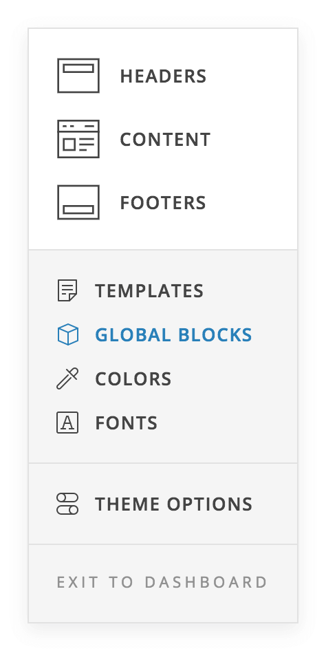
The Template Manager: What Is It? Pro, Cornerstone
At its core, the Template Manager is a way to save and reuse content throughout our ecosystem of builders. As of right now, that means 4 different types of Templates:
- Preset Templates – A Preset Template is a snapshot of all control settings for an individual v2 Element. For example, if you have multiple button styles that you've taken some time to setup that work nicely together, you can save each version as a Preset Template and then reuse those styles as needed throughout your site with a single click.
- Content Templates – All layout and element information for an entire page or a selection of sections from a page's content. For example, you could save an entire page that you wish to use over and over again, or you might want to save a few sections from that page into a reusable Template to use on other pages.
- Header Templates – Saves all header information including bars, containers, elements used, and their respective settings.
- Footer Templates – Saves all footer information including bars, containers, elements used, and their respective settings.
You can think of each Template saved as a snapshot of how an individual element or collection of elements looks and functions. This allows you to create consistent, reusable design systems as individual pieces or collections of elements that can be created once and used as needed.
Atomic Thinking: Preset Templates
Lets take our Preset Template example mentioned previously and imagine the following button is something you've designed:

There is a lot going on with a button like this that you have to specify to get it to look this way. We have button background color, primary text color, secondary text color, padding, margin, border radius, internal spacing between elements, graphic used, unique typographic options for both lines of text, et cetera...the list is quite extensive to say the least. And we haven't even mentioned things like interaction colors, borders, box shadows, or many of the features unique to our builders such as graphic interactions, alternate graphic content, particle animations, et cetera.
With the Template Manager, we can take a snapshot of all these settings to ensure consistent reuse over and over again, while only needing to spend the time to design it once.
Building It Up: Content, Header, and Footer Templates
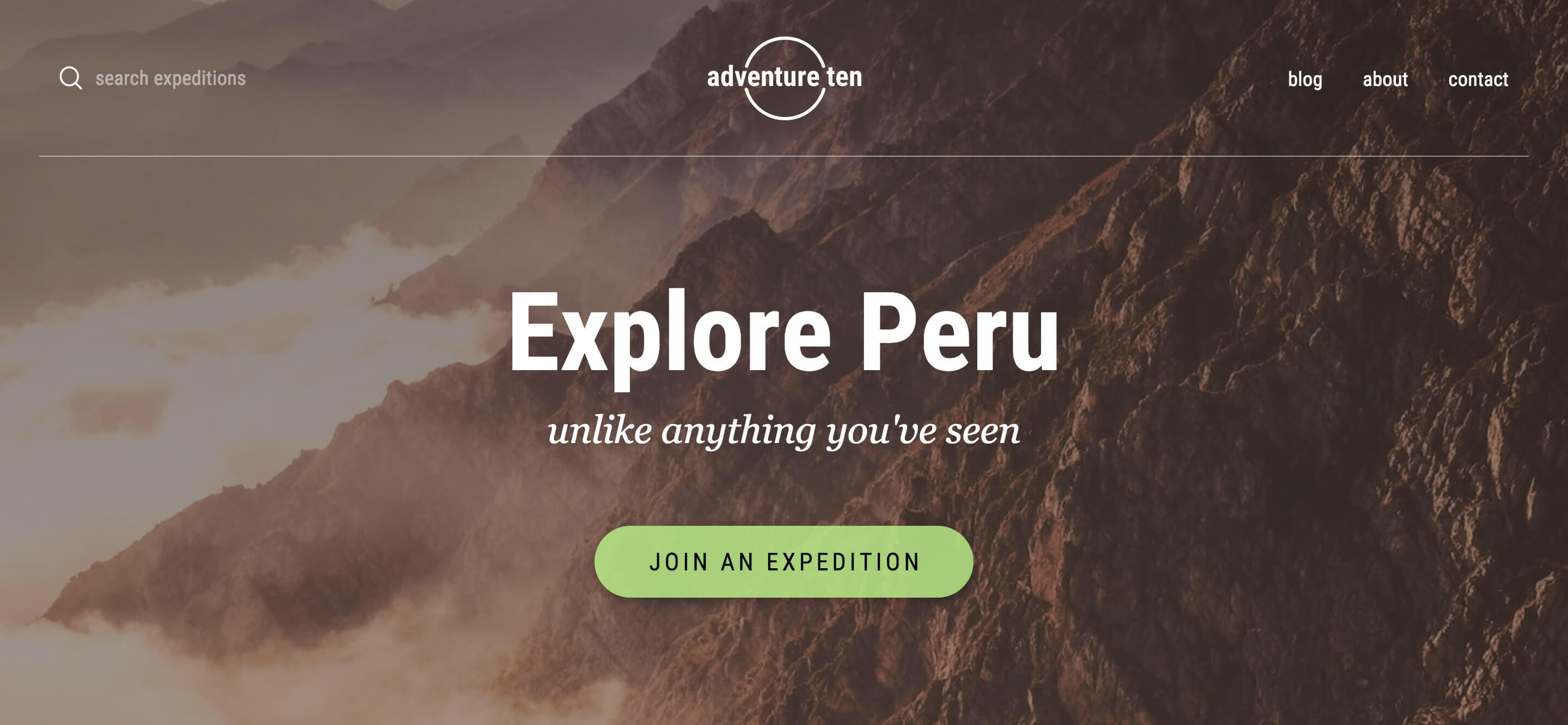
Using the ideas we've learned with our Preset Templates, we can take things even further with our Content, Header, and Footer Templates. For the sake of this discussion, let's use the header below as an example:
There are many ways we can look at this and break this up to be reused in our site-building process:
- After designing this header, you might wish to save Preset Templates for various Elements used within so that you can reuse them throughout your site. For example, if you really like the button style you've come up with here and wish to use it on other pages or in the footer of your website, you could save it out as a Preset Template and recall it as desired.
- You then might want to take that button Preset Style and design some accompanying styles that work well for buttons in other contexts, but using this style as a base. For example, you may want to keep the typography and general dimensions in place but simply invert the color scheme. You could save out that slightly altered version based on this button as its own template and reuse it whenever needed.
- Once done with this header, saving it out as a Template will allow you to reuse it across multiple pages quickly and make minor changes as needed. For example, let's say you were using this as some initial content on a travel website you're working on. You might want to save out this header, duplicate it and assign it to another page for another country. You could quickly update the titles, links, and background image, and have a consistent bit of introduction content that you've only designed once, but can quickly reuse and customize as needed throughout your site.
- Imagine some weeks down the road that you're working on a new project and you want to reuse something from this website as a starting point on that new website. You could take anything as small as an individual Preset Template and import it into your new website to get a headstart, or you could take a whole page, or just a section of a page and easily move it over and have a place to begin from.
- Going even more abstract, you could take some time to design dozens of general starting points for Elements and Content, and always have those on the ready as a portable design system that you use to get all new projects off the ground. This would also allow you create consistent design systems for you to work from, or if you're on a team, ensure that everyone starts and works with the same base.
Hopefully you're starting to get a sense of the power you'll be able to tap into when using this new Template Manager. Not only can styles and systems be setup for easy reuse across an individual website, but you can also use it to create design systems across numerous websites, giving you an immense headstart with any new project.
Using The Template Manager
We'll take a moment to run through the numbered areas in the screenshot below to describe what that portion of the manager does:
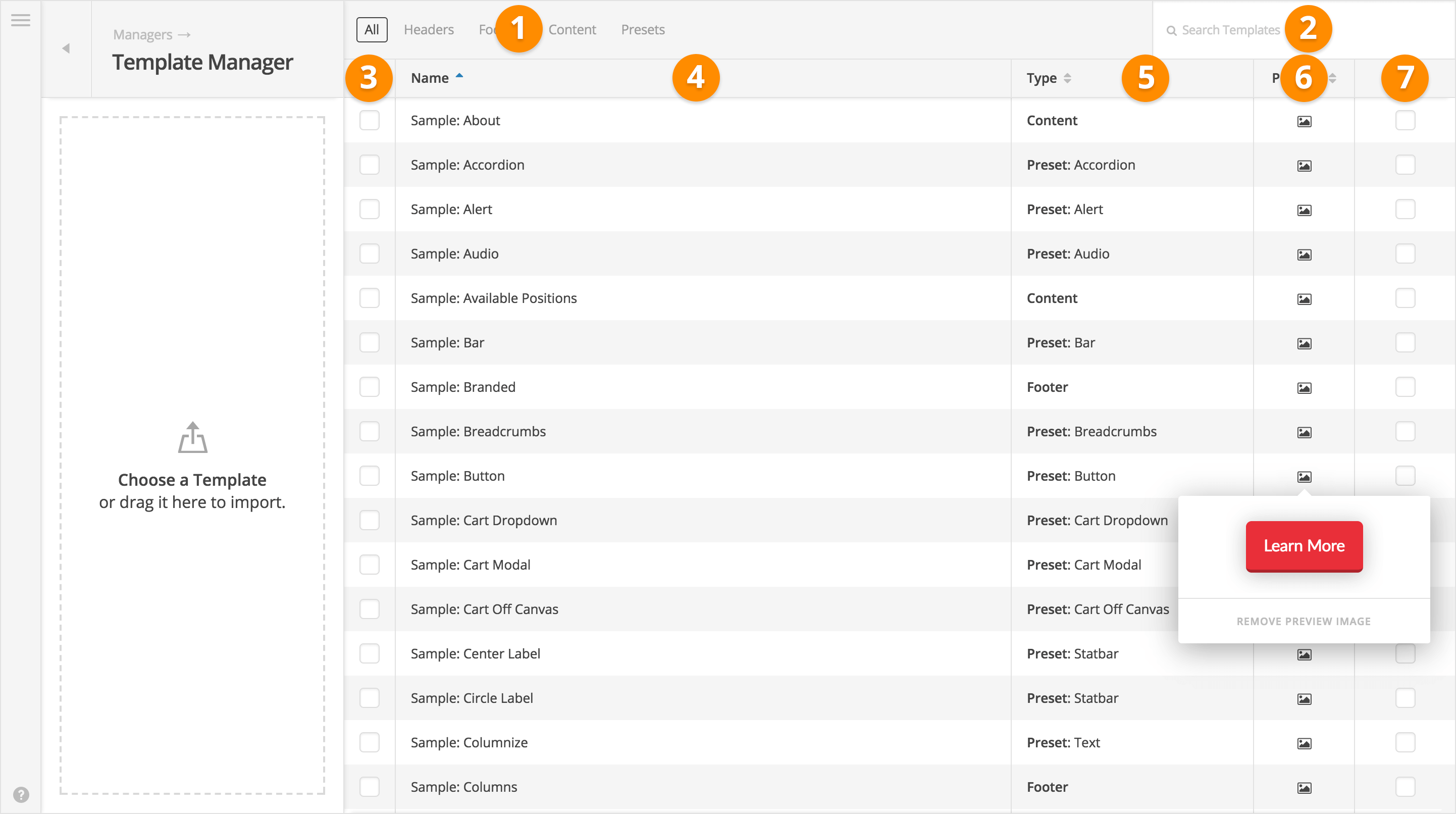
- Type Filter – By default “All” Template types are shown in the Template Manager. If you wish to narrow down your search a bit more, you can specify which Template type you'd like to view here. For example, if you only need to look through your included presets, clicking the “Presets” filter will only display v2 Element presets, and omit all Content, Header, and Footer Templates.
- Template Search – A fuzzy search that will scan all of your Templates for the keywords entered. Will search through the Template name and type content.
- Select – The Template select column is used to choose a grouping of Templates that you wish to download or delete. Once at least one Template is selected, a popup will appear at the bottom of the screen with available actions.
- Name – The Template name column displays the given label for a Template. The name of a Template can be updated by double-clicking in this column on the specific Template you wish to rename, which will allow for quick editing of the name, and then hit “Enter” to save.
- Type – The Template type column displays which kind of Template you're working with (i.e. Content, Header, Footer, or Preset). If the type is “Preset,” it will additionally display which Element the preset is for (e.g. “Navigation Inline,” “Navigation Modal,” et cetera). These types are hardcoded and cannot be changed.
- Preview – The Template preview column will display an optional image of the Template if provided by the user. By default, a “+” sign will be visible, and when clicked, the WordPress media uploader will appear and allow you to assign an image. If an image is present, hovering over the column with an image icon will display the preview image in a popup. This is incredibly helpful for giving a quick glimpse of the Template users are about to interface with.
- Hide – The Template hide column allows Templates to be present in the manager, but hidden in the actual site-builders to keep those dropdowns cleaner by not displaying options that you may not be planning to use right away.
Introducing Design Cloud Pro

Imagine a collection of over 100 premium design assets and growing directly at your fingertips. Next, imagine these were ready to be installed with the click of a mouse, allowing you to build everything from a tricked out button to a pixel perfect header or even a beautiful content rich landing page. Imagine no longer because you get all this and more in Design Cloud!
The beauty of the Design Cloud library is that you're able to quickly browse multiple template types (e.g. Headers, Content, Footers, Presets, et cetera) to download what you need as it is called for. As your project grows, you might think to yourself “I'd love to have a really cool cart style for my online store,” come back to the Design Cloud, find that preset and download it to your library of templates to pull from.
For instance, you might be working on a new project and wish you had a header to begin with and get a good starting point:
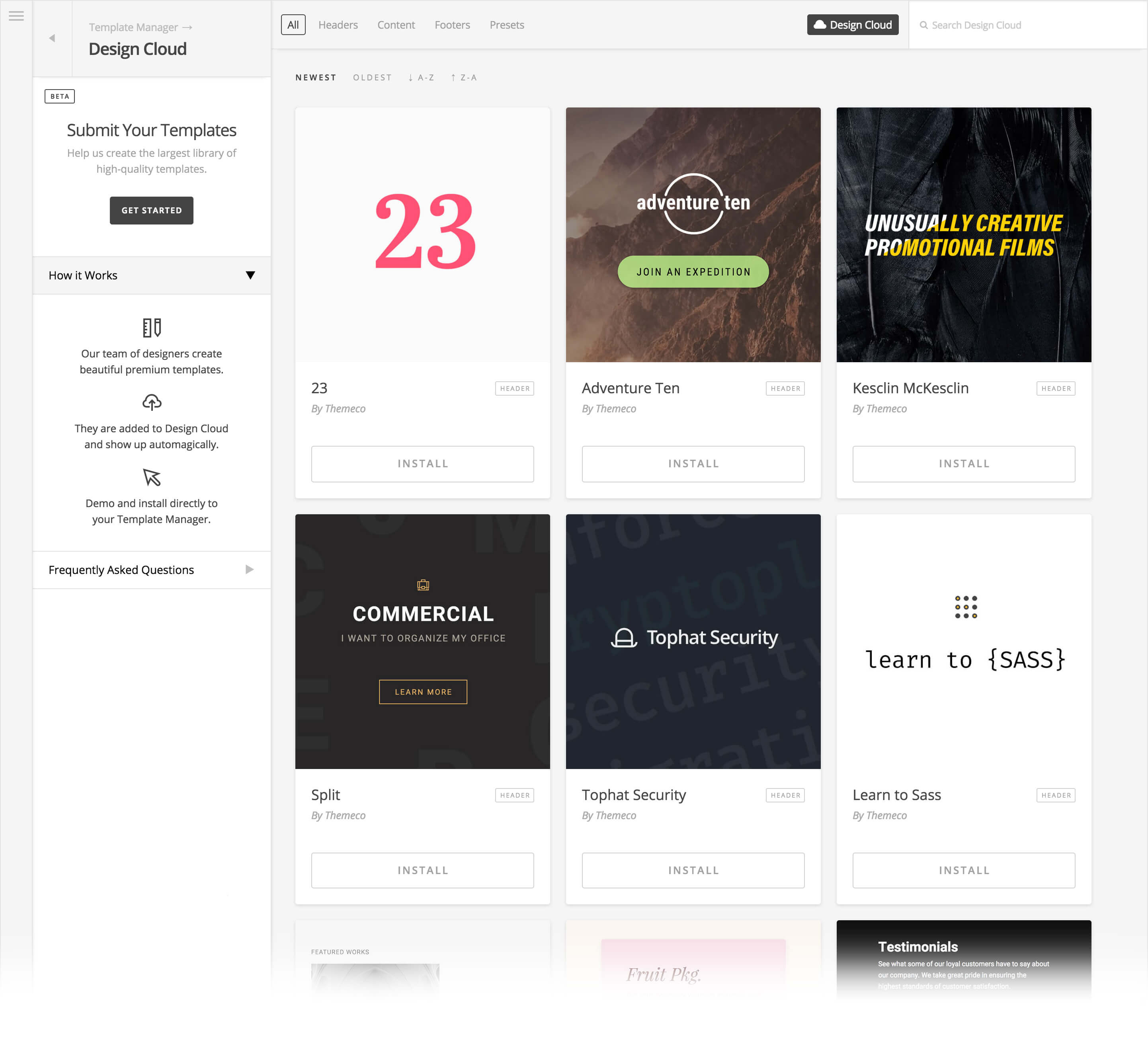
After browsing through the list of available Headers, let's say that our Tophat Security header grabs your eye:

You can go check out the live demo of that template to see that it suits your needs (a live demo is provided for every template in Design Cloud). If you decide that the template fits the bill, you can come back and install that item directly within the Design Cloud, where it will then show as installed:

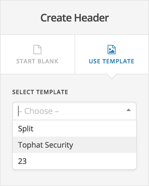
Once installed, that template is available for you to use as you please throughout our various builders. Since Tophat Security is a header, if we hop over to the Header Builder and select the “Use Template” option, we'll see our newly downloaded item in our list of available templates:
Currently, Design Cloud features custom templates of all types—Headers, Content, Footers, and Presets—curated and designed by Themeco to meet our standards. We also have Template Packs, which can be any number of combination of our various template types.
For now, we are featuring four Preset Packs, which include a unified set of styles for our entire group of Elements, or can be used to demonstrate different design possibilities with a specific Element. In the future, packs might feature multiple Headers, Content, Footers, and Presets, all creating a unified website design experience that can be used in various combinations to create whole website designs.
Additionally, we're excited to introduce a template submission process to anyone in our community who wishes to share something they've created (currently in beta). All templates submitted will undergo a curation process to ensure quality, so you can rest assured that anything added to the Design Cloud will meet our highest standards.
We look forward to seeing how Design Cloud helps our users to get new projects off the ground using as little or as much as they want from our new, ever-growing collection of design assets!
Element CSS: Dynamic, User-Generated Styling Pro, Cornerstone
Another big feature that we've been hard at work on for this release is Element CSS, which is our answer to the shortcomings of simply offering an “inline CSS” input on an element as many builders do. While inline CSS can work as a decent way to give users quick access to customize the styling of singular Elements—such as a Section or Column—its limitations become quickly apparent the more you work with it:
- There is no way to target nested markup within a parent Element using inline CSS
- There is no way to style interactive states for an Element such as
:hover,:active, et cetera - There is no way to create and style pseudo elements to enhance the look and feel of an Element
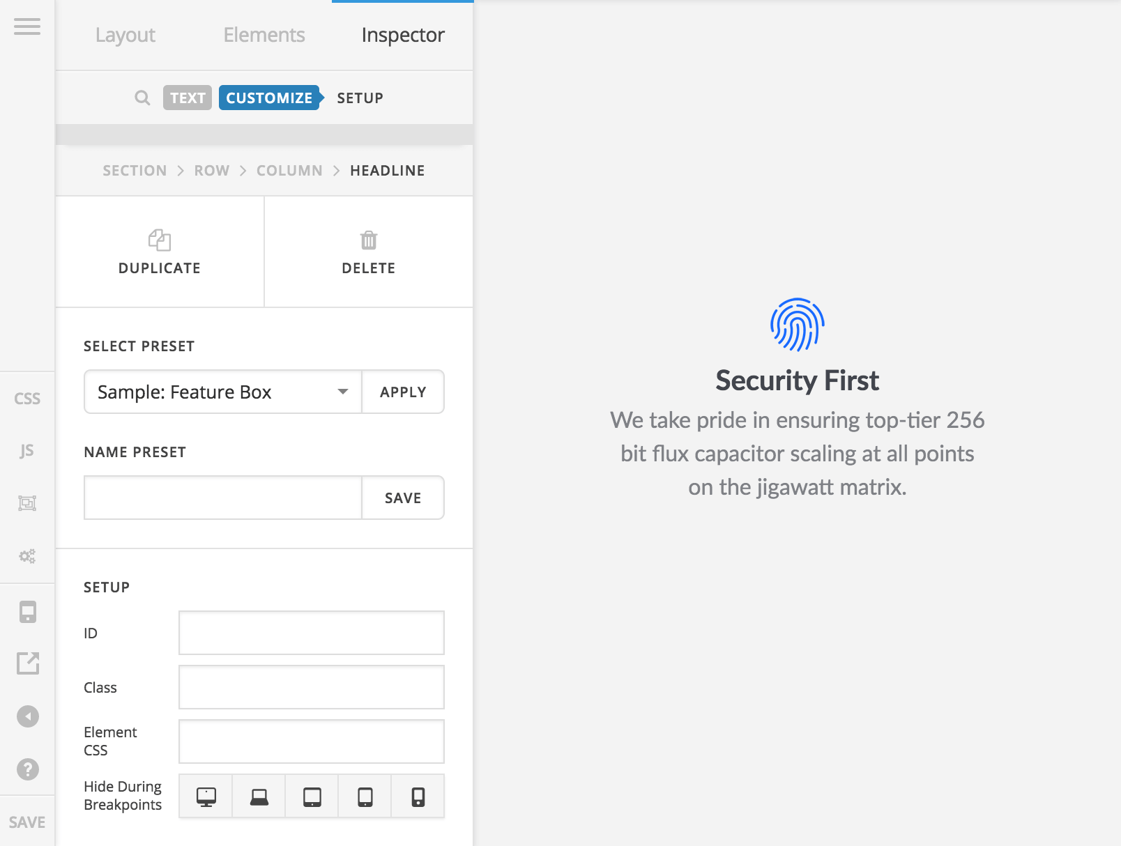
Enter Element CSS, which we will briefly demonstrate using the Headline Element. To get to the Element CSS input, go to the Customize control grouping on any element, and you will find the input in the Setup box:
Clicking into that input will reveal a code editor that slides in from the edge of the screen:
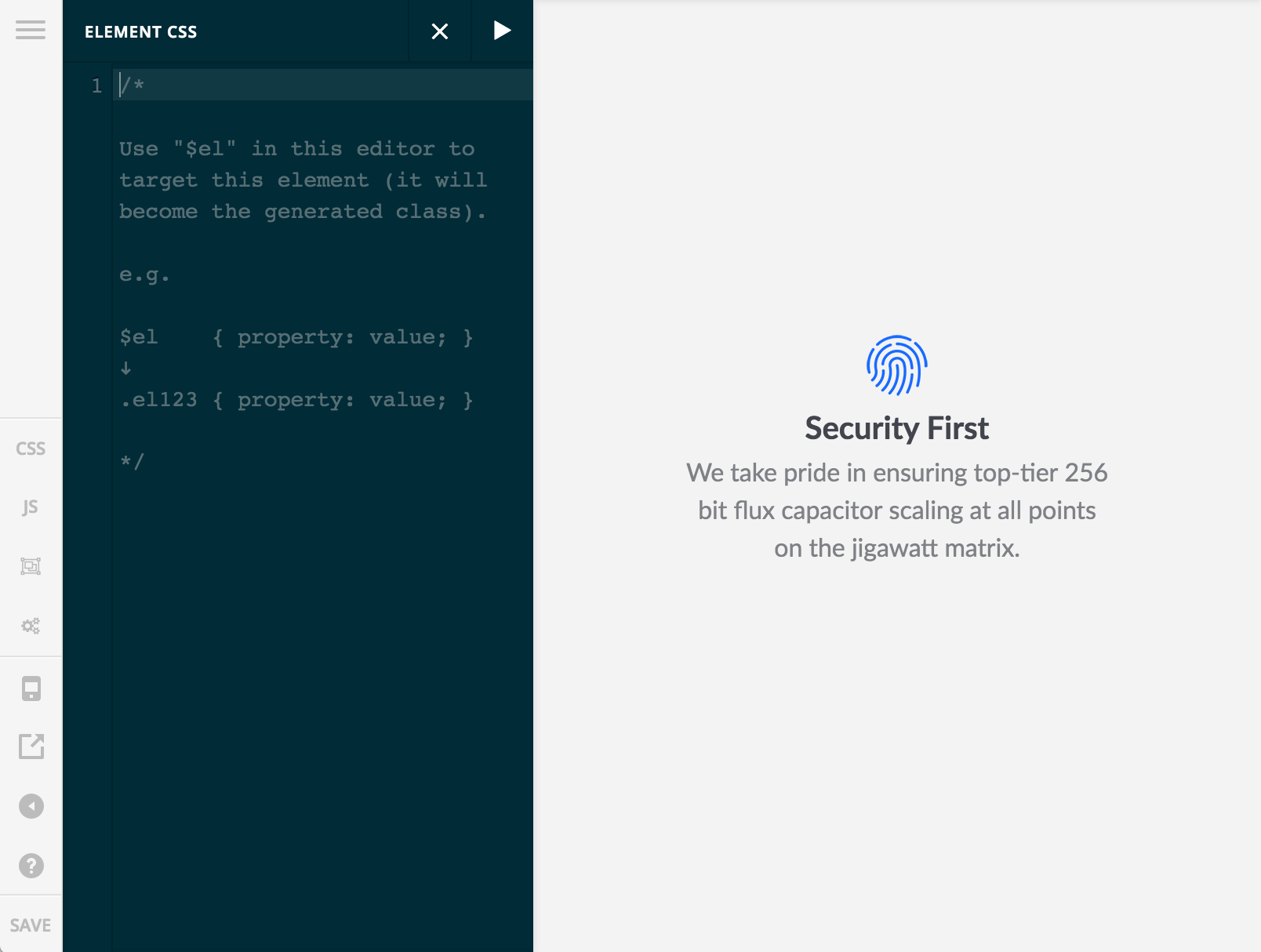
As noted in the placeholder text of the code editor, this editor can receive the special $el selector, which will tap into our dynamic CSS system and have its dynamic class swapped out upon save. These dynamic classes are generated procedurally as each element is rendered on the screen, meaning that if this Headline Element was the 12th Element placed on the page, its generated class would be .el12, which is then used to target and style it.
It is because of this procedural class generation that you couldn't previously target an element using its generated class, as this class would update as you add or remove other elements to the page (you can always add a custom class to any element and style using that, but the Element CSS system allows you to introduce custom styling within the system without needing to setup any sort of external stylesheet or global CSS).
So let's see this in action. In the following screenshot, some of the styles used can be added using Element controls such as the border-radius and box-shadow, but we placed them here to see everything live. Additionally, the Headline Element does not feature a control for adding a background image directly, so if you wanted to do this you would need custom CSS (background images can of course be added to Sections, Columns, et cetera, which is where this typically might go in the builders, but this example shows off how you could add it directly to an Element):
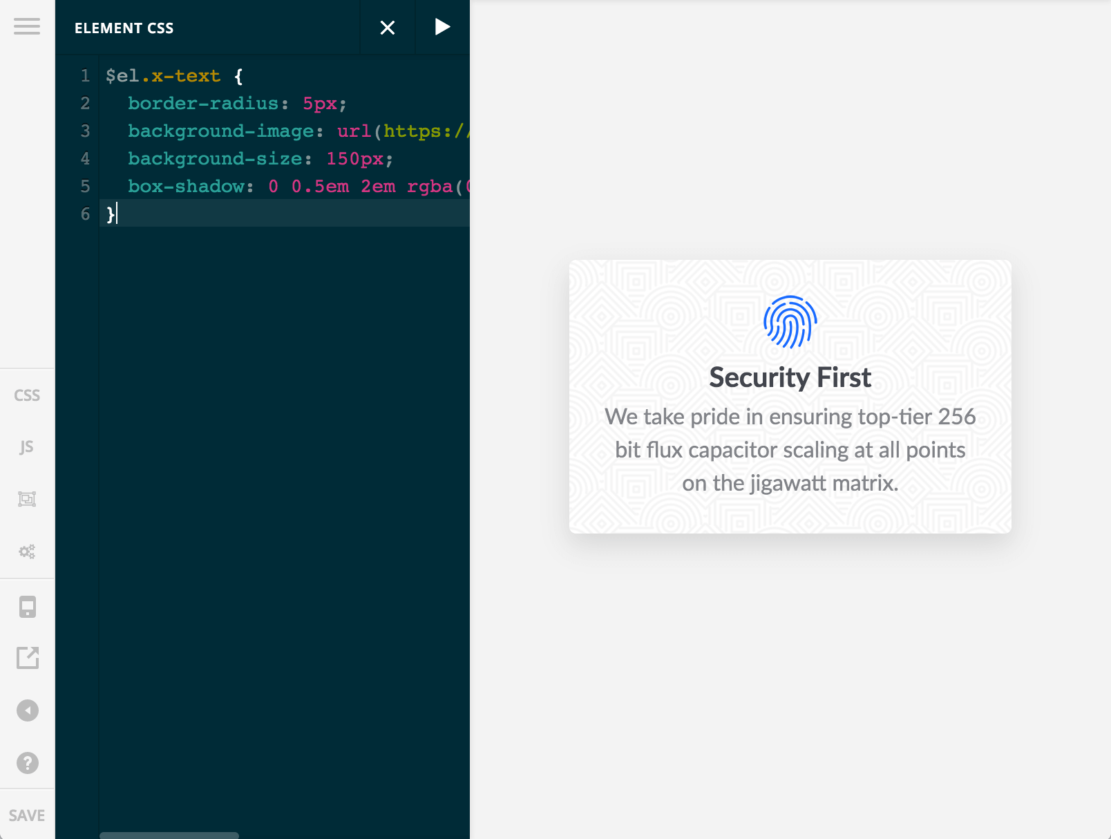
Notice that we're using $el.x-text to target the Headline Element, which is sometimes necessary to ensure proper specificity so that your customizations will take effect. Next, we'll show how we can target nested markup using the Element CSS system to introduce a pseudo element into the Headline:
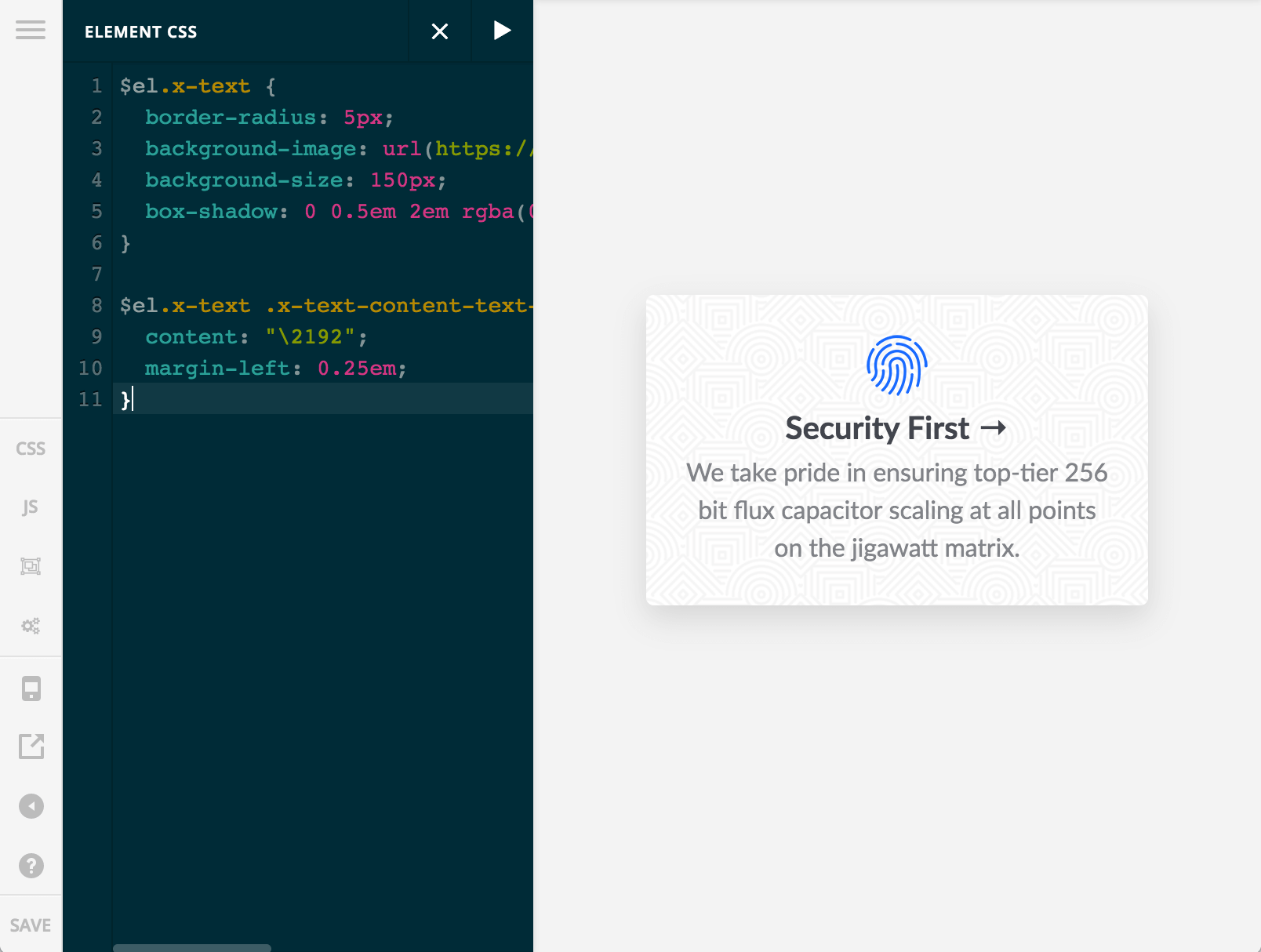
Here we're adding a pseudo element with unicode content for a nested big of markup within the Headline Element. Again, things like pseudo elements or interactive styles (e.g. :hover, :active, et cetera) would not be styleable via inline CSS alone on a parent Element.
Hopefully the power of this system is becoming apparent when paired with the Template Manager. One thing you could do is add Element CSS on a parent Section and target anything within it (Rows, Columns, and Elements) and style it to be a completely isolated, fully deliverable block of content that can work across any project.
For instance, if you wanted to make a custom portfolio of content and have the columns break at special breakpoints and then setup the content in a unique way, you could add all the Elements to that Section and style everything using Element CSS on the Section to keep things completely self-contained without needing external global styles. This means that a whole block of content could be moved from one project to the other immediately, no setup needed.
Global Blocks: Design Once, Use Everywhere Pro, Cornerstone
And the hits just keep on coming! Having Global Blocks is something we've wanted to get built into our tools natively almost since the launch of our builders, and there has been plenty of discussion around it in the community as well. In fact, our very own Michael Bourne developed his own working version that was available as a free plugin for quite some time (big props to Michael for his invaluable contributions to our community)!
That being said, with this latest release and some of the changes implemented into the builders, we needed to rethink this entire system from the ground up. All that to say, we are very pleased to announce that Global Blocks are now an official part of all builders for users to take advantage of!
The idea behind Global Blocks is relatively simple: to have the ability to design something once and then utilize it throughout multiple pages or areas of your website. Down the road if edits ever need to be made, users can go back to the “single source of truth” (i.e. the representative Global Block) and edit it once there, and then have those changes reflected throughout the entire website.
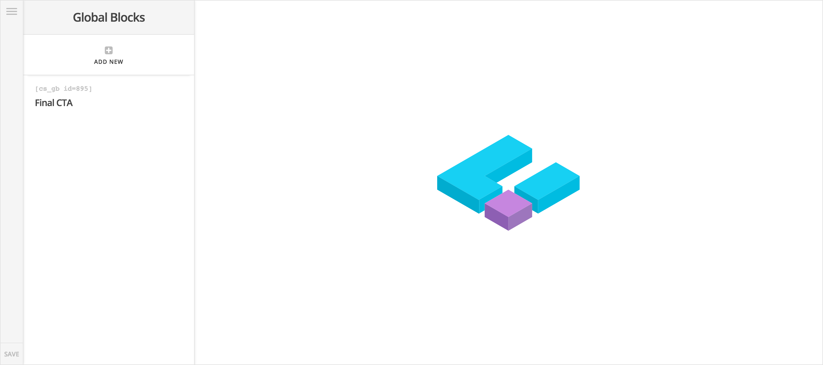
To better understand this idea in action, let's walk through the entire process of creating a global block. First, navigate to the Global Blocks menu item in the primary navigation:
Once you've done that, you'll find an interface that looks very similar to the index screen for the Content Builder. To create a new Global Block, click the Add New button at the top of the workspace and your new item will appear in the list below. You can then double-click the title to rename the item (similar to other areas of our builders). For this example, we're going to imagine we're designing a simple call to action that we want to assign at the end of all pages, so I've renamed it “Final CTA”:
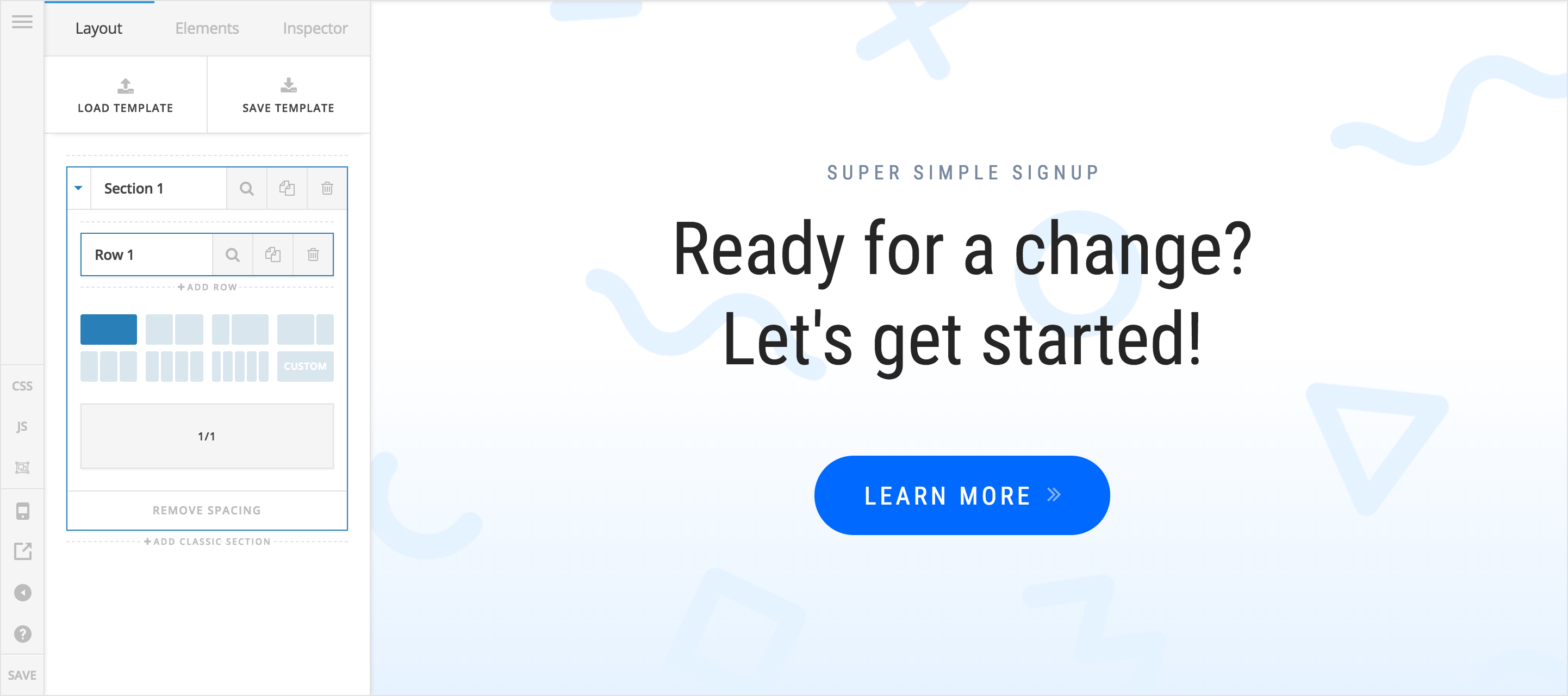
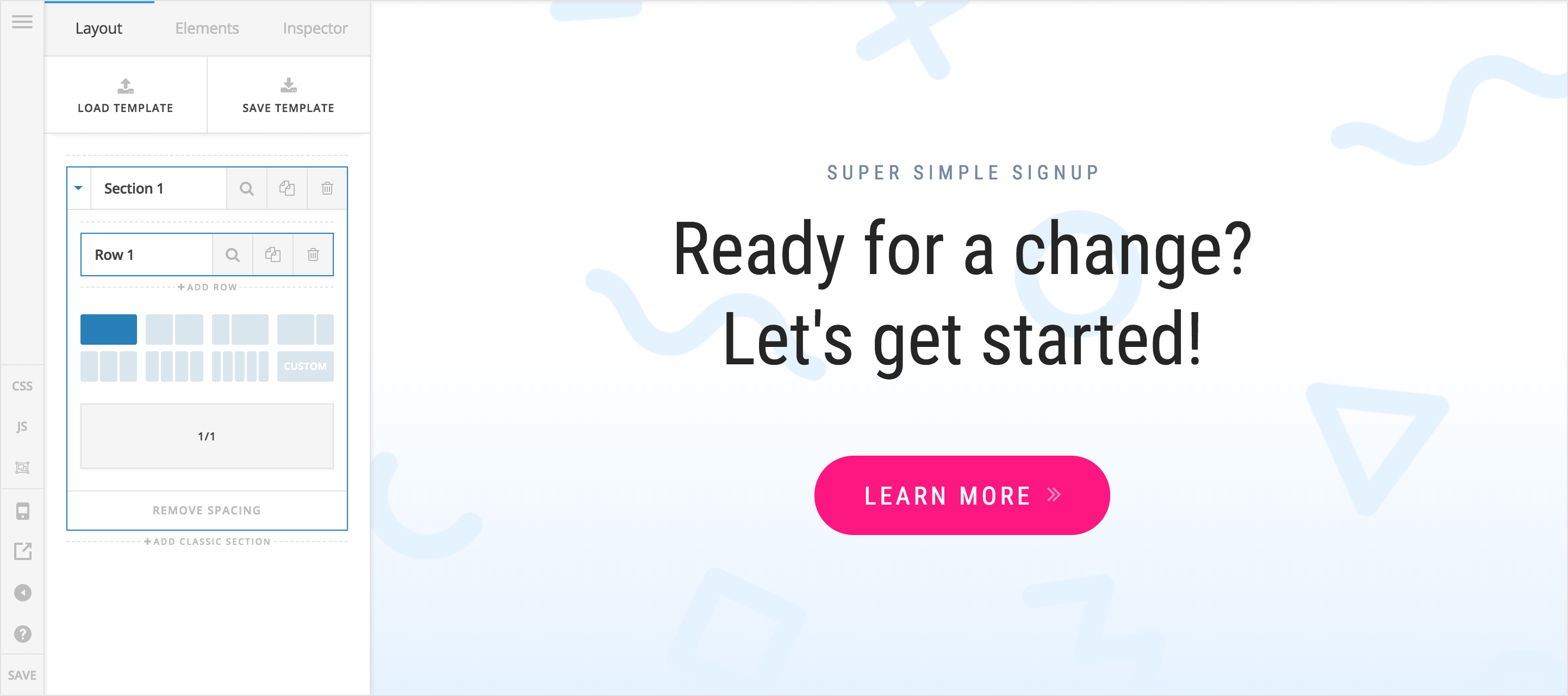
As for the design we're going to create, we'll go with this design below. It's fairly straightforward with some large headlines and a button centered within our section that has a background image on it:

Once you click into the item on the Global Blocks index to begin creating, you'll find an interface that is an exact duplicate of our Content Editor, so you'll feel right at home working here and won't have anything new to learn:
After you're done designing, you can go into any builder and look for the Global Block Element in the Elements list, which is used to output your already built Global Block:
When you add the Global Block Element to the page, you'll find one control in the Inspector pane that will allow you to assign which Global Block you want to output. This input is searchable, which is very helpful if you find that you've created many Global Blocks over time:
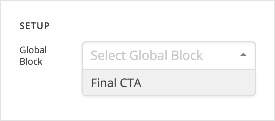
Then you can repeat this assignment process for every page that you wish to output your Global Block on. For this example, let's say that you've added your “Final CTA” block to 10 different pages across your website.
Now imagine that you want to go back and make some changes to the button (perhaps you need to update the link that is used, or you want to try out a new color to see if it converts better). If this was designed individually across all pages, you would need to open up and edit each instance of this design ten times over, which certainly can add up in terms of time spent simply navigation between each page and finding the element you need to make the updates.
However, since we've designed this as a Global Block, we can simply go back to that one instance of the Global Block, make our edits there, and when we save those changes they will automatically show up across all of our pages where the block is used:
There are a few things to keep in mind when working with Global Blocks and using them throughout your content:
- Global Blocks can be used to design singular elements you wish to reuse. For instance, if you have an individual button that you want to use in different parts of multiple pages, you can make a Global Block that is just that button and nothing else and place it anywhere you need.
- Global Blocks will always be wrapped in a Section, Row, and Column. Because Global Blocks need to support whole sections, this means that all of the markup that comes with a Section is always output around your content. If you wish to create a Global Block that is just a singular element as mentioned previously, you will need to make sure to remove all of the spacing (e.g. margins, padding, et cetera) that comes with these containing elements. You can quickly remove all spacing from containing elements by clicking the Remove Spacing button at the bottom of your Sections in the Layout pane (see image above).
- Global Blocks can contain multiple Sections. You're not limited to creating one Section at a time when designing your Global Blocks. If you have a situation where you need multiple Sections to be output at a time, you can create as many as you wish and when you assing your Global Block in a builder, all Sections contained within will be output.
- Global Blocks can be nested. This can begin to feel a bit like the movie Inception (but with HTML, not dreams) if you're not careful, but nesting of Global Blocks is certainly possible. Feel free to experiment and see what you can accomplish using this if you feel it's needed, but keep in mind the relationships between all of the markup that will come with that.
- Global Blocks can be referenced by shortcode. If you take a look back at the image of the Global Block index screen, you'll notice that there is a shortcode displayed in the line above the item's title. Instead of referencing your Global Block by Element in a builder, you can use this shortcode instead. It's a great way to introduce complex content into areas of the builder that are traditionally meant for text, such as dropdowns, modals, off canvas areas, accordions, and more.
Element Defaults Pro, Cornerstone
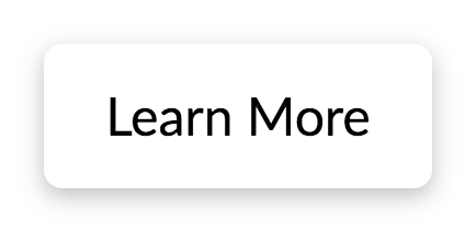
Jumping back to the Template Manager for a moment, another important piece to take note of is the new Element Defaults feature, which allows users to specify the initial state of an Element should when added to a Builder. By default, all Elements have a very generic styling applied to them when first placed in some content. For example, adding a button will always initially result in the following:
This can now be altered by clicking on the Settings button in the lefthand bar on the Template Manager page (the cogs icon). Clicking that button will reveal the following interface:
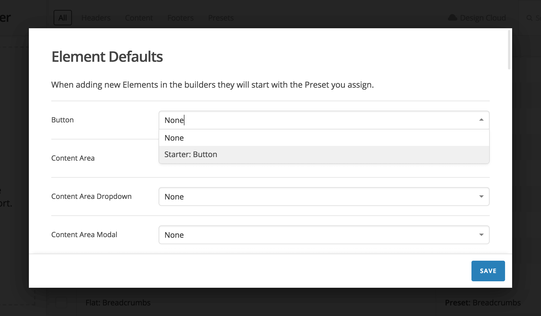
You will notice that there is a dropdown corresponding to every Element available. Any Preset Template you have saved can be set as the default styling for that corresponding Element whenever you use it going forward. For the example seen above, we're assigning the Starter: Button style, available in our Starter Pack. Doing so would mean that any new button added to a page would now result in the following:
This button can still be further edited just as any other button, all we're doing here is instructing the builder what initial styling to apply. This is a great feature to take advantage of if you have a general theme going throughout your website and want to have a consistent starting point for all of your elements.
New Elements Pro, Cornerstone
In addition to all of the amazing new features mentioned above, we've introduced a few new Elements with this release. These include all-new Accordion, Statbar, and Quote Elements. Be sure to check out those new elements as there is plenty of new creative possibilities to explore!
Improved Accessibility Pro, X, Cornerstone
In our continuing effort to improve accessibility for dynamic elements such as collapsing elements, dropdowns, off canvas areas, modals, et cetera, we've introduced some significant overhauls to our ARIA integrations throughout. This includes things such as:
- Setting appropriate
roleattributes and relationships between toggles and their target content when applicable. For instance, the appropriaterolefor an accordion header istaband its associated target content would need aroleoftabpanelto be setup correctly. These defined roles can help with devices such as screenreaders to make better sense of what makes up a page and how pieces of content relate to one another. - Managing component state with attributes such as
aria-hidden,aria-expanded, andaria-selectedwhere required. Again, this helps with assistive technologies to make better sense of what can be ignored and what requires focus after interacting with a toggle. - Further defining component relationships by utilizing attributes such as
aria-controlsandaria-labelledbywhen appropriate to make interconnected content more clear. - Implementing
aria-haspopupon content to indicate the presence of interactive popup elements, such as dropdowns, modals, et cetera.
To see how some of these attributes behave while ineracting with an element, check out the video below demonstrating these concepts with our new Accordion Element:
Notice the state changes of not only the class names for each element, but also how the various aria-* attributes behave for each opened and closed state of the Accordion Item.
These accessibility changes have been implemented near universally with our v2 Elements. The one exception at the time of this release is the Navigation Collpased Element, which still relies on an old library at the moment as it will require some further changes to make it work as desired.
Customizer Migration Pro, X, Cornerstone
We will be moving away from utilizing WordPress' native Customizer in our next major release. The Theme Options section of our builders will be the new permanent home for all global site options. You can read this article for more information.
Third Party Plugin Previews Pro, Cornerstone
We have made some updates with regards to how certain third party plugins are previewed in our builders. You can read this article for more information.
Bugfixes and Updates Pro, X, Cornerstone
As always, we've included a round of various updates and bugfixes across many areas of our products. Be sure to check out the sidebar for details on those items.
Changelog
- Pro 2.0.4 - March 9, 2018
- Bugfix: Regression causing builder previews to timeout in Firefox.
- X 6.0.4 - March 9, 2018
- Bugfix: Regression causing builder previews to timeout in Firefox.
- Cornerstone 3.0.4 - March 9, 2018
- Bugfix: Regression causing builder previews to timeout in Firefox.
- Pro 2.0.3 - March 9, 2018
- Updated: Allow a default preset to be assigned to layout elements.
- Bugfix: ACF integration not working in V2 elements.
- Bugfix: Theme Options toolbar link appearing to non admin users (would send them to an “unauthorized page”).
- Bugfix: jQuery.backstretch error if scripts are minified.
- Bugfix: Issue where “no closing </html> tag” error appears when one is present.
- X 6.0.3 - March 9, 2018
- Bugfix: Theme Options toolbar link appearing to non admin users (would send them to an “unauthorized page”).
- Bugfix: jQuery.backstretch error if scripts are minified.
- Cornerstone 3.0.3 - March 9, 2018
- Updated: Allow a default preset to be assigned to layout elements.
- Bugfix: ACF integration not working in V2 elements.
- Bugfix: Styling Options toolbar link appearing to non admin users (would send them to an “unauthorized page”).
- Bugfix: Issue where “no closing </html> tag” error appears when one is present.
- Pro 2.0.2 - March 7, 2018
- Updated: Apply Offload S3 filters to saved content.
- Bugfix: Typekit always loading from wp_footer when loading from wp_head is possible.
- Bugfix: v2 Navigation Inline Element not outputting custom classes or hiding correctly in footers.
- Bugfix: Keep marginless columns setting from affecting nested children using Global Blocks.
- Bugfix: Content box shadow not working on Off Canvas Elements.
- X 6.0.2 - March 7, 2018
- Bugfix: Typekit always loading from wp_footer when loading from wp_head is possible.
- Bugfix: v2 Navigation Inline Element not outputting custom classes or hiding correctly in footers.
- Bugfix: Keep marginless columns setting from affecting nested children using Global Blocks.
- Cornerstone 3.0.2 - March 7, 2018
- Updated: Apply Offload S3 filters to saved content.
- Bugfix: Typekit always loading from wp_footer when loading from wp_head is possible.
- Bugfix: v2 Navigation Inline Element not outputting custom classes or hiding correctly in footers.
- Bugfix: Keep marginless columns setting from affecting nested children using Global Blocks.
- Bugfix: Content box shadow not working on Off Canvas Elements.
- Pro 2.0.1 - March 2, 2018
- Bugfix: Font Manager not loading TypeKit fonts.
- Bugfix: Font Manager sometimes not letting weights be changed.
- Bugfix: Navigation Elements not applying nav_menu_item_title WordPress filter.
- Bugfix: jquery.easing conflicting with plugin that load jQuery UI on the front end.
- X 6.0.1 - March 2, 2018
- Bugfix: jquery.easing conflicting with plugin that load jQuery UI on the front end.
- Cornerstone 3.0.1 - March 2, 2018
- Bugfix: Font Manager not loading TypeKit fonts.
- Bugfix: Font Manager sometimes not letting weights be changed.
- Bugfix: Navigation Elements not applying nav_menu_item_title WordPress filter.
- Bugfix: jquery.easing conflicting with plugin that load jQuery UI on the front end.
- Pro 2.0.0 - March 1, 2018
- Feature: Template Manager.
- Feature: Element Defaults.
- Feature: Global Blocks.
- Feature: Design Cloud.
- Feature: Element CSS.
- Feature: New Accordion, Statbar, and Quote Elements.
- Updated: Improved accessibility via role and aria-* attribute implementation.
- Updated: Decide if you want content overwritten when applying a preset.
- Updated: Better compatibility with WordPress import/export system.
- Updated: Save JSON without additional slashes. Improves compatibility with find/replace tools.
- Updated: Google Fonts data.
- Updated: Add [x_portfolio_filters] shortcode. Allows portfolio filter output when using a Pro header.
- Updated: WooCommerce v3.3 support.
- Updated: Hide Ethos post carousel and slider if post count is 0.
- Bugfix: Correct Google Fonts not always loading when font manager was enabled.
- Bugfix: Font weight not displaying correctly in Theme Options.
- Bugfix: Some external URLs being made protocol relative.
- Bugfix: Masonry not positioning correctly with RTL languages.
- Bugfix: Collapse navigation overlapping nested menus.
- Bugfix: WPML issue where language switcher appeared when translation was disabled.
- Bugfix: Sticky bars not staying fixed in IE11.
- Bugfix: Classic Block Grid not correctly previewing in content builder.
- Bugfix: Classic layout Elements not scrolling into view when inspected.
- Bugfix: Classic Social Sharing email subject not working for some email clients.
- Bugfix: Border and box shadow control color pickers.
- Bugfix: Background color in Theme Options not accepting global color.
- Bugfix: Double scroll bar appearing when no footer is output in Ethos.
- Bugfix: Breadcrumb trail and labeling for portfolio items.
- Bugfix: Removed rounding display errors for slider controls in the Customizer.
- X 6.0.0 - March 1, 2018
- Feature: Template Manager.
- Feature: Element Defaults.
- Feature: Global Blocks.
- Feature: Element CSS.
- Feature: New Accordion, Statbar, and Quote Elements.
- Updated: Improved accessibility via role and aria-* attribute implementation.
- Updated: Google Fonts data.
- Updated: Increase demo importer timeout.
- Updated: WooCommerce v3.3 support.
- Updated: Hide Ethos post carousel and slider if post count is 0.
- Bugfix: Correct Google Fonts not always loading when font manager was enabled.
- Bugfix: Font weight not displaying correctly in Theme Options.
- Bugfix: Some external URLs being made protocol relative.
- Bugfix: Masonry not positioning correctly with RTL languages.
- Bugfix: Background color in Theme Options not accepting global color.
- Bugfix: Double scroll bar appearing when no footer is output in Ethos.
- Bugfix: Added “Navbar Scrolling” option back for fixed left and right headers.
- Bugfix: Integrated WooCommerce cart styling.
- Bugfix: Breadcrumb trail and labeling for portfolio items.
- Bugfix: Removed rounding display errors for slider controls in the Customizer.
- Cornerstone 3.0.0 - March 1, 2018
- Feature: Template Manager.
- Feature: Element Defaults.
- Feature: Global Blocks.
- Feature: Element CSS.
- Feature: New Accordion, Statbar, and Quote Elements.
- Updated: Improved accessibility via role and aria-* attribute implementation.
- Updated: Decide if you want content overwritten when applying a preset.
- Updated: Better compatibility with WordPress import/export system.
- Updated: Save JSON without additional slashes. Improves compatibility with find/replace tools.
- Updated: Google Fonts data.
- Bugfix: Correct Google Fonts not always loading when font manager was enabled.
- Bugfix: Font weight not displaying correctly in Theme Options.
- Bugfix: Some external URLs being made protocol relative.
- Bugfix: Collapse navigation overlapping nested menus.
- Bugfix: WPML issue where language switcher appeared when translation was disabled.
- Bugfix: Classic Block Grid not correctly previewing in content builder.
- Bugfix: Classic layout Elements not scrolling into view when inspected.
- Bugfix: Classic Social Sharing email subject not working for some email clients.
- Bugfix: Border and box shadow control color pickers.
Status
- 03/08: Pro 2.0.4, X 6.0.4, and Cornerstone 3.0.4 available via automatic updates (final release of this cycle).
- 03/08: Pro 2.0.3, X 6.0.3, and Cornerstone 3.0.3 available via automatic updates.
- 03/06: Pro 2.0.2, X 6.0.2, and Cornerstone 3.0.2 available via automatic updates.
- 03/01: Pro 2.0.1, X 6.0.1, and Cornerstone 3.0.1 available via manual updates.
- 02/28: Pro 2.0.0, X 6.0.0, and Cornerstone 3.0.0 available via manual updates.
The following confirmed issues are specific to this cycle. If listed here we are planning to address it in a subsequent point release. Items will be crossed off as they are corrected and you will see corresponding notes in the changelog above.
Regression caused by the third point release (when using Firefox the builder preview windows don't load).(fixed in fourth point release)Issue where a “no closing tag” error appears when one is present.(fixed in third point release)jQuery.backstretch error if scripts are minified.(fixed in third point release)Unable to assign a default preset to layout elements.(fixed in third point release)Theme Options toolbar link appears for non admin users. This would lead to an unauthorized page as they do not have access.(fixed in third point release)ACF Integration not working with V2 elements or Global Blocks.(fixed in third point release)Marginless columns on a row affecting Global Blocks inside that row.(fixed in second point release)Classic Block Grid element item containing custom HTML will break the preview window.(fixed in second point release)Inline Navigation elements in a Pro Footer not respecting hide classes.(fixed in second point release)Tooltips & popovers for classic elements not being removed from the DOM properly after fade out.(fixed in second point release)TypeKit fonts not loading on the front end or may load in the footer causing FOUT.(fixed in second point release)Added integration with Offload S3 plugin to solve 404 issues.(fixed in second point release)Conflict when a third party plugin uses jQuery UI on the front end.(fixed in first point release)nav_menu_item_titlefilter not being applied to link titles in navigation element.Unable to add or remove weights in Font Manager if no weights were previously selected.(fixed in first point release)TypeKit configuration can't be refreshed.(fixed in first point release)