How Switching to X Theme Helped us Grow
April 20, 2016
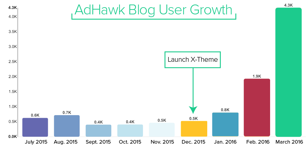
About a year ago, I joined a couple ex-Googlers to start an Advertising Technology startup, taking on the role of Marketing Manager & Special Ops (self-titled). After setting up a basic landing page to start building an email list, our engineers dove back into building product, leaving me with a bare landing page, almost zero development or design experience, and a mission to create one of the largest content libraries of digital advertising tutorials on the internet.
This is my journey with WordPress before and after X Theme. I'll start with my initial pain points, dive into X Theme's flexibility, usability, and user-loving support team, and show you how this all set AdHawk's growth curve permanently up and to the right.
My first step towards reaching our marketing goals was to download a basic WordPress theme to launch our digital marketing blog as a subdomain to our landing page. I downloaded the default Twenty Fifteen WordPress theme and started creating our first AdWords and Facebook Ads tutorial videos on YouTube. Each video then received a dedicated blog post that included clarifying points, use cases, and other best practices. Simple enough.
Our library quickly grew to over 70 videos and 50 blog posts before I stepped back to look upon what I had created. It wasn't until then that I realized I was the only one looking on in appreciation. The users coming from our product landing page were bouncing and exiting from the blog as if it was Pamplona on the morning of the running of the bulls. The backlinks weren't coming and the social shares only trickled through the digital marketing community.
I had fallen into the Field of Dreams Fallacy: an affliction common among website developers, designers, small business owners, and marketers alike who mistakenly believe “If I build it, they will come.” Not only had I failed to iterate on design, I hadn't put the same effort into distribution as I had in creation.

Wrong you are, James Earl Jones.
I decided to dig into our analytics data and send a survey to our existing email list asking for feedback on the blog. I made a few key discoveries about just how much a basic WordPress theme was holding us back.
Brand inconsistency: There was a massive discontinuity between our meticulously designed landing page and our cookie cutter WordPress theme. One user responded to the survey: “My first impression of the blog was that had accidentally been taken to the wrong site or only the HTML structure was loaded.”

Failure to re-engage visitors: WordPress' default widgets and navigation structure did nothing to keep users on our site. The average exit rate for our posts was over 90%, even though most users were making it through the whole post and half of the tutorial video. With WordPress' default blog homepage as a feed of all posts, the navigation bar menu was the only place users could find content that interests them.
Inability to generate leads without turning the site into Frankenpress: I spent so much time researching and testing different plug ins to meet my marketing needs such as click-to-tweets, content shortcodes, inline share buttons, popups, email forms, sidebar widgets, SEO, and performance plug-ins. I was even further deviating from our brand to assemble a Frankenstein-esque assortment of marketing tools to try to hit our goals.

Funny enough, at this point the actual quote from Field of Dreams fit my situation well: “If you build it, he will come.” Aka one guy will come. Mission accomplished.

I gathered the feedback and did some research around premium WordPress themes. I snooped on the X-Theme Facebook Group to see what the community was like and was immediately sold. Join X Theme Users on Facebook.
I would gush about the community here, but I think Kyle does it much more justice in his Community Post.
A little elbow grease and child theme setup later and I was up and running. So! Here's how I used X Theme to supplement our existing web structure & drive rapid growth.
Building a Brand Identity with X Theme
Optimizing for reader experience & uniformity: X Theme's seamless integration with Adobe's typekit made the transition from our landing page to blog and back much more seamless. Additionally, we had a lot of custom spacing for title cases and headers we were able to easily implement. Under Customize > Typography, you can make minute adjustments to letter spacing and font sizing to optimize for readability and uniformity across your site.
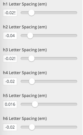
For those of you who want to optimize your type for readability, I analyzed results from 20 of the top digital marketing blogs (mine included) and found some interesting common threads:
- Serif fonts trump Sans-serif fonts 2:1
- Most popular font: Arial
- Average characters per line: 75
- Average body font size: 15px
- Most common body font size: 16px
- Average content container width: 680px
- Average sidebar size: 300px
Recreating key custom features using the Customizer: One important feature of our landing page is the subtle introduction of our color palette in our navigation bar.
I was able to copy the code directly from our landing page and paste it into the cornerstone customizer. It's amazing how simple this is compared to your standard WordPress theme. X had paid for itself already. The results:


X also makes it super easy to implement other brand elements like a cross-platform favicon, colored links, and custom icon sets.
Custom Navigation to Boost Engagement
Creating a custom blog homepage: The inability to edit the blog homepage on free WordPress themes is what prompted my search towards a premium theme. With X, we were able to do the following:
Control which posts are viewed on the blog homepage using the Recent Post Element in Cornerstone builder. There were certain top posts we wanted to remain on the homepage and other categories we didn't necessarily want in our feed, like our weekly roundup of the digital marketing content (more on that later). Keep the focus on our most recent post up top, while offering a mix of popular reads and recent posts below. I analyzed the results of SumoMe's free Content Analysis headmap to determine how many posts should be featured on our homepage.
Here's the scroll rate of the blog homepage pre and post X implementation:
November 2015 through December 2015


Another period for added statistical significance.

Though we had a lower percentage of users clicking on our featured post, we saw the exit rate plummet. We gave users a variety of posts, and then offered them the option to see “all posts” after scrolling through the homepage. This button sees about 15% of our homepage clicks, which effectively catches a huge portion of users who would have otherwise fallen through the cracks.

In addition to the All Posts button, Cornerstone allowed us to add a mailchimp-integrated email form to the blog homepage. This created a centralized call to action to subscribe to our blog, where we provide additional value to our audience after they leave the site through email marketing campaigns.
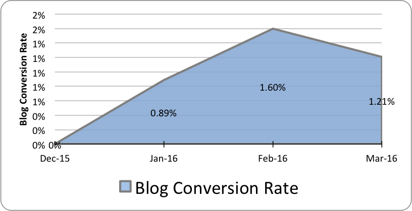
Most importantly, we saw a direct correlation between the increase in time spent on our blog and the number of leads for our paid ads optimization product, AdHawk. Before switching over, we hardly saw ANYONE entering our site on the blog and converting on our landing page. After implementing the Icon Stack in X and rolling out landing page destined calls to action, our blog conversion rate to tryadhawk.com spiked:
Sidebar freedom: As a bonus, using X's basic page templates allowed us to remove the sidebar for the homepage. This reduced the clutter of the homepage and kept our readers hyper-focused on either subscribing or reading.
Unlike many themes, X makes it easy to deviate from the “All or Nothing” approach to website elements. I was able to design sidebars for specific blog categories or posts. Just like designing an ad just for your target demographic, we were able to tailor our offerings based on the blog category. Here's how to do this for your website in just a few minutes:
- Start from your WordPress Admin dashboard
- Select Appearance from the lefthand sidebar
- Select Sidebars beneath Appearance
- Create & Name new sidebars
- Select which posts, categories, tags, etc. you would like to show that specific sidebar
- Click Update
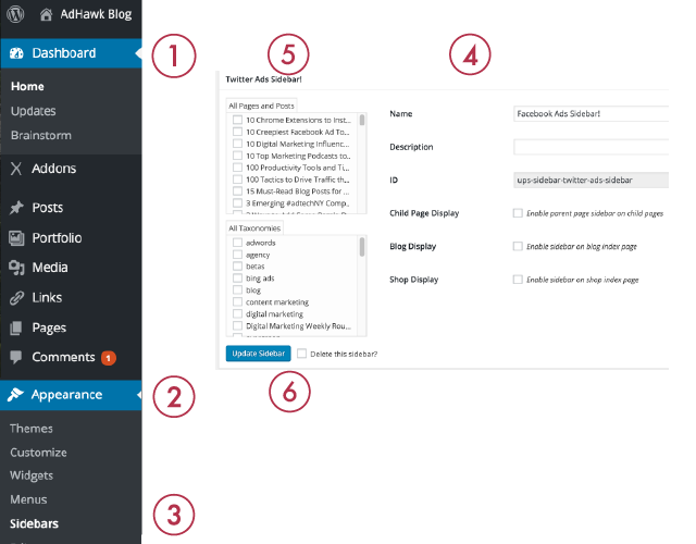
You can then actually design your different sidebars. Here's my sidebar for all our posts and guides around Facebook & Facebook Advertising:
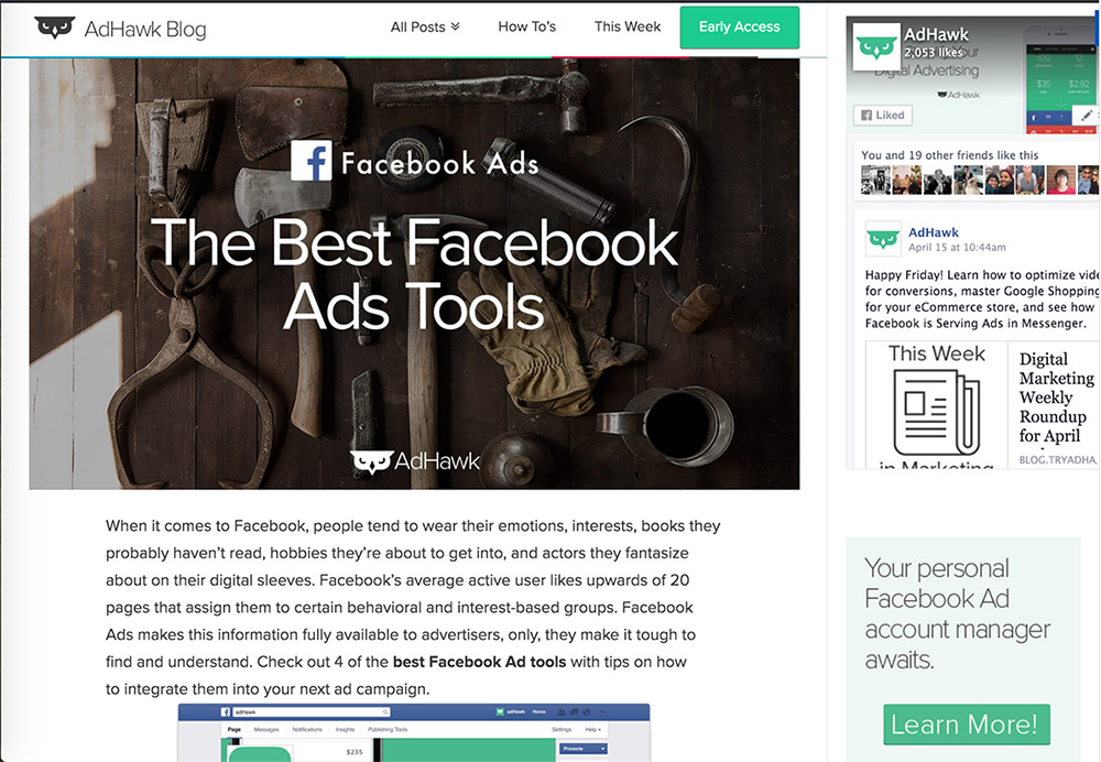
Implemented popular post & suggested reading widgets that changed based on what category you were reading.
Streamlining Our Marketing Funnel
The content upgrade: X allowed us to roll out mass implementation of marketing efforts. Most important to us was generating leads through content upgrades. Content Upgrades are a content marketing strategy that allows readers to download additional valuable information from within an existing blog post. By implementing the content upgrade we infinitely increased our email leads from zero to over 200 from users downloading our AdWords Glossary and AdWords eBook.
This “button” directs users to a dedicated landing page where they exchange an email for the download. We tried services like LeadPages and found that it was easier to create a landing page in X Theme that had a few key features:
- Continuity between the call to action button that drives people to that page
- No Header, No Footer, No Sidebar Page template
- Cover image of the offering
- A short description
- An email form
To learn more about saving, downloading and uploading templates, visit the Themeco Knowledge Base here. For more on content upgrades, Backlinko wrote a great piece on it.
Please feel free to email me with any questions on this: [email protected] love connecting with new people!
Building our email list: As mentioned, custom templates allowed us to insert calls to action in the middle of all of our posts, giving users as many chances as possible to subscribe to our list.
Throughout the site, I was able to create 10 different types of subscription opportunities. 9 of which with X, and one exit popup with SumoMe. Here's our subscriber growth from Mailchimp (includes our Newsletter, eBook, and Glossary).

Creating a weekly newsletter with X that isn't a waste of time: To keep our subscribers engaged, we launched a weekly newsletter hosted on our blog. X allowed us to build once and simply switch up the copy and links each week. Production and launch takes about an hour. Here's an example.
Just like the landing pages, making an initial time investment with X allows you to focus on your campaigns and brand-specific details rather than building and maintaining your site.
We switched to X on December 18th 2015. Other than having further refined our distribution strategy, nothing changed other than the theme switch.
As I mentioned, making an initial investment into templates or downloading some of these awesome ones frees you up to test and try new marketing initiatives. X is built to scale with you and your business. Many of our current readers are surprised to hear that the development, design, and content is mostly coming from one person. I now spend the majority of my time creating content, engaging with our users, and trying new strategies. If you have any questions about leveraging X to boost your marketing efforts, reach out anytime: [email protected]

We're very thankful to Bobby Stemper from TryAdwak for giving us all a guided tour of their conversion to X Theme for their blog. While most people think a theme like X needs to run an entire site (it can), keep in mind it is a great tool to use for very specific applications such as a blog. Hopefully the wonderful and specific insights Bobby shared will help you and your clients get the most out of X. Be sure to visit TryAdwak.com as well as their marketing blog powered by X.
Are you interested in possibly being part of a future Themeco Customer Spotlight? We're looking for awesome people doing great things with X or Cornerstone. If that's you, we'd love to hear from you.
