Customer Spotlight: SEO Rank Monitor
April 15, 2015
We're changing up the format a bit for today's Customer Spotlight by introducing you to Dawid Sakowski of SEO Rank Monitor. Once we saw the work Dawid and his team did with X on their site, we knew they would have invaluable insights to share on building beautiful sites that also convert! Instead of the standard Q/A, Dawid was kind enough to put together an article addressing some important characteristics he looked for and uses today in his X-powered site.
How The X Theme Changed Our Business
Choosing a theme for your website is an ongoing process. And the reality is that, in the beginning, you may not find the immediate solution you are seeking. The keys to finding a successful theme are patience and trial and hard work. Combining all three of these factors, while challenging, allows you the unique opportunity to increase your skills and grow your business. So even though it might be a long ride, we encourage you to hold on!
Earlier this year, we set out to find a theme that better fit the direction of our ever-changing online business. Changing our website theme has been an invaluable experience that has bettered our company on many levels and we are thrilled to share our lessons and experiences with you today.
Learn from the Past
When we decided to go with X theme for SEO Rank Monitor, we already had a rough idea of what we were looking for in a theme. This wasn’t the first time that we had chosen a theme, which meant we were fortunate enough to have experience on our side. At this point in the our business plan, we were well aware of what would and wouldn’t work for our website. And rather than shy away from any poor experiences in our past, we chose to embrace them; using what we had learned about design and our target audience as the launching pad for advancing our website into the future.

Set Your Website Goals
As a business, the first thing we did was set our goals for our updated website. It was obvious to us early on that we needed a website that was both easy for our browsers to use and simple for us to monetize. By setting our website goals upfront, we were thoroughly aware of what we wanted to accomplish. In turn, this allowed us the opportunity to find a theme that fit our needs, rather than changing our needs in order to fit a particular theme.
Do the Research
After setting our goals, we deeply submerged ourselves into research. In fact, we did an incredible amount of work and research upfront, before actually settling on the X theme. And, looking back, this research period played the biggest role in pinpointing our ideal theme. During this research period, we recognized that in order to avoid the mistakes of our past theme, we needed to make an educated decision that also made sense with our online business plan. The trials of our past theme had taught us that design and conversion rate were synonymous with our success. We couldn’t have one without the other and we were no longer interested in settling for mediocre. So, as a result, we spent a lot of energy researching both design and conversion optimization and carefully comparing our results between contending themes.
Try, Try Again
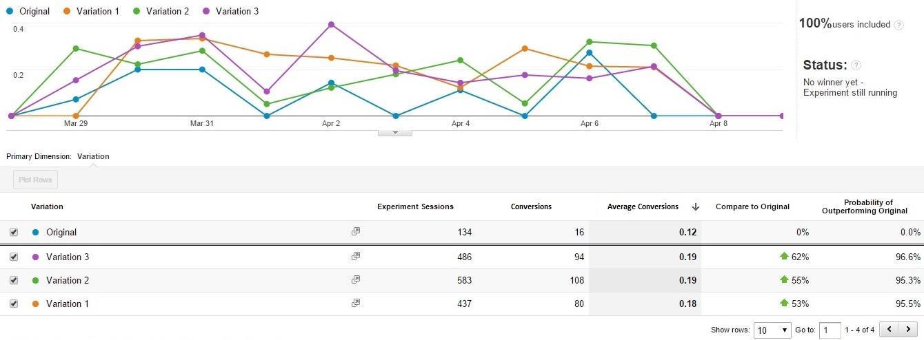
X Theme, we quickly found, was an incredibly flexible theme to work with during our trial period. In general, it felt more like a framework to work within rather than a rigid theme to abide by. This flaccidity gave our developers greater possibilities for meeting our needs and goals. In addition, it also allowed us the opportunity to conduct split tests to determine what our browsers preferred.
Google Analytics is our favorite tool to use to measure the success of X Theme. Like we said before, we believe that websites are an ongoing process. They require maintenance and monitoring and for us, that means constantly being aware of what our browsers are doing on the website. To gauge these behaviors we tend to pay particular attention to page views and sessions, bounce rates and other metrics related to SaaS projects like churn rate and sign up rates. If we noticed that one statistic is lower that our anticipated goal, we are able to make small design improvements here or there to bring it back up.

Create a Clear Call to Action
The biggest lesson we have learned from using such a user-friendly theme was that our browsers craved clear calls-to-action. Because X Theme allowed us to make simple changes more regularly, we were able to see the direct results that arose from reformatted call-to-actions techniques.

When we were using more challenging themes, these changes to our call-to-actions were time consuming and monetarily challenging. But, the simplicity of X Theme granted us the opportunity to split test. In these split tests we could see what worked for our browsers and what didn’t. And quickly learned that our browsers like being told exactly what to do. Confused browsers, it seemed, had the habit of nothing.
Understanding Conversion Optimization
As we began implementing our new theme, we learned the true power of conversion optimization. Conversion optimization is simply a method for converting browsers into buyers. While we had always known this strategy was an important facet of our business plan, we didn’t recognize how pivotal it actually was until we began to see the results with X Theme.
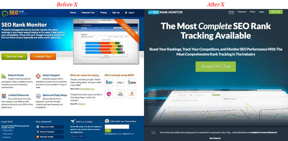
When we applied X Theme to our website, our conversion rate increased 300% when compared to our previous site design.
This had two major effects that would change the pace of our business as we knew it. First, our high conversion rate meant that we had a better return on our investments, ROI. This was a crucial improvement because it meant that, as a business, we were not only making investments that we could afford, but that essentially, the investments we had made were in turn making us money. When you are growing business that shift from investing to profiting bolsters your drive to continue.
Second, with an increase in our conversion rate of 300% we had now reached a point in our business where we could shift some of our focus away from only seeking visitors to other aspects of the site. This created a major shift in website philosophy. The number of new people visiting our site, we decided, was not as important to focus on as the number of people who were actually converting. We resolved to begin focusing our energy on conversion optimization because that factor alone was rewarding us the opportunity to surpass our month goals.
Above all else, we appreciate that X Theme allows us the opportunity to lead our browsers on a simple path. We have learned more in this process than we ever imagined possible and we are excited to see where this change will lead our company.
Are you considering changing your website? It’s an exciting avenue to explore and we’d love to help you along the way.
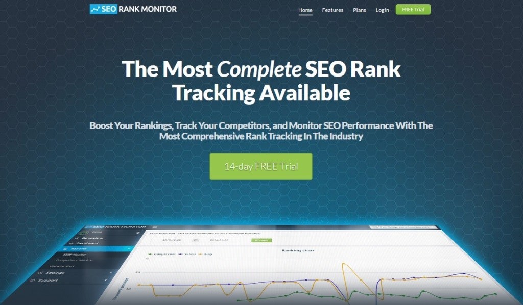
A big thanks to Dawid and his team for putting together this wonderful article. Hopefully it will help you think about building your X-powered site around clearly defined calls to action and taking time to go through the data. It's critically important to know HOW your visitors are interacting with your site in order to make sure both the process and your results are as optimized as possible. To find out more about Dawid and his company, we encourage you to check out seorankmonitor.com (powered by X). If you are a customer of ours who is interested in being featured in a future Spotlight, we'd love to hear from you.