Row
In this article, we're going to discuss the all-important Row Element and its child Column Elements.
Rows & Columns
Simply put, the Row Element adds a Row to your page (shocker, we know). To add the Row Element, simply search for "Row" and drag it to the canvas. This section of controls allows you to set the amount of columns in addition to the layout of your Row all from the first couple controls in the Inspector:
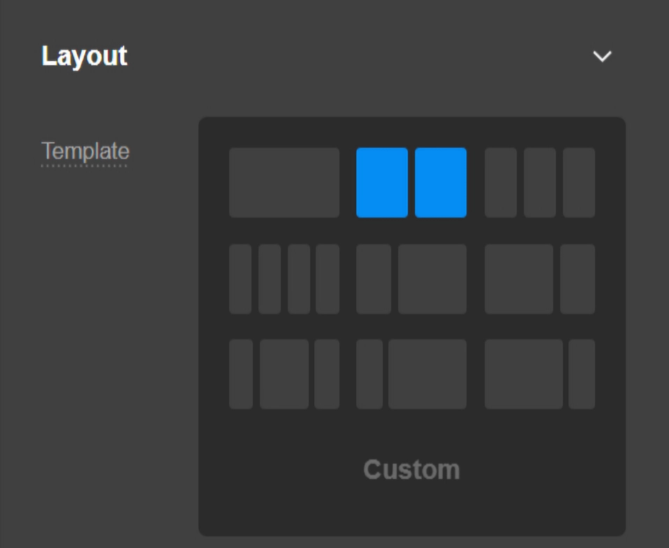
An important distinction to make here is the difference between the Column Element—which is a required, direct child of the Row Element—and “column layout” of your Row. "Columns" is where you add as many physical columns that you need in your Row, whereas "Layout" determines the percentage width for each Column in a specific position of the Row's layout. Column count is not limited by the layout of your Row. For example, you may wish to have 6 Column Elements within a Row and to have them laid out equally at 33.33% each. In this scenario, Columns 4-6 would visually appear on a new line but would still be within the same Row.
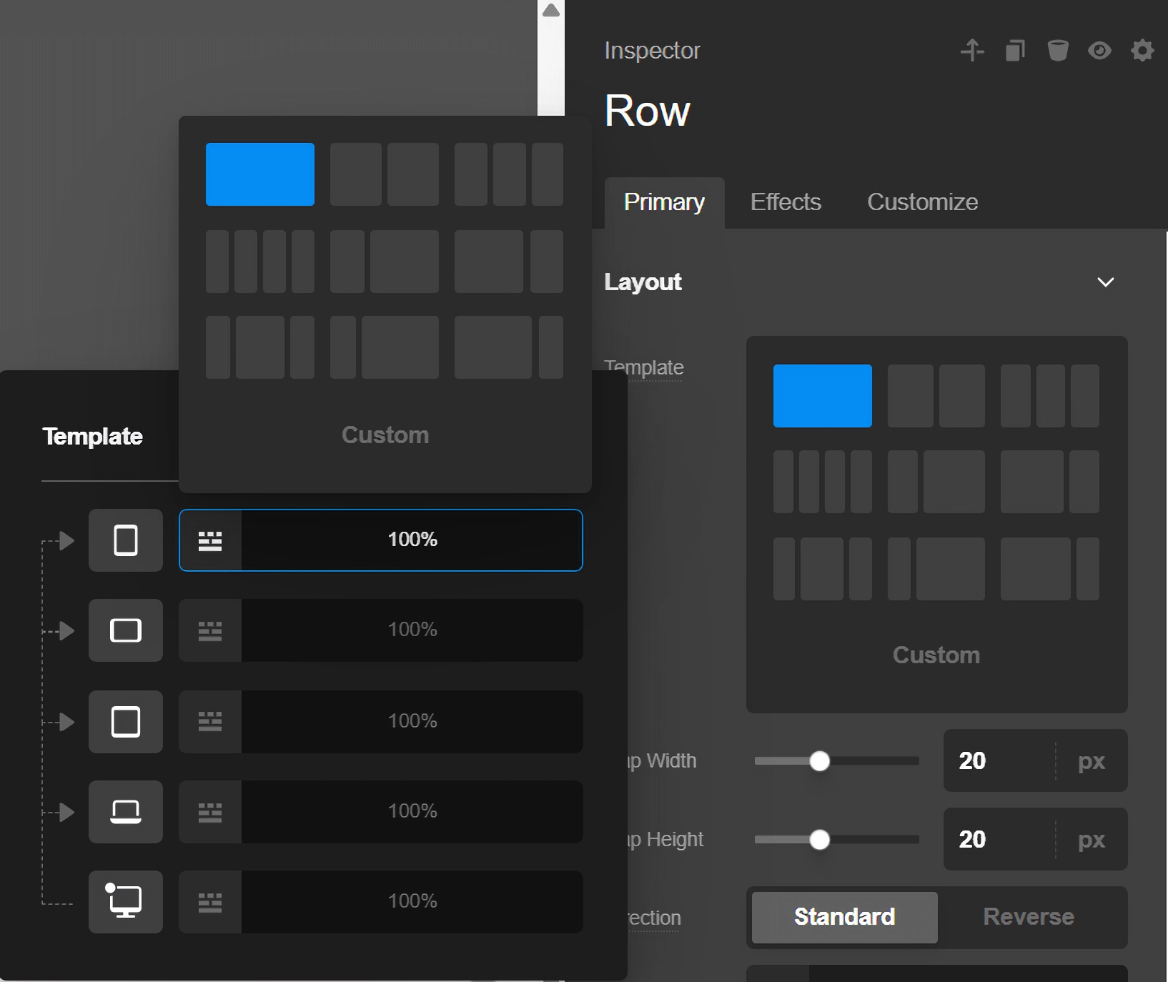
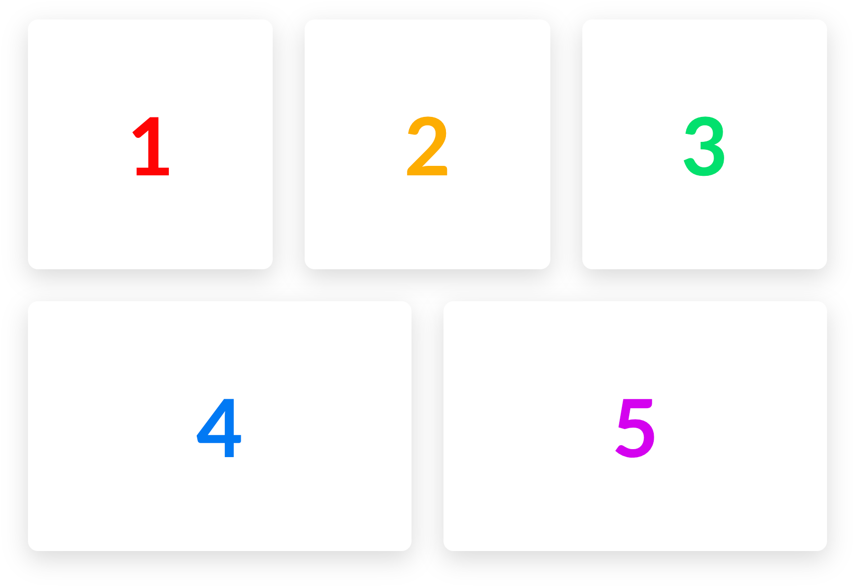
Let's take that example above and walk through how we would make it happen with the new Row. The first thing you would do is add 6 Columns to the Row:

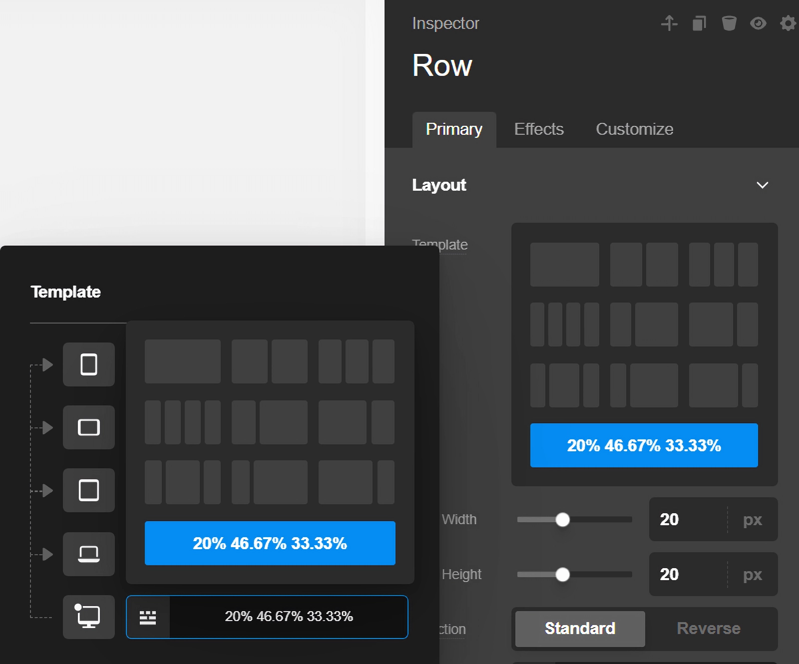
Next, we would set the layout for the breakpoint we're working currently on (in this example we'll start with the XL breakpoint). There are multiple common preset configurations available to choose from such as 50% / 50%, 33.33% / 66.66%, et cetera. In this scenario, since we want 3 equal columns for our layout, we can choose the option below:
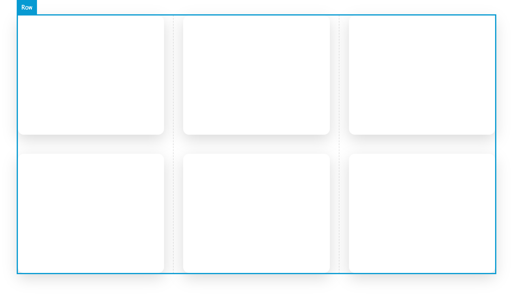
Which would create the following output (the Column Elements have been styled to make visualizing them a little easier):
Modifying the Layout
You may have already noticed that there's something a little different to the Row when hovering over it: a faint, dotted line that appears within the vertical gaps of the Row. These are handles that can be grabbed within the live preview to horizontally resize the layout between adjacent Columns. The dotted line is only an indicator that appears on hover, but the entire gap is able to be dragged. Clicking down on any of the vertical gaps will reveal the following feedback:
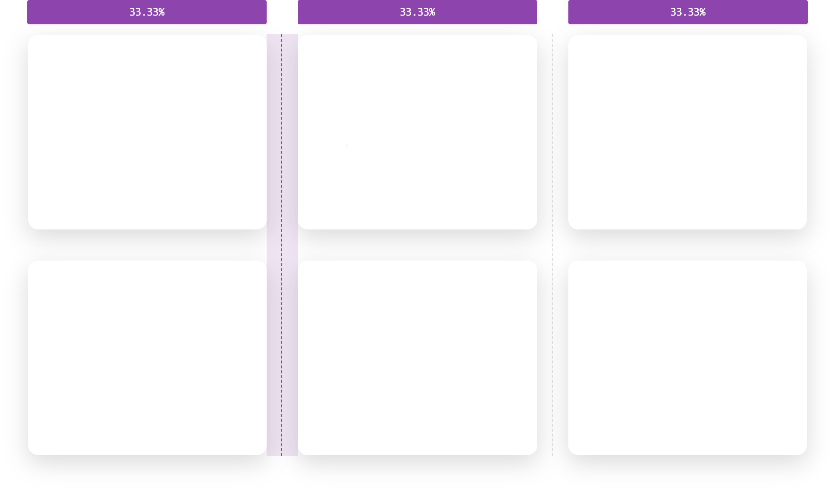
The active handle that you are currently interacting with will highlight in addition to the tooltips that appear above each Column, revealing their current widths. As you begin dragging the handle, the layout will update in real time and the tooltips will also update accordingly. Additionally, if you hop back over to the Inspector you will find that the previous column layout preset will have changed to a "Custom Layout," reflecting the changes made by dragging the handles in the preview:
This process can be repeated for each breakpoint using the tabs to the left of the "Layout" controls. Expanding on our example above, we may wish for our 6 Columns to respond down to a 50% / 50% layout on our LG and MD breakpoins, and then go 100% on SM and XS.
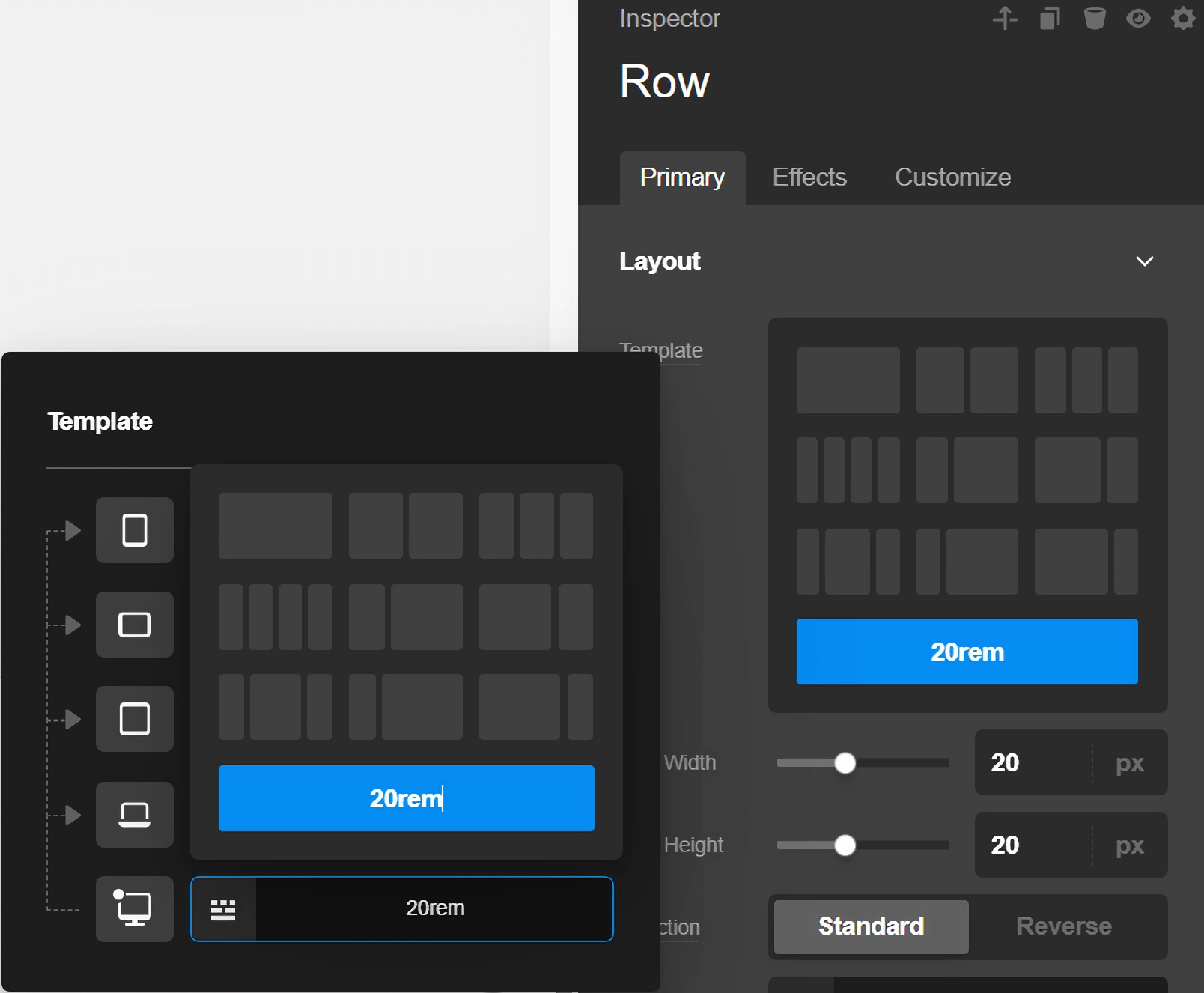
A very unique layout hack to keep in mind is that the Column widths are set using flex-basis as the Row is powered by flexbox. Because of this, if you set the same custom fixed value (e.g. 200px, 20rem, et cetera) for every breakpoint then the Columns will respond not by breakpoint, but by ensuring that their own width never goes below that fixed value if possible. This is great for layout situations where you want to define a bunch of Elements that stick to a very specific max-width and just have them wrap as they need to. Again, to do this you would just need to set one fixed value at each breakpoint using the custom layout input like so:
One final interesting bit of information about the "Layout" control is that it will automatically switch the active tab to the breakpoint you're currently viewing in the builder. You can of course switch to any breakpoint you wish to style at any point, but this helps to ensure that you're starting your work on the breakpoint you most likely intend to be updating.
Setup & Gaps
After setting up the general layout of your Row, you will find even more helpful controls in the "Setup" control group:
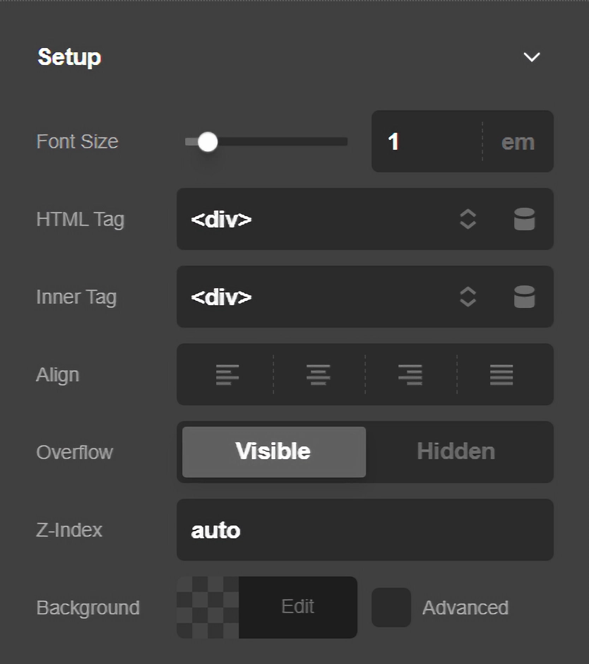
We can perform many common tasks such as setting the base font-size or a background-color, but you'll also find that there are many helpful improvments to the revamped Row.
Probably most helpful are the gap controls. The previous version of the Row had set horizontal gaps and did not have a way to set vertical gaps at all, often requiring users to resort to Gaps that would be shown/hidden across multiple breakpoints or custom CSS. Now, you can quickly and easily specify these values natively to have the Row space out its own Columns intrinsically. Remember that you will not see any vertical gaps until your Row's layout changes so that Columns are stacked one on top of the other.
Alignment
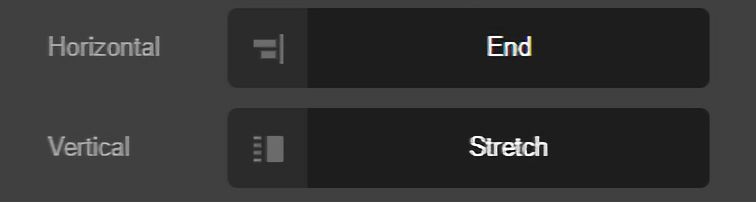
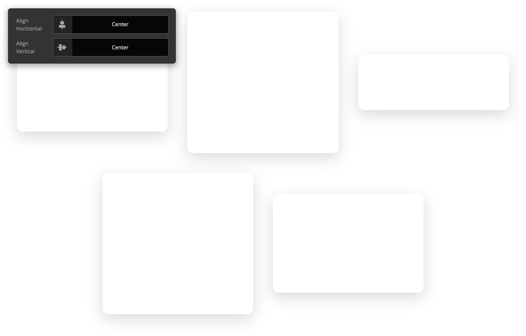
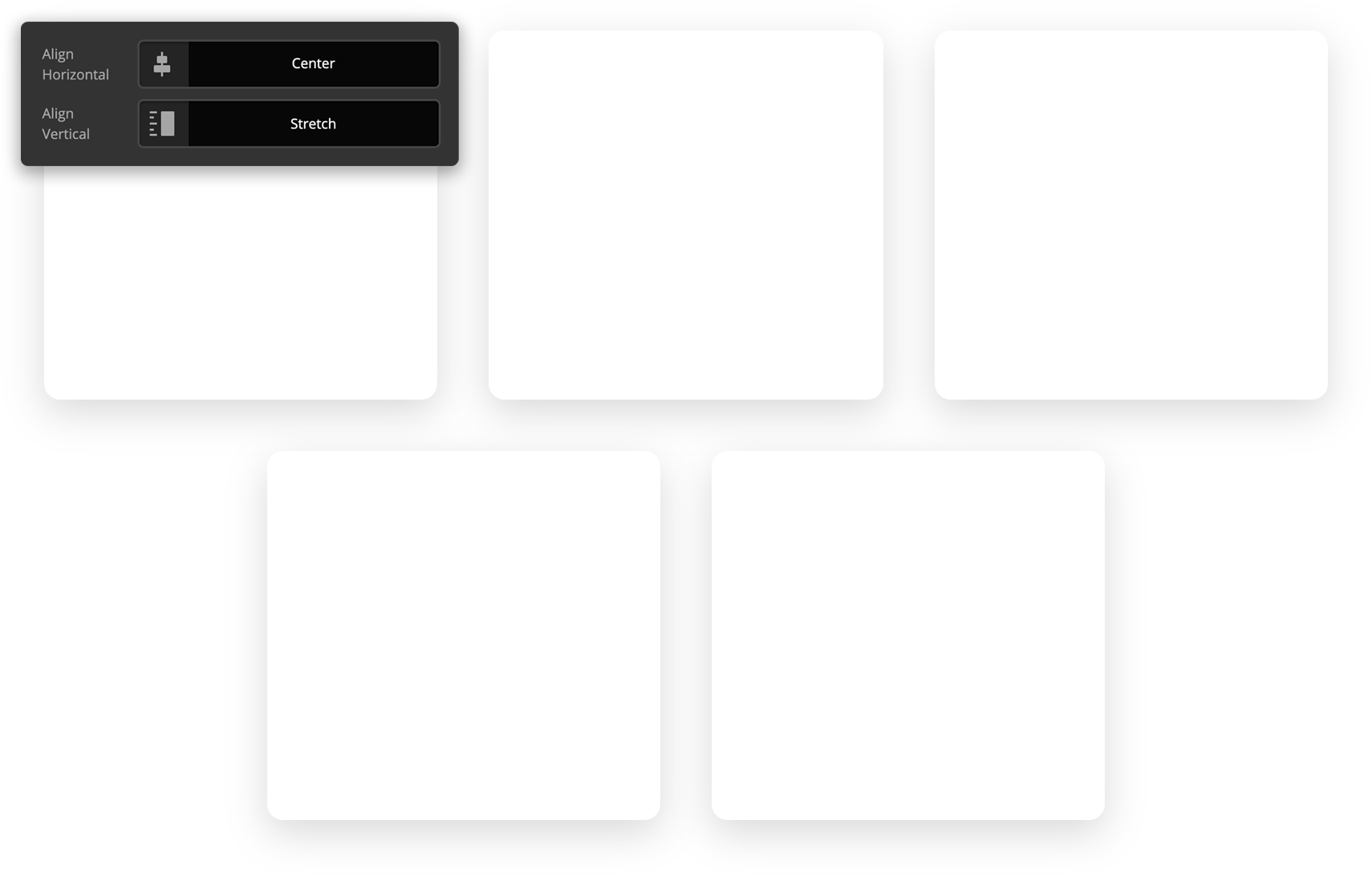
The alignment controls are an incredibly powerful part of laying out the Columns within your Row as we have flexbox potential to tap into. This can allow us to achieve all sorts of unique layouts not possible in traditional builder grid systems. For example, let's take our 33.33% / 33.33% / 33.33% layout from before but remove one Column from it. By default, with the Horizontal Align control set to Start, your layout would appear as such:

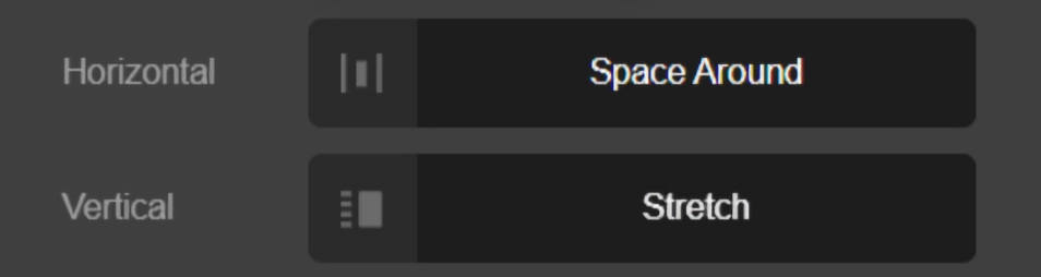
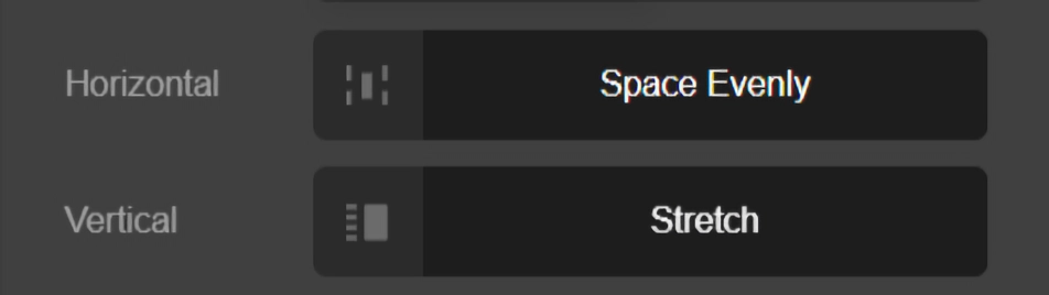
Since we have extra horizontal space to distribute our Columns amongst the space our Row is occupying, if we adjust the Align Horizontal control we sill start to see different layout results emerge:
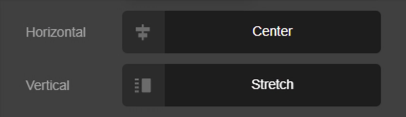

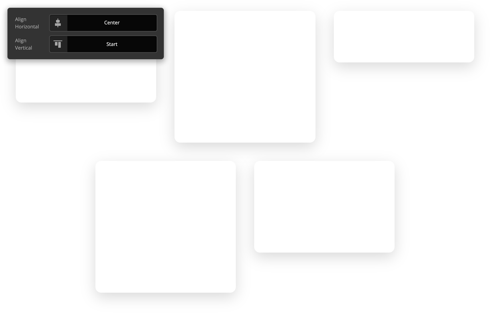
Additionally, if our colums have differing heights, we can use the Align Vertical control to distribute the placement of the columns within their respective row (note that for all of the examples below, we utilized an invisible spacer to achieve the different heights of these columns):

Reverse & Grow
The final specialized controls for the Row that are important to note are the Reverse and Grow checkboxes. Starting with Reverse, let's take a look at the ordered content below:
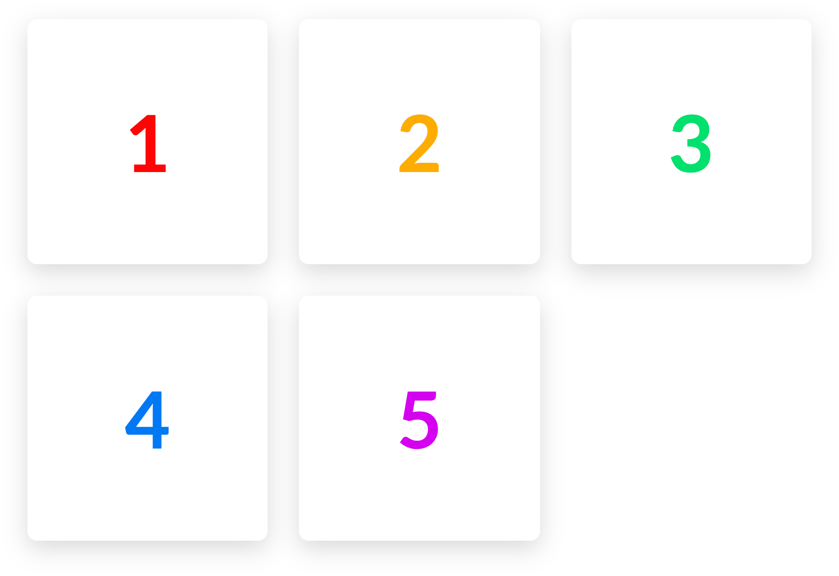
Notice how the numbers appear from left to right as they would on a website utilizing LTR text directionality. If we turn on the Reverse checkbox, that would result in the following:
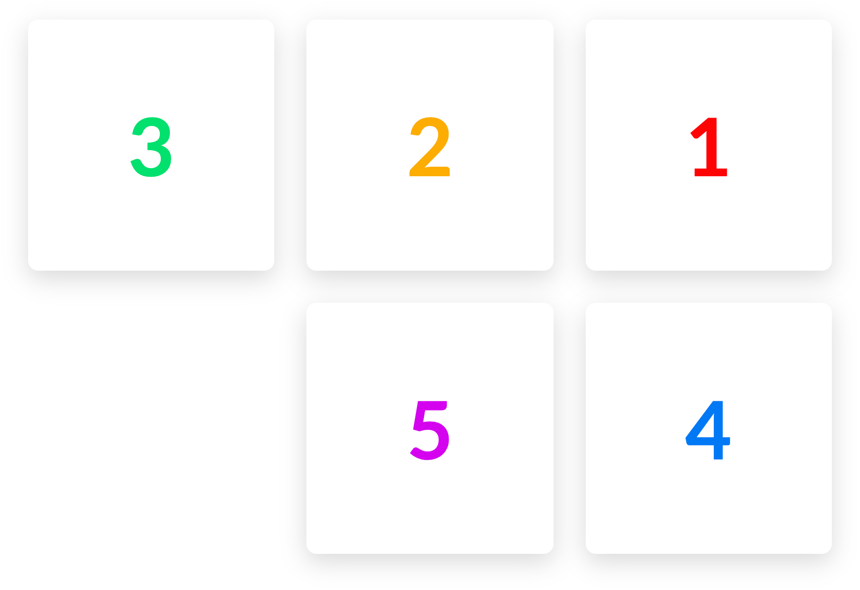
Engaging the reverse functionality effectively mirrors the appearance of your content horizontally. This is important to note as it does not have any actual effect on the order of your Columns (e.g. 5 does not appear in the place of 1, et cetera).
Utilizing this checkbox is most effective for situations where you might have alternating Sections of content on desktop (e.g. Image / Text then Text / Image) but on mobile you want them all to appear with either the text or image on top uniformly. Since Reverse only alters the horizontal appearance of our Rows, you can use Reverse for every other Section with this pattern, and it will automatically respond to the way you want it to appear on mobile. No more hiding / showing multiple Rows and Columns to achieve this particular layout!
Additionally, the Grow checkbox will force any Columns to fill all available space when possible:
This is simpily a stylistic choice and there are some situations where you might wisth to have a squared out Row of content, even if you do not have an even number of Columns available.
Customize
The Customize pane consists of various features that allow you to take further control over your Element's styling and functionality:
- ID – Sets an HTML ID on the Element.
- Class – Sets an HTML Class on the Element.
- Element CSS – Use this feature for increased stylistic control of your Element, especially over nested markup. Click here for more detailed information on this feature, such as using
$elto dynamically target the base tag, et cetera. - Hide During Breakpoints – Hides the Element at different screen sizes when design alterations are needed. Click here for more information.
- Conditions – Adds / removes Elements from the page when certain criteria are met (e.g. “If a featured image is set...”). Click here for more information.
- Custom Attributes – Use this option to add custom HTML attributes to the root tag of the Element (e.g.
data-info="123"). This can be particularly helpful when integrating with various scripts and libraries. - Looper Providers & Consumers – Use these controls to access information in your WordPress installation and output it on the frontend of your website using Elements from across our Builders. Click here for more information.
Video Tutorial
Demo
To see a live demo of the Row Element click here.
Summary
To sum up, we've discussed the Row Element. We've discussed that a Row Element is an easy tool for adding rows on a page in Cornerstone, and we've learned how to change its content, design, and the various Row settings.
See something inaccurate? Let us know