Posts
In this article, we're going to introduce to you the various Posts Elements and how to use them.
Cornerstone includes a handful of Posts Elements that are natively built using a handful of new features that also came out during the same release cycle:
- Loopers & Dynamic Content: A powerful new feature allowing users to query and filter information in your WordPress install and “loop” through that returned list of data to output a uniform set of Elements. We can then use Dynamic Content to access specific data points in the Looper (this has been available in the Builders for some time now, but using it with Loopers is a new concept).
- Element Conditions: Outputting content conditionally is an important facet of designing loops that work well with variable data (e.g. you might need two sets of output depending on if a featured image is or isn't set).
- Effects: And how exactly do we make all of this information fun and exciting to engage with? Give it a sprinkle of life with Effects and chaining together child Element interactions.
We strongly recommend that you read through those resources first before going through this article, as they will provide the necessary foundation to understand some of the concepts we will discuss here.
The aim of this article is to run through each of the Posts Element variations included in this update and explain why they are structured the way they are so that you can confidently make adjustments as needed or use them as a starting point for your own design ideas. We will only discuss settings of note throughout the markup of each Element. In addition to this article, we encourage you to check out our Posts Element walkthrough on YouTube.
Introduction
An important piece of information to keep in mind about all of these Posts Elements is that they are completely native to our Builders, meaning that they are built out of the Elements you already know and work with all the time in your designs (e.g. Rows / Columns, Images, Headlines, Icons, et cetera). You can think of the Posts Elements as prefabricated designs that are made up of many smaller constituent parts.
This means instead of having one Element to display your recent posts with a limited set of options that might never truly give you what you want, each of these Posts Elements are highly customizable yet very simple to adjust. For example, if you drag in the Posts (Minimal) Element and find you don't like that the headline text turns orange on hover, you can click on that piece of text directly—as it is built using the Headline Element—to inspect it, adjust the hover color, and you're done!
Additinally, it means that if none of these prefabricated Elements quite work for your setup, if there's something specific you're imagining you can most likely create it on your own to your exacting specifications.
Commonalities
Each of these Elements is built using a Looper Provider on their top-most Element, which is set to Recent Posts with a custom Count set:
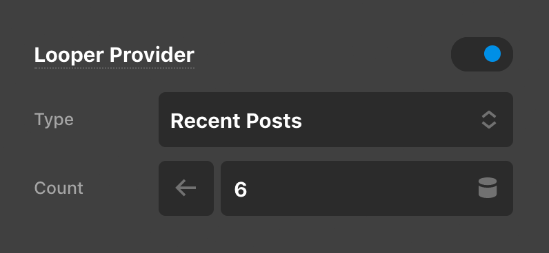
This setting will pull in your latests posts by date in descending order (how most recent posts Elements typically work). The important thing to be aware of here is that specifying a custom count for the exact number of posts you need on your Looper Provider is recommended as it will limit your query size and help with performance. If you wish to adjust the output count for any of these Elements, you can do so here.
The actual loop output is triggered by the Looper Consumer set to All (which means all of the posts given by the Provider) found on the first child of the top-most Element:
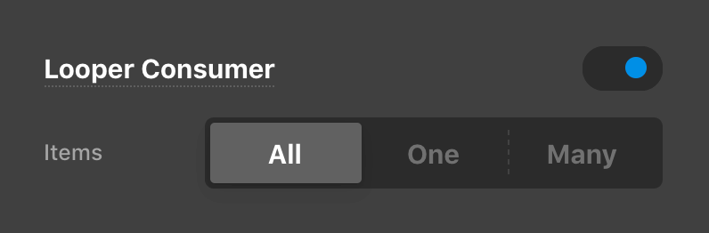
Remember that all data accessed from the Looper is done by using Dynamic Content. For text, this might be as simple as using {{dc:post:title}} to access a post's title, and you can also use these template strings in conjunction with other text like we do for featured image alt text, which is uniformly set to Featured image for “{{dc:post:title}}” (but can of course be altered if you need to do so). Additionally, featured images are pulled through dynammically by clicking on the Dynamic Content icon in the image control and setting it accordingly.
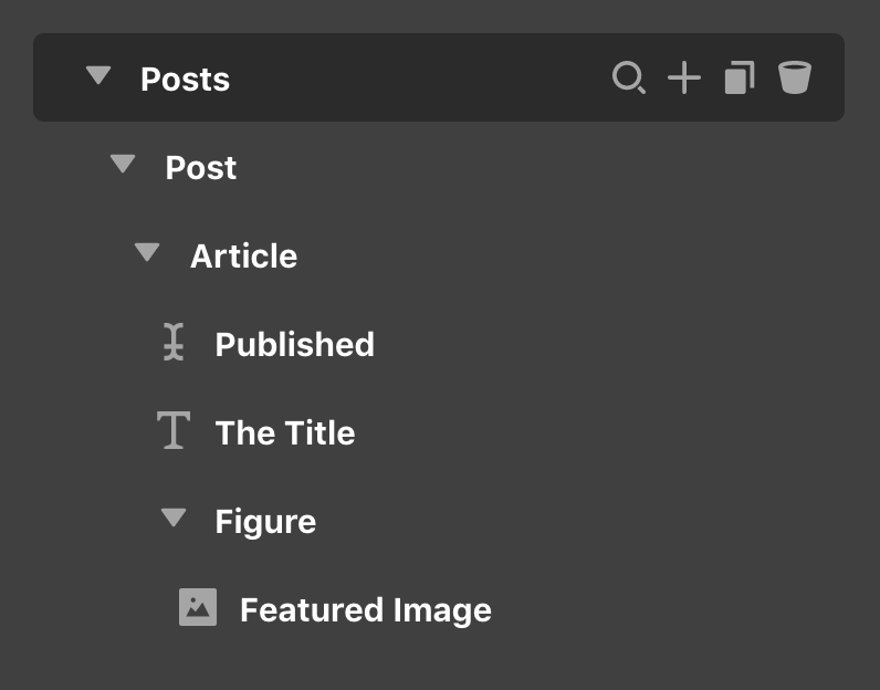
Another shared feature amongst the Posts Elements is that the Post in the outline has its Tag set to <a> with {{dc:post:permalink}} as the link value so that clicking anywhere on that Element will take the user through to the content. That being said, you can adjust this as you see fit and place the link on any (or multiple) Elements within your own variations.
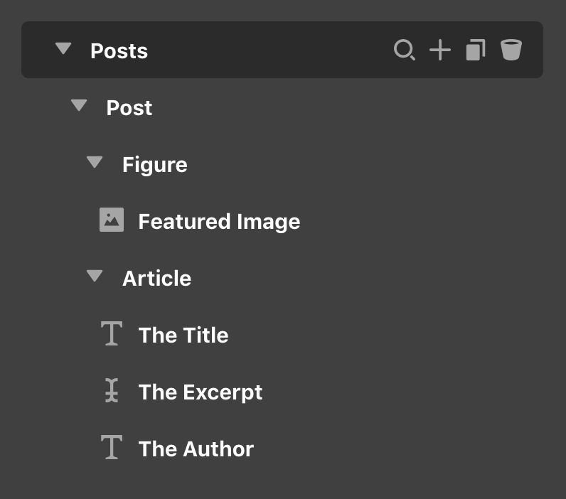
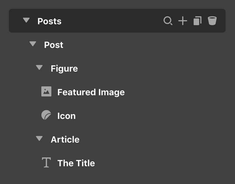
Any other layout Elements within an individual “Post” will be labeled after the Tag that they have set. For instance, an Element with its Tag set to <figure> will be labeled “Figure” in the outline, <article> will be labeled “Article,” and so on. You can adjust these labels in the outline if you wish.
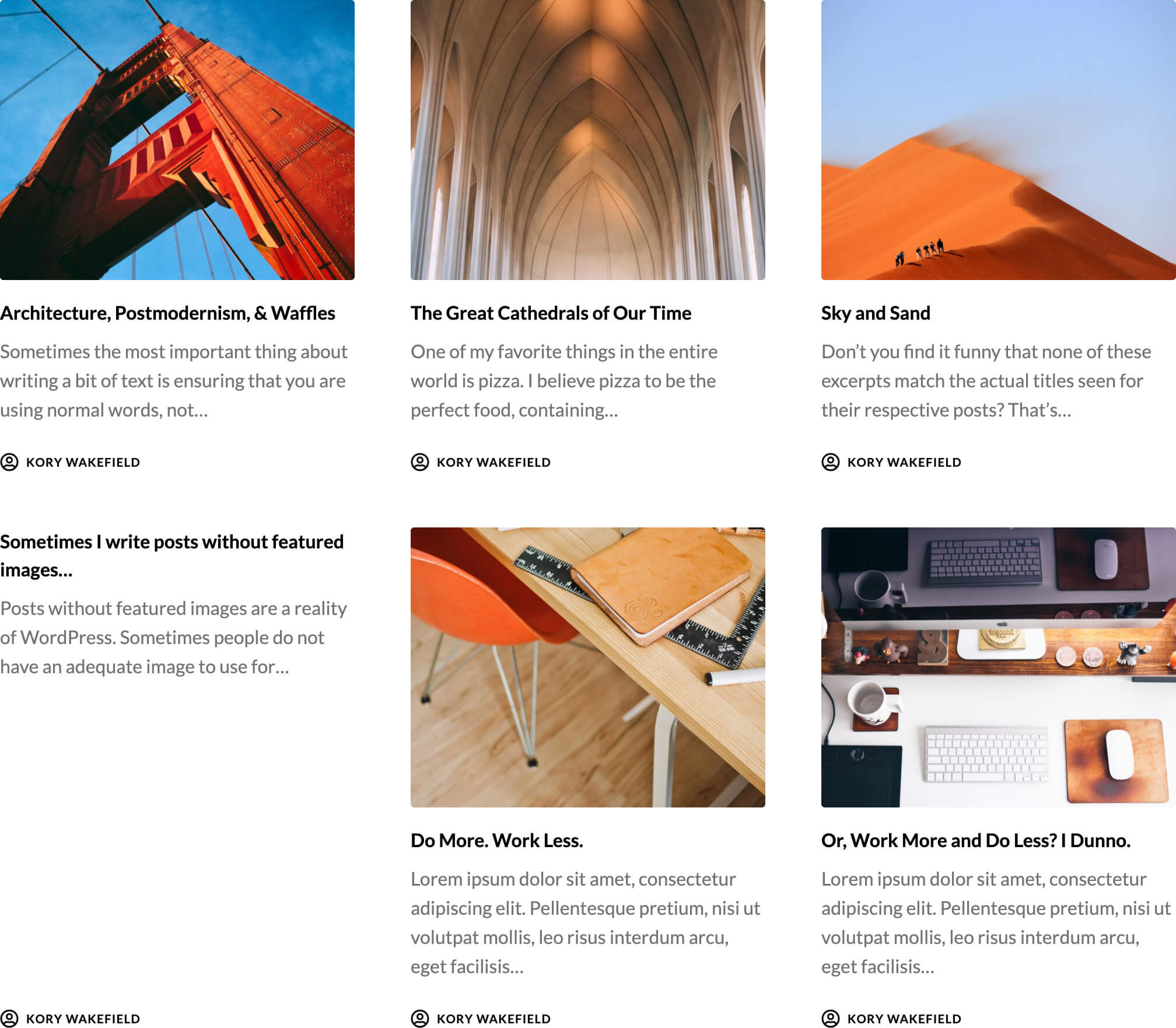
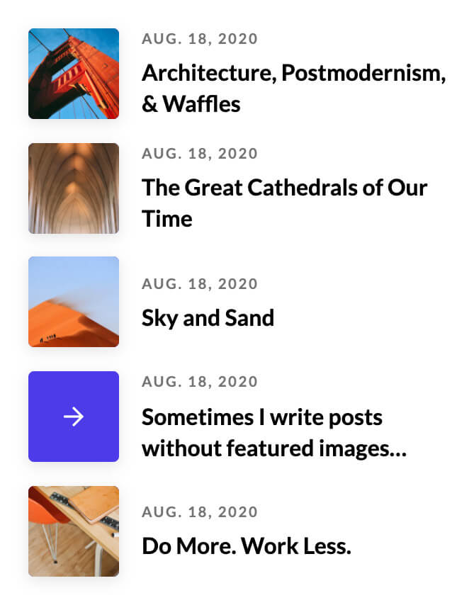
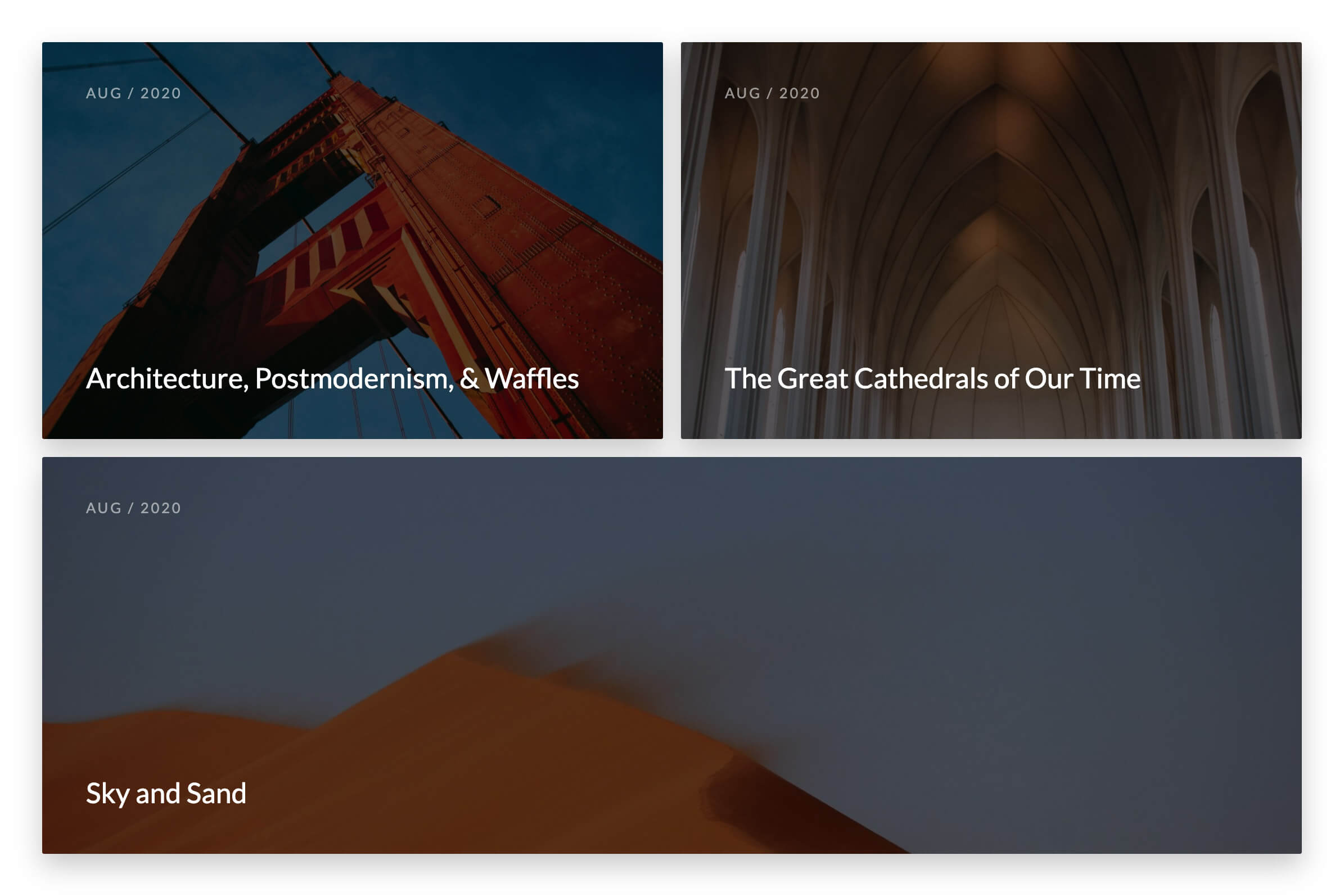
Minimal
The Posts (Minimal) Element is our take on a more traditional recent posts design with a clean and simple look that will work well on any site:
Posts
A Row Element with the following responsive layout:
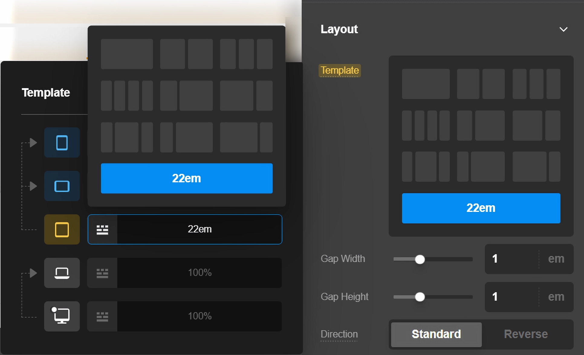
This unit of 22em set as a custom value on every breakpoint allows us to achieve an “auto-responsive” layout, which we have discussed on our YouTube channel. This approach is used as we can never be sure where this Element might be placed (i.e. wide main content vs narrow sidebar).
Beyond that, the Align Vertical control is set to stretch, allowing us to use flexbox positioning to ensure our Columns are always equal height.
Post
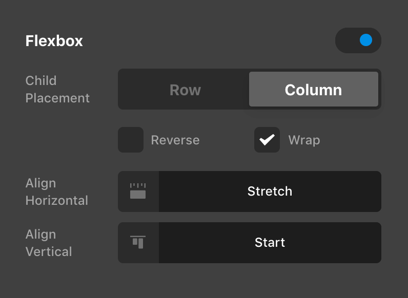
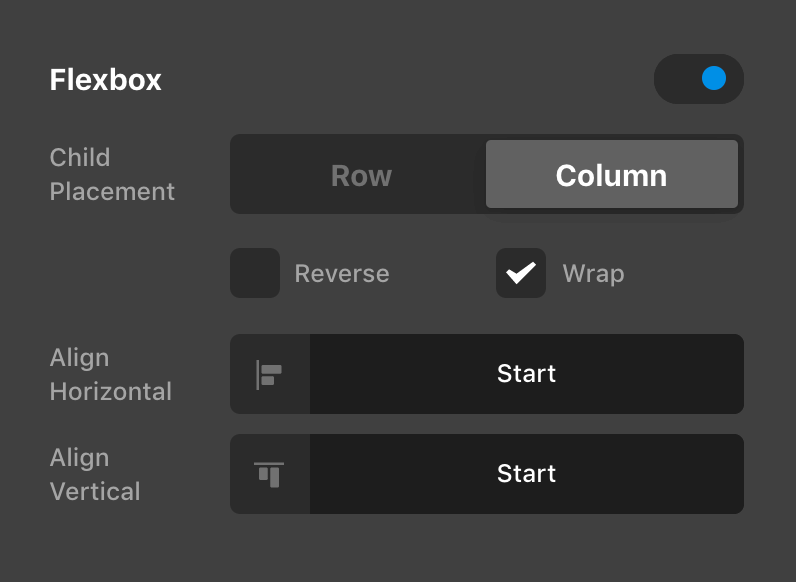
A Column Element with its Flexbox control enabled and set to a Column layout so that the content inside is laid out vertically:
Additionally, Link Child Interactions is enabled on the Post's Effects control group with all three targets turned on. This allows the Post to chain all child color, particle, and effect interactions on hover.
Figure
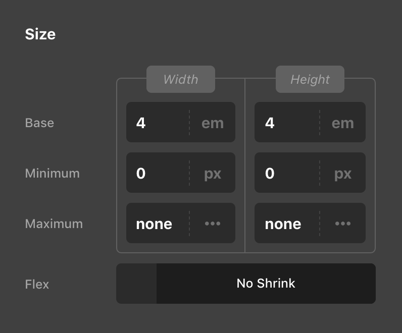
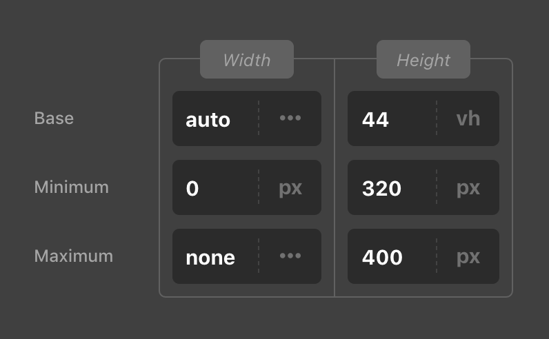
A Div Element that houses the featured image of the post. One of the more important things to note here is how its sizing is setup:
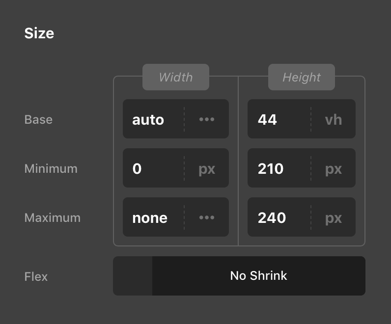
This is done to ensure that image heights are always uniform regardless of their physical size. If you wish for your images to show their natural dimensions, you can begin by resetting these values to their default state.
Inside we have an Image Element with its Width and Height set to 100% so that it completely fills the parent. Object Fit is set to cover so that it will not become scrunched since we are forcing its dimensions from the parent.
Finally, this Element has a condition on it so that it is only output if a featured image is set. This ensures that no empty <img/> markup is output and allows the Article markup to expand and fill the available space with how it is setup. Because of this condition, a Margin Bottom value is set on this Element to space out the content below it appropriately.
Article
A Div Element that houses the main content of the Post. The main thing to note here is the Flex value using Custom output:
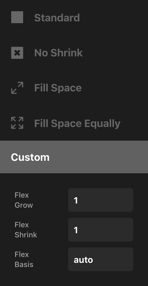
This is probably the most important control here, as Flex Grow of 1 ensures that this Element will fill all available remaining space within the Column, and then Flex Shrink of 1 allows it to shrink if necessary. Next, the Flexbox control group is enabled for this Element and set to a Column layout to orient content vertically:
Within this Element we have our content to ouptut the post's title, excerpt, and author. The length of the excerpt can be adjusted via the Dynamic Content string inside the Text Element, which also has a Margin Bottom of auto to push the author output towards the bottom when there is space to do so. This allows the author markup to always be anchored in the lower corner of the post and help frame its dimensions more clearly.
List
The Posts (List) Element is a variation on the recent posts design that is intended to be used in narrow spaces (think small columns, sidebars, et cetera):
By default, this Element will span the entire width of the container it is in, but we recommend setting a Max Width on it if used in a wider space.
Post
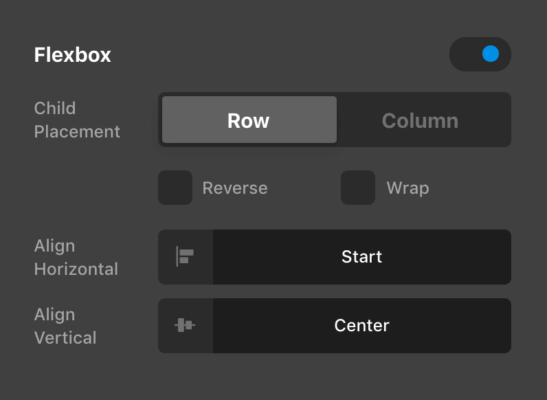
A Column Element with its Flexbox control enabled and set to a Row layout that doesn't allow wrapping so that the content inside is laid out horizontally:
Additionally, Link Child Interactions is enabled on the Post's Effects control group with all three targets turned on. This allows the Post to chain all child color, particle, and effect interactions on hover.
Figure
A Div Element that houses the featured image of the post or a substitute icon if one is not present. One of the more important things to note here for this Posts Element is how its sizing is setup:
Additionally, the Overflow is set to hidden so that the Border Radius can appropriately cut off the internal image if set. This Element also has its Flexbox positioning enabled so that the content inside can be centered both vertically and horizontally.
The two Elements inside are an Image that houses the featured image if it is set, or an Icon if the featured image is not set. The Image has its Width and Height set to 100% to completely fill the parent. Object Fit is set to cover so that it will not become scrunched since we are forcing its dimensions from the parent. The Icon that shows up in place of the Image is meant to showcase how we can use the absence of our primary content in a space to be replaced with a helpful alternative (in this case, the arrow helps to reinforce that clicking this post will go off to another page).
Article
The lone Headline Element inside here is outputting the post's title in its primary text and the post's published date in the subtitle field.
Tiles
The Posts (Tiles) Element is a variation that features a very clean layout that focuses primarily on the featured image of each post:
This Posts Element's markup is relatively straightforward, which you can see from the Outline view of the Builders below. That being said, there are a couple nuances to be aware of here, specifically with how the featured image is setup.
Posts
A Row Element with the following responsive layout:
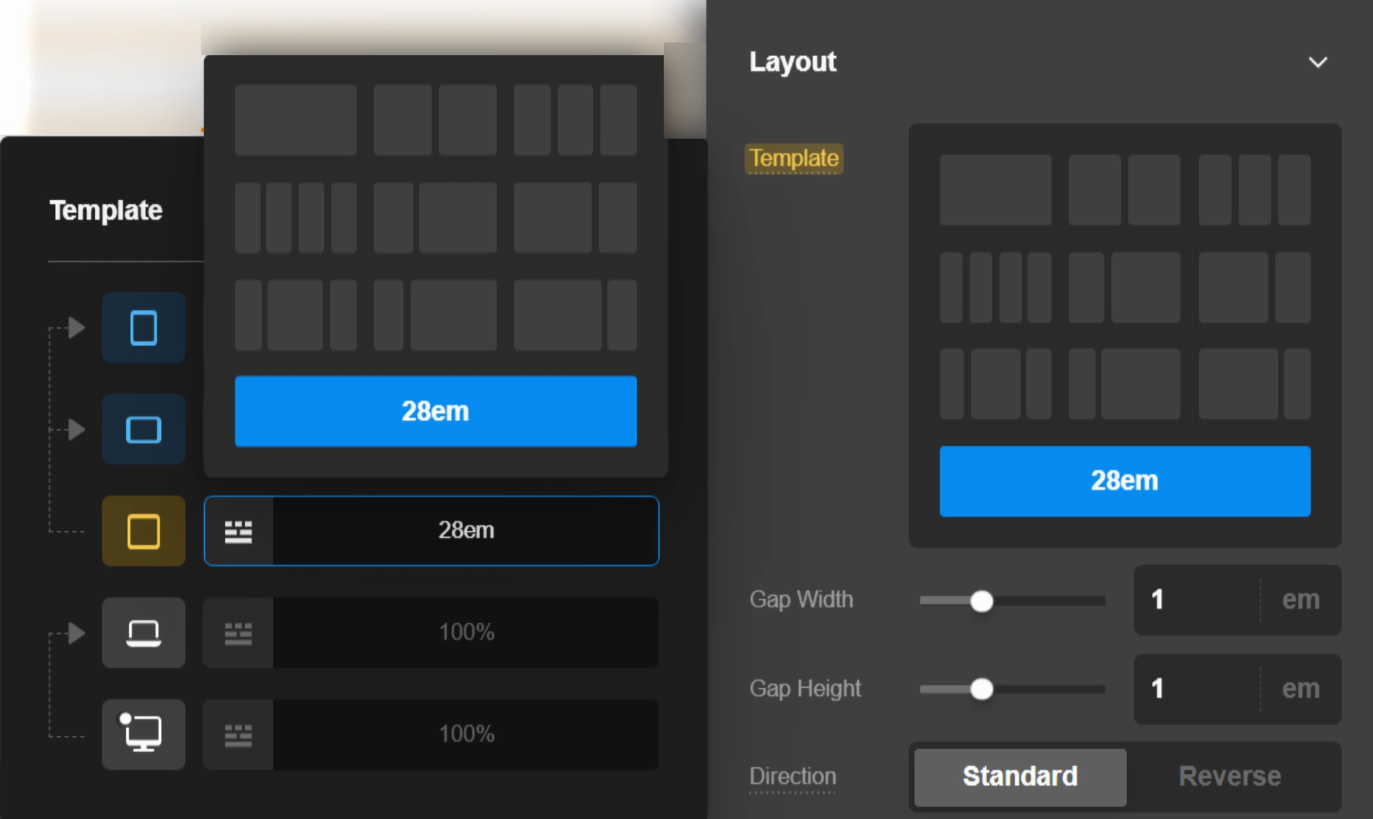
This unit of 28em set as a custom value on every breakpoint allows us to achieve an “auto-responsive” layout, which we have discussed on our YouTube channel. This approach is used as we can never be sure where this Element might be placed (i.e. wide main content vs narrow sidebar).
Beyond that, the Align Vertical control is set to stretch, allowing us to use flexbox positioning to ensure our Columns are always equal height. Additionally, the Grow option under Layout Options is enabled, which is what allows Columns to span all available horizontal space when available (as seen above in the example screenshot with the third post).
Post
A Column Element with one thing in particular to note, which is how the Height is being used under Setup:
This is done to ensure that image heights are always uniform regardless of their physical size. You can adjust these values as you see fit to work better with your designs. Also under the Setup control group is the Z-Index control, which is set to 1 to help us achieve the look we want with our featured image later on.
Additionally, Link Child Interactions is enabled on the Post's Effects control group with all three targets turned on. This allows the Post to chain all child color, particle, and effect interactions on hover.
Article
A Div Element with its Width and Height set to 100% and its Flexbox contol enabled with a Column layout to space out content vertically:

This is also where we've set our “overlay color” on top of the featured image so that we get the fading effect. If you wish to update the base and interaction background colors behind the text content, do so here.
The text content inside this Element is our formatted published date at the top with the post's title down below. The post title has Margin Top set to auto to push the two pieces of text apart and force the title to the bottom. One final thing of note here is that its Position is set to static, which is important to be aware of with how the featured image within works.
Figure
This is one of the more unique setups to output the featured image in a Posts Element, so we wanted to take a bit of time to break this down.
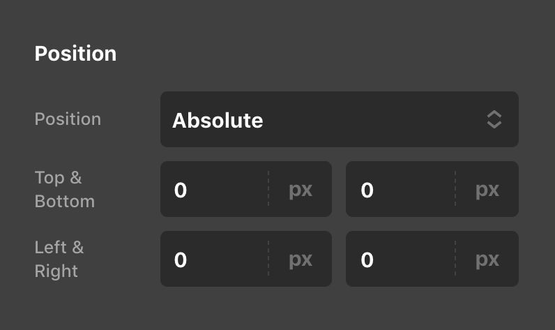
Essentially, this is a Div Element with a Z-Index of -1, which when paired with our value of 1 on the Post above allows us to push this content behind our text content, but not behind the entire page's content (which would make it disappear from view). Additionally, its Position is set to absolute with all position values set to 0px to have the image stretch to the edges of the Post:
Because of this, you will not be able to directly inspect this Element in the live preview, but you are still able to access it via the Outline pane. The reason why we use this markup for the image output rather than a background image is twofold:
- We need to use conditional logic on this Element to not output it if a featured image is not set.
- To acheive the scaling effect that occurs on hover, we need to have an actual Element we can apply an effect to within the Builder.
This is also where you will also find an Interaction effect of scale(1.05) for the Transform control, which is triggered by the Post as mentioned earlier. Finally, within this Element we have an Image with its Width and Height set to 100% and Object Fit set to cover like our previous examples.
Magazine
The Posts (Magazine) Element is a variation that combines various aspects of the previous examples in this article as well as leveraging multiple Looper Consumers to style its content in multiple ways:
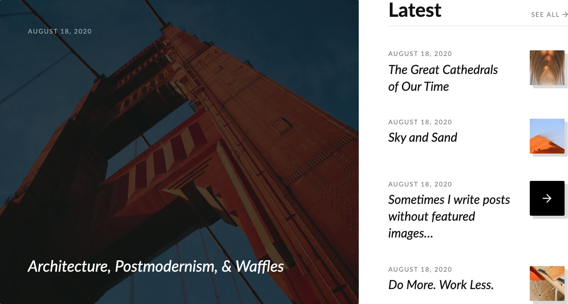
This Posts Element's markup is slightly more involved than the previous examples, but this is mostly due to the utilization of multiple Looper Consumers and having to style those two sets of markup for Posts:
Posts
A Row Element with the following responsive layout:
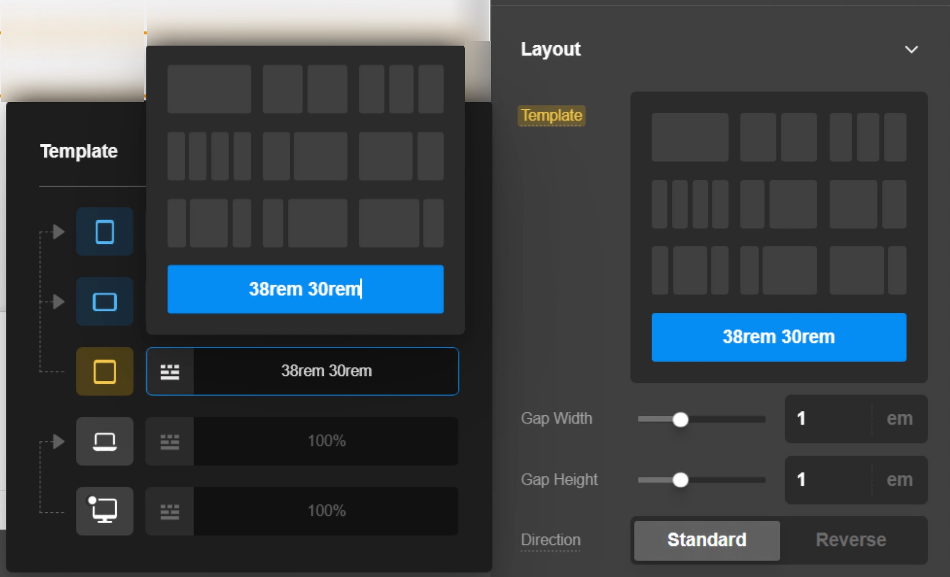
Once again we are employing one of our “auto-responsive” layouts, which is discussed in more detail on our YouTube channel. This value of 38rem 20rem is set as a custom value on every breakpoint and is paired with the Grow checkbox being selected, which allows us to achieve some really cool results.
Effectively, this says that the first column (“Main Post”) should not responsively dip below 38rem if it can break to a new line, while the second column (“More Posts”) should not go below 20rem if it can break to a new line. This means that even if you were to throw this into a smaller sidebar area, the layout will automatically collapse to a single column appearance and should for the most part work almost anywhere.
To adjust the ratio between the two columns, increase or decrease each value accordingly and you will find that the layout can be easily adjusted without having to resort to percentages while still being fully responsive in a more natural way.
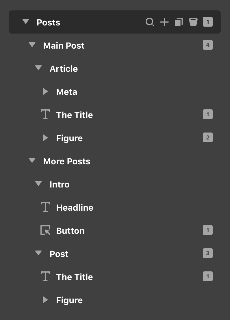
Main Post
A Column Element, which is essentially a slightly altered version of the structure for the posts found in the Posts (Tiles) Element.
More Posts
This Column Element serves as a container for the Intro at the top of the content and its subsequent Post Elements. The most important setting to note here is its internal Flexbox settings:
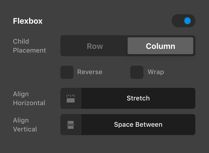
The horizontal alignment of Stretch spreads all content across the entire width of this Column while the vertical alignment of Space Between is what ensures that all content within this Column is spaced out across the entire height of the Column. The interesting thing about this layout is that if you add more Posts on the right, the Main Post to the left will expand in height. Alternately, if you adjust the height parameters of the Main Post on the left, the Posts on the right will space out accordingly…some very fun things to play around with!
Beyond that, we have the Intro, which contains the Column headline and link out to the Blog of the site by default. Finally, the Post Elements that end everying out are a slight variation of the Posts (List) Element, so definitely check that out to understand that layout a bit more. One control of note on each of these Post Elements is the Margin control, which has a top spacing to serve as a base distance between each Post Element while the layout as a whole responds.
Demo
To see live demos of the Posts Element variations, see below:
See something inaccurate? Let us know