Parameters
In this article, we're going to discuss how to leverage Element Parameters to custom-tailor and simplify the site-building process.
- Creating Your First Parameters
- Detailed Parameter Mapping
- Control Types: Text
- Control Types: Textarea
- Control Types: Text Editor
- Control Types: Code
- Control Types: Choose & Select
- Control Types: Color
- Control Types: Color Pair
- Control Types: Unit Pickers & Sliders
- Control Types: Image
- Control Types: Font Family & Weight
- Control Types: Icon
- Control Types: Transform
- Control Types: Filter
- Control Types: File
- Grouping Controls
- Nested Grouping
- Conditional Parameters
- Responsive Parameters
- Lists
- Creating a tooltip for a Parameter
- Using objects as values in Parameters
- Parameter UI Icons
- Example
- Summary
Components are a fantastic tool for abstracting away complexity and bringing consistency to your designs by allowing you to create an asset once, and then use it everywhere. However, there are still plenty of situations where we need some variability in our designs, and that is where Parameters come in (sidenote: Parameters can be used on standalone Elements).
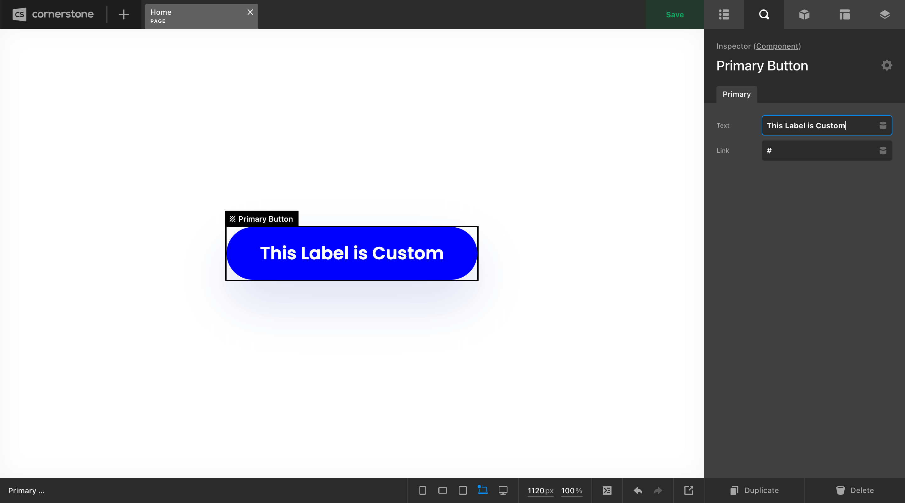
Let's take the humble Button. It is likely that if you have made this into a Component, you will want to update some content within it on a case-by-case basis. The two most common pieces of content you may wish to update within the button are its text label and href value. With Parameters, we could easily create custom controls on our button component and wire them up where necessary to expose these data-points and make them editable per instance.
Creating Your First Parameters
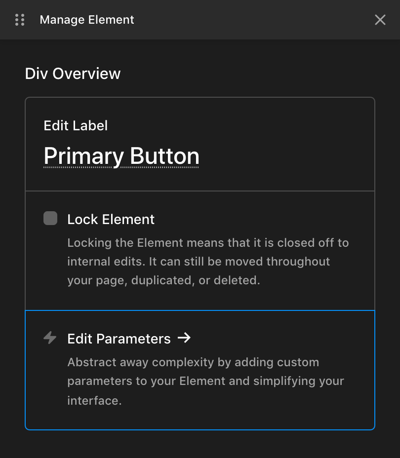
To begin this process, open the Element Manager for the Element you wish to work on and click on Edit Parameters,
This will bring up a JSON code editor where you can input some structured notation to achieve your desired result. In this instance, we want to expose an input for a text label and the href value, so let's go with the following:
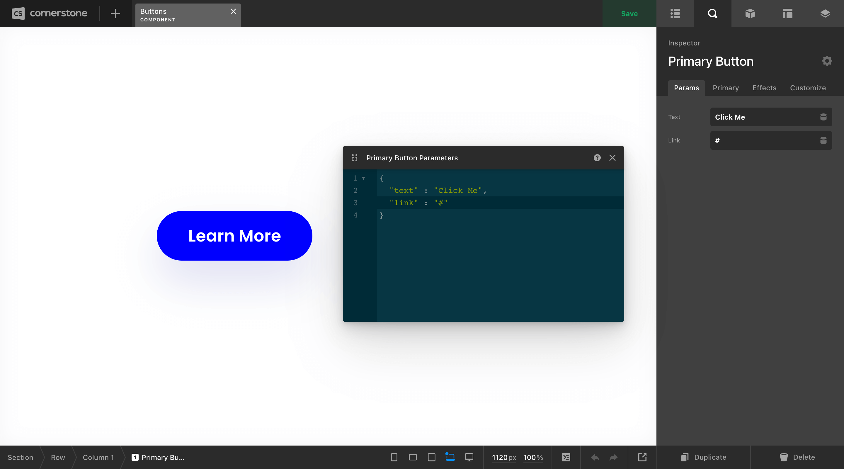
So what's happening here? Well, we have our JSON object in the code editor (e.g. {}), and then inside that we have two lines of key / value pairs, each representing a new Parameter we want to add to our Element. Each Parameter added to our Element will show up in the Parameters control group seen in the Inspector on the left side of the above screenshot.
The string on the left side of the : for each line is the key, which is the value we will reference in a moment when wiring up our Parameters with Dynamic Content.
The string on the right side of the : is the default value of the Parameter.
Next, we need to wire up our Parameters so that our controls are outputting properly. To do this, we'll be using Dynamic Content in the form of {{dc:p:__key__}}, where __key__ is the value of the string on the left side of the : seen above.
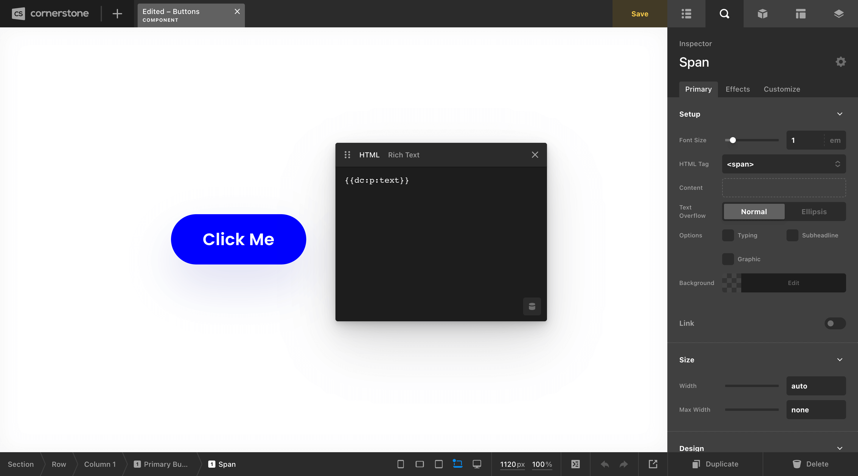
Let's start with our text label. For this example, our button is made up of a Div Element using an <a> as its base tag with a Headline Element inside for the label with its base tag set to <span>. Since our text output is handled by the Headline Element, we'll inspect that and place our Dynamic Content there:
Now that we have the appropriate “plumbing” in place, the default value we set for our button's label is now pulling through. Next, we can do the same thing for our href value by pluggin its Dynamic Content value into the appropriate place:
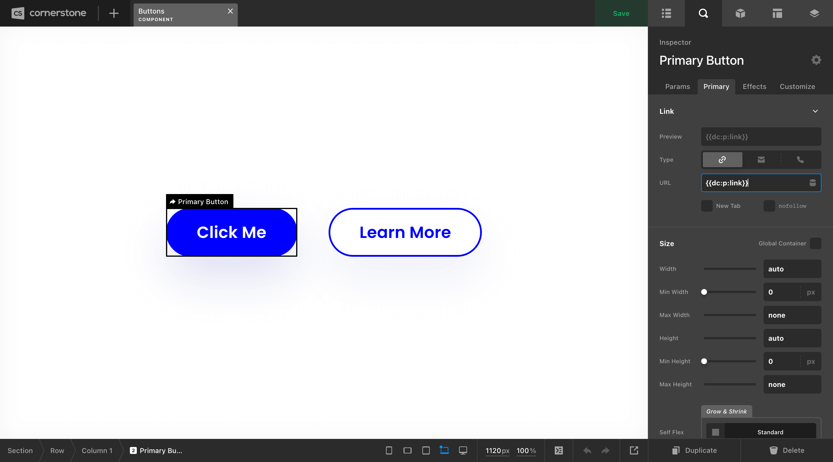
Once all of our Parameters are wired up, they are all that will be exposed in the Inspector whenever we utilize this Component in the Page or Layout Builders:
Breakout Mode
Adding Parameter Dynamic Content on certain control fields is only available via Breakout Mode. See the guide here for more info.
Detailed Parameter Mapping
While a mapping like the one shown in our previous example is helpful for simple use-cases where only a couple of inputs are needed, you will notice that there are a few things that happen “for free” when doing it this way:
- The label of each paramater is generated by the
key. - The type of the input is automatically set to a text input to receive simple strings.
But what if you wanted to alter the label, or call for a specific type of input more applicable to what you are using the parameter for? Or perhaps you just prefer things to be as explicit and detailed as possible (like some of us at Themeco). If that's the case, you can use the following format:
{
  "text" : {
    "label"   : "Text",
    "type"    : "text",
    "initial" : "Click Me"
  },
  "link" : {
    "label"   : "Link",
    "type"    : "text",
    "initial" : "#"
  }
}
This mapping will result in the exact same control output as seen in our previous example, but you can see that it's broken out to be much more explicit. The key is still the value found to the left of the : for each of our items, but the value side of things has been broken out into a more detailed object, allowing us to specifically target aspects of each control and overwrite them if we wish. For this example, we have tapped into the following options for each of our controls:
label– Allows you to overwrite the default label generated by the key of the control. For example, you may want your key to remain something simple liketext, while changing yourlabelto something more descriptive like “Button Text” in the Workspace.type– A standard text input is the default control type used for shorthand parameter declarations, but there are other control types you may wish to reference such as color pickers or unit sliders to provide more specialized control over your mappings (more on this later).initial– The default value that is populated in your control.
Next we will cover the types available to use in your parameter mappings, along with any additional options that can be used with that specific type to further control it's appearance or behavior in the Workspace.
Control Types: Text
Outputs a standard text input control. Can receive CSS values, or strings of content to be used in parts of your Element such as labels or attribute values.
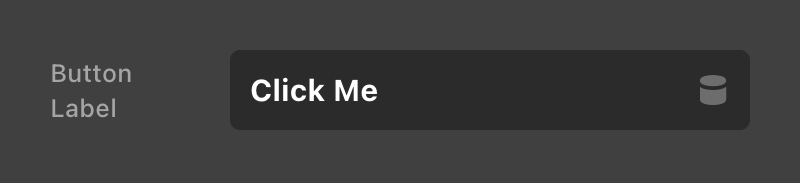
{
  "buttonLabel" : {
    "label"       : "Button Label",
    "type"        : "text",
    "initial"     : "Click Me",
    "placeholder" : "Specify a button label"
  }
}placeholder– Allows you to specify the content string seen in the text input when no value is input.
Control Types: Textarea
Outputs a textarea input control, typically used for longer strings of content.
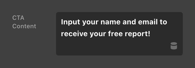
{
  "ctaContent" : {
    "label"       : "CTA Content",
    "type"        : "textarea",
    "initial"     : "Input your name and email to receive your free report!",
    "placeholder" : "Input your call-to-action content",
    "height"      : 2
  }
}placeholder– Allows you to specify the content string seen in the text input when no value is input.height– Allows you to specify the number of rows the control takes up in the Workspace (defaults to2).
Control Types: Text Editor
Outputs the text editor control, which provides an HTML / rich text editing experience. Typically used for longform content or areas where you need to output custom HTML.
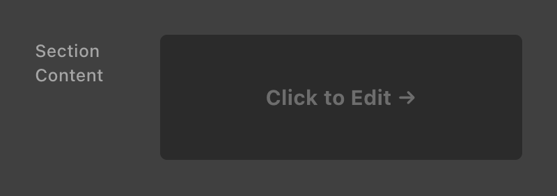
{
  "sectionContent" : {
    "label"      : "Section Content",
    "type"       : "text-editor",
    "initial"    : "",
    "height"     : 2,
    "expandable" : false
  }
}
Control Types: Code
Outputs the code editor control, which provides an interface for outputting custom CSS or JavaScript.
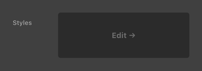
{
  "cssCode" : {
    "label"   : "Styles",
    "type"    : "code",
    "initial" : "",
    "height"  : 2,
    "lint"    : "css"
  }
}height– Allows you to specify the number of rows the control takes up in the Workspace (defaults to1).lint– Can accept a value ofcss,js, orjson. When omitted, no linting is applied.
Control Types: Choose & Select
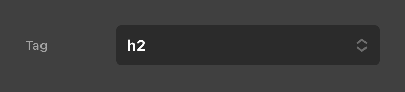
We will discuss choose and select parameters together as they have a similar setup, with their primary difference being in their final UI output. The result of using these controls is the same though in that they provide the user with a predefined list of choices to select from, eliminating the possiblity of user error upon input. Let's take a look at a simple example where we'd want the user to select an HTML tag to wrap their content in:
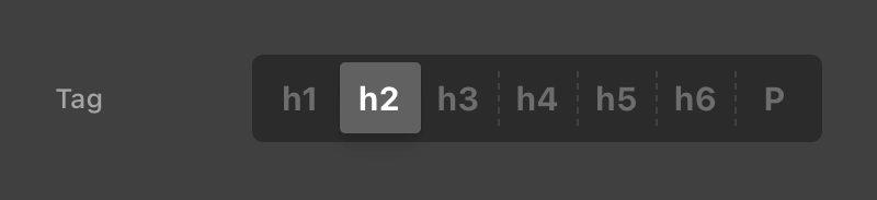
{
  "tag" : {
    "type"    : "choose",
    "label"   : "Tag",
    "initial" : "h2",
    "options" : [
      { "value" : "h1", "label" : "h1" },
      { "value" : "h2", "label" : "h2" },
      { "value" : "h3", "label" : "h3" },
      { "value" : "h4", "label" : "h4" },
      { "value" : "h5", "label" : "h5" },
      { "value" : "h6", "label" : "h6" },
      { "value" : "p",  "label" : "P"  }
    ]
  }
}
The above type of choose outputs these options in a single line that is immediately clickable by the user. Take note of the options key, which accepts an array ([]) of objects that provide a value and a label. The value is what gets passed on by the parameters to the Element, while the label is what you want it to say in the UI as the user is making their selection.
It should be noted that this particular number of options is really only sutable as a choose here because of how short the labels are. The choose control is typically used for situations with two or three simple choices to be made, each with succinct labels as they are output directly to the UI.
On the other hand, the select type is perfect for very long lists of data, as it can in theory handle an “infinite” amount of options and labels that are very long.
Using {{custom}} as a value will auto enter the choose control into Breakout Mode.
{
  "delimiter" : {
    "type"    : "choose",
    "label"   : "Delimiter",
    "initial" : "",
    "options" : [
      { "value" : "", "label" : "All Letters" },
      { "value" : ",", "label" : "Commas" },
      { "value" : "{{custom}}", "label" : "Custom" }
    ]
  }
}
Finally, the choose can accept an offValue option, which is a value that is provided to the control if a user deselects the control, technically giving you an additional “hidden” choice. This can also accept objects as of Cornerstone 7.4.5.
{
  "category" : {
    "label": "Category Type",
    "type": "choose",
    "offValue":  {
      "color": "grey",
      "title": "Please select"
    },
    "options": [
      {
        "value": {
          "color": "green",
          "title": "Business"
        },
        "label": "Business"
      },
      {
        "value": {
          "color": "red",
          "title": "Pleasure"
        },
        "label": "Pleasure"
      }
    ]
  }
}
Control Types: Color
Outputs a single color picker control that can be used anywhere a standard color string or global color is desired.
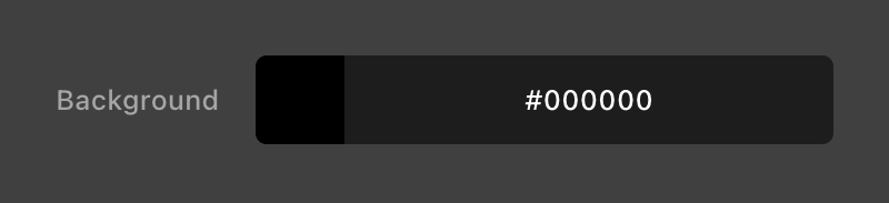
{
  "bgColor" : {
    "label"   : "Background",
    "type"    : "color",
    "initial" : "#000000"
  }
}palette– When set tofalse, will disable the Global Color palette in the color picker. Helpful in situations where perhaps your color value is being output to custom code that cannot parse Global Colors into a final value.
Control Types: Color Pair
Outputs a base / interaction color picker, which can be used to plug in values for interactive Elements. This particular control returns a multi-dimensional value, and as such must have its initial values set accordingly. Take note of the initial option above and how it receives an object with a base and alt key, these are used to set the starting “Base” and “Interaction” values respectively.
To reference each of these values seen below you would use {{dc:p:textColor.base}} and {{dc:p:textColor.alt}} respectively.
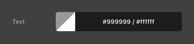
{
  "textColor" : {
    "label"   : "Text",
    "type"    : "color-pair",
    "initial" : {
      "base" : "#999999",
      "alt"  : "#ffffff"
    }
  }
}palette– When set tofalse, will disable the Global Color palette in the color picker. Helpful in situations where perhaps your color value is being output to custom code that cannot parse Global Colors into a final value.
Control Types: Unit Pickers & Sliders
There are multiple different types available that can be used to access various types of unit pickers and sliders. Each of these types is tuned in to be used for a particular context, so take note of the options available and use what is most appropriate for your situation.
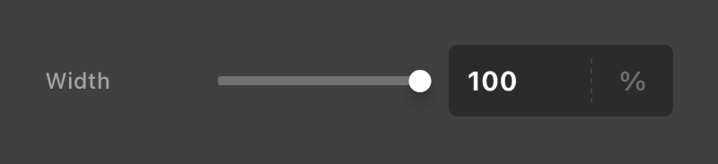
{
  "contentWidth" : {
    "label"   : "Width",
    "type"    : "size",
    "initial" : "100%"
  }
}dimension– The most general purpose unit slider available. Allows all units, but does not specify any keywords in the unit picker select menu.size– Similar todimensionbut includes theautokeyword.size-sm– Tuned in to be used for smaller sizing applications and includes theautokeyword.min-size– Similar todimensionbut includes thenonekeyword.max-size– Similar todimensionbut includes thenonekeyword.margin– Has reduced ranges for spacing things and allows negative values in addition to theautokeyword.border-width– Has reduced ranges applicable for borders.border-radius– Has reduced ranges applicable for border radius values.padding– Has reduced ranges applicable for internal spacing.gap– Tuned specifically for Column / Cell gaps.gap-sm– Reduced ranges for Column / Cell gaps when used in tighter spaces.flex-basis– For values to be output as theflex-basisproperty for Elements like the Div.grid-template-track– To be used as part of thegrid-template-columnsvalue on the Grid Element. Allows use of thefrunit.font-size– Tuned for generalfont-sizeapplications.letter-spacing– Tuned for generalletter-spacingapplications.line-height– A unitless slider that ranges from1to2.5.opacity– A unitless slider that ranges from0to1.z-index– Unitless with no slider, includes theautokeyword.time–@since CS 7.4.7Slider withsandmsas it's unit
Additionally, You can specify custom units, ranges, and keywords for your unit picker. This is helpful if you wish to create a custom set of values particular to a specific use case. Finally, the slider option can be provided a true or false value depending on your needs:
{
"contentWidth" : {
"label" : "Width",
"type" : "dimension",
"initial" : "28rem",
"slider" : true,
"keywords" : [ "auto" ],
"units" : [ "px", "em", "rem" ],
"ranges" : {
"px" : { "min" : 260, "max" : 600, "step" : 20 },
"em" : { "min" : 14, "max" : 32, "step" : 1 },
"rem" : { "min" : 14, "max" : 32, "step" : 1 }
}
}
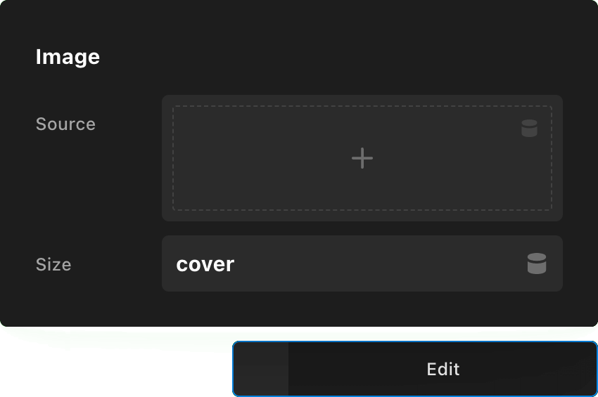
}Control Types: Image
Outputs an image upload control, which returns a reference to the image asset for later use.
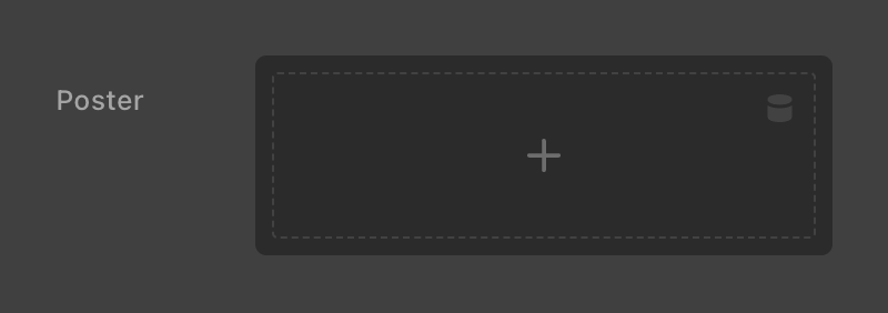
{
  "posterImage" : {
    "label"   : "Poster",
    "type"    : "image",
    "initial" : "",
    "height"  : 2
  }
}height– Allows you to specify the number of rows the control takes up in the Workspace (defaults to2).- To use this parameter in an image. You need to add the dynamic content (EX
{{dc:p:posterImage}}) in the wordpress media popup section that says "Insert from URL". Or by enabling dynamic content and using the top right dropdown.
Control Types: Font Family & Weight
Outputs the specialized controls for referencing font families and their respective weights within Elements.
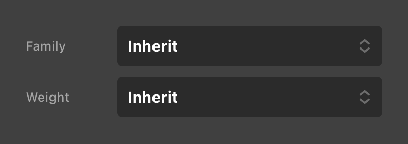
{
  "fontFamily" : {
    "label"   : "Family",
    "type"    : "font-family",
    "initial" : "inherit"
  },
  "fontWeight" : {
    "label"   : "Weight",
    "type"    : "font-weight",
    "initial" : "inherit"
  }
}
The font-weight type will automatically sync up with the available weights if it is mapped immediately after the font-family parameter. If you change the order, you can manually sync the weight control by setting the family option to the name of the parameter with type font-family. For example:
{
  "myFontFamily" : {
    "label"   : "Family",
    "type"    : "font-family",
    "initial" : "inherit"
  },
  "anotherParameter" : "",
  "myFontWeight" : {
    "label"   : "Weight",
    "type"    : "font-weight",
    "initial" : "inherit",
    "family"  : "myFontFamily"
  }
}
The font-weight type has special fw-normal and fw-bold keywords that can be used for the initial option if desired. These will reference the “Normal” and “Bold” values specified by a Global Font if that is what you are referencing, or will fallback to the CSS keywords normal and bold if those are not available. We recommend using these values as a starting point, althrough you can also provide specific weights if desired.
Using your global fonts you can pass this into the initial key. Prefix the ID with global-ff: like the following example.
{
  "fontFamily" : {
    "label"   : "Family",
    "type"    : "font-family",
    "initial" : "global-ff:DUnea0YWkQi16hIWcW"
  }
}
Control Types: Icon
Outputs a Font Awesome icon picker, which returns a reference to the selected icon. The initial option should be given an identifying string that matches the icon you wish to start with.
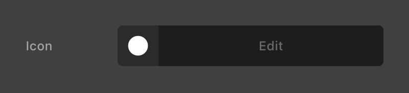
{
  "icon" : {
    "type"    : "fa-icon",
    "label"   : "Icon",
    "initial" : "circle"
  }
}
Control Types: Transform
Outputs a picker similar to the Transform controls found under the Effects Module on all Elements.
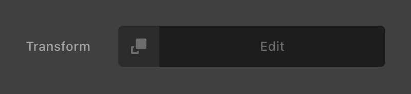
{
  "baseTransform" : {
    "type"        : "transform",
    "label"       : "Transform",
    "initial"     : "",
    "placeholder" : "translate3d(0, 0, 0)"
  }
}placeholder– Allows you to specify the content string seen in the text input when no value is input.
Control Types: Filter
Outputs a picker similar to the Filter controls found under the Effects Module on all Elements.
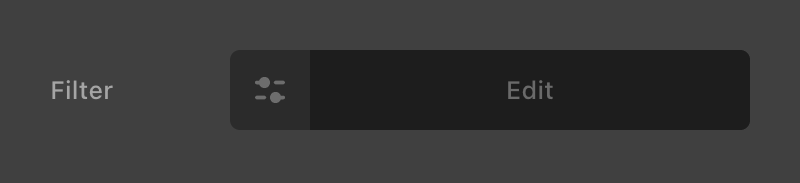
{
  "baseFilter" : {
    "type"        : "filter",
    "label"       : "Filter",
    "initial"     : "",
    "placeholder" : "grayscale(100%)"
  }
}placeholder– Allows you to specify the content string seen in the text input when no value is input.
Control Types: File
@since CS 7.4.0+
Generic file input. The file_types is an array of mime types or audio, video, or image.
{
"file" : {
"type" : "file",
"label" : "File",
"file_types": ["text/csv"],
"placeholder": "Insert your CSV!"
}
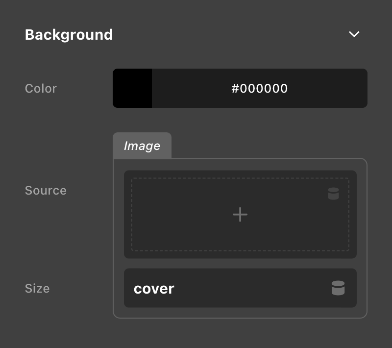
}Grouping Controls
For more complex parameter mappings, you may find it helpful to group your controls into sections to provide more structure and make things easier to parse. To do this, we use a type of group on our top-level item, and then we provide a key of params at that same level, which then receives a standard control mapping like we've seen so far.
The following is a simple example of a “Background” group, which has two controls for managing a color and an image:
{
  "bg" : {
    "type"   : "group",
    "label"  : "Background",
    "params" : {
      "color" : {
        "label"   : "Color",
        "type"    : "color",
        "initial" : "#000000"
      },
      "image" : {
        "label"   : "Image",
        "type"    : "image",
        "initial" : ""
      }
    }
  }
}
The above mapping would result in the following output:
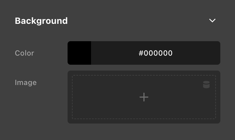
This is nice because not only does it give us a visual hierarchy to follow, but it also allows to cut down on unnecessary repetition in our labels. For example, without the “Background” control group around our controls, you would likely need to name each individual control “Background Color” and “Background Image” respectively to clearly indicate what they relate to.
It is very important to keep in mind that adding groups to your controls changes the way you reference them with Dynamic Content. For example, since each of our controls above is inside a group keyed bg, we would reference them as {{dc:p:bg.color}} and {{dc:p:bg.image}} respectively.
Nested Grouping
If that wasn't fun enough, groups can in theory be nested indefinintely. We say “in theory” because at a certain point, it really doesn't become very helpful to have a control that you have to jump down numerous layers to access unless you have a very particular use case for it. With great power, comes great responsibility. 😊
So let's take a look at our previous “Background” example and see how we might expand upon that idea. Let's say we wanted to add a control to manage the background-size of something. That particular property works in conjunction with the background-image property, so let's group our two “background image” controls for greater clarity:
{
  "bg" : {
    "type"   : "group",
    "label"  : "Background",
    "params" : {
      "color" : {
        "label"   : "Color",
        "type"    : "color",
        "initial" : "#000000"
      },
      "image" : {
        "type"   : "group",
        "label"  : "Image",
        "params" : {
          "src" : {
            "label"   : "Source",
            "type"    : "image",
            "initial" : ""
          },
          "size" : {
            "label"   : "Size",
            "type"    : "text",
            "initial" : "cover"
          }
        }
      }
    }
  }
}
Note that we changed our image key to be a type of group, and we moved our actual image control down into that group. I have re-keyed the image control to be src for greater clarity, and then added the size control inside that same grouping. I've also adjusted some labeling to make things more succinct. This will result in the following output:
Remember how we said that groups are able to be nested over and over again? This picker pattern is how. By default, nested groups of controls will show up inside of a picker, allowing you to tuck away vast swaths of controls and keep things nice and tidy at the top level if you so desire.
However, if you don't want your controls to show up inside of a picker, you can simply provide a noPicker option with a value of true on your nested group like so:
{
  "bg" : {
    "type"   : "group",
    "label"  : "Background",
    "params" : {
      "color" : {
        "label"   : "Color",
        "type"    : "color",
        "initial" : "#000000"
      },
      "image" : {
        "type"     : "group",
        "label"    : "Image",
        "noPicker" : true,
        "params"   : {
          "src" : {
            "label"   : "Source",
            "type"    : "image",
            "initial" : ""
          },
          "size" : {
            "label"   : "Size",
            "type"    : "text",
            "initial" : "cover"
          }
        }
      }
    }
  }
}
This will result in the following output:
Again, take note of how utilizing these conventions allows us to keep our labeling clean and succinct in addition to adding visual structure that helps us parse things quickly. Remember that since we have nested our controls inside of another group, our reference to those keys has changed to {{dc:p:bg.image.src}} and {{dc:p:bg.image.size}} respectively.
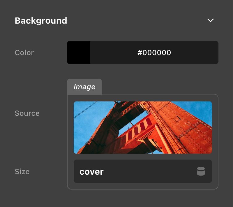
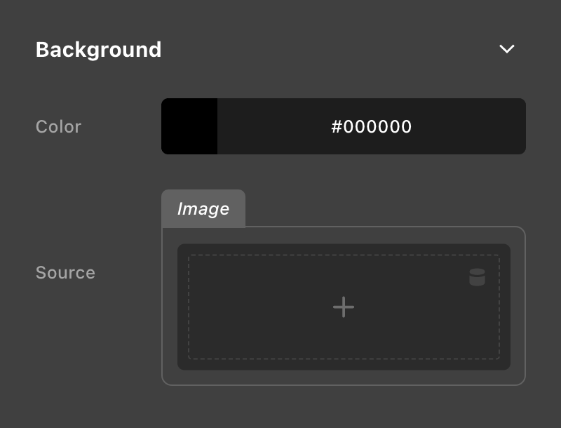
Conditional Parameters
Alright, so let's continue on with our “Background” control and see how we can improve its usability with conditional Parameters. Setting when on a parameter will let you write a formula to determine if it should be visible.
In this particular instance, I only want the size input to show if the src control has an image uploaded to it. This will cut down on the visual clutter and only reveal this input when it's needed.
For this formula, I'm going to leverage the eq(__key__, __value__) function, where __key__ is the key you want the operator to look for and __value__ is the value that key needs to match for the control to show. Additionally, in this particular instance we want our control to show when the image control is not empty, so to do that we will also introduce the not() function, which gets wrapped around the entire statement like so to negate it:
{
  "bg" : {
    "type"   : "group",
    "label"  : "Background",
    "params" : {
      "color" : {
        "label"   : "Color",
        "type"    : "color",
        "initial" : "#000000"
      },
      "image" : {
        "type"     : "group",
        "label"    : "Image",
        "noPicker" : true,
        "params"   : {
          "src" : {
            "label"   : "Source",
            "type"    : "image",
            "initial" : ""
          },
          "size" : {
            "label"   : "Size",
            "type"    : "text",
            "initial" : "cover",
            "when"    : "not(eq(src, ''))"
          }
        }
      }
    }
  }
}
Take note that we've provided not(eq(src, '')) for our when formula. Formulas need a path to the key you are referencing, and if you are basing your control off of another control inside the same group, we only need to provide the key of that control, which is why src is all we see here. This is the same as passing in $.bg.image.src as a fully explicit path, where $ represents the “root” of your mapping tree. You can use this full chain syntax to reference any key of any control in your mapping. Also take note that we used '' to reference an empty value inside this operator, as it is already wrapped in double quotes as part of the JSON syntax.
The statement we've provided above ensures that the “Size” control is shown only when an image is set:
And is hidden if that image is removed:
As mentioned previously, the when option has a structured set of rules with regards to how it operates. Below is a brief outline explaining some ways you can leverage this option in your own builds:
- Setting
whentofalsewill cause the parameter to be hidden 100% of the time. - Formulas can include whitespace.
- A formula is an arrangement of Functions, Paths, and Literals:
- A Literal is a single or double quoted string, a number, or the keywords
truefalseandnull. Literals are passed directly into functions. - A Path is a way to reference a value from a parameter. They are represented as unquoted strings.
- Only siblings and their children are accessible. You can’t have a condition on a deeply nested parameter that looks at a value farther up the three.
- A Function is something that evaluates one or more values that are derived from Paths, Literals, or the results of a Function call.
- Bringing it all together, consider this formula
eq(side, 'left'):'left'is a Literal value.sidewill retrieve the current value of the side parameter.eqis a Function that calculates if the current value ofsideisleft.
- A Literal is a single or double quoted string, a number, or the keywords
- The Formulas offer several functions which can be composed. For example:
or(eq(side, 'top'), eq(side, 'bottom'))– requires side to be top or bottom.and(eq(side, 'top'), eq(fruit, 'orange'))– requires side to be top and fruit to be orange.
- Available Functions:
eqAccepts two arguments and returnstrue/falsedepending on if they are equal.notAccepts one argument and returns a negation of it’s boolean value (e.g. if the value wastrue, it is nowfalse).orAccepts any number of arguments. Returnstrueif any one of them istrue.andAccepts any number of arguments. Returnstrueif they are alltrue.
Responsive Parameters
While Parameters were initially developed with the idea of being able to pass static content into an exsiting structure (e.g. different labels / links on different instances of a button Component), we also understood that there were going to be situations where responsive styling was required to get the most flexibility out of certain Components.
To accomplish this, simply add isVar with a value of true to any control that is being passed to an already responsive control on an Element. For example, you cannot create “responsive labels” on a Button Component this way, as text is always static output. However, you could add the isVar option to controls that are being passed on to CSS properties like font-size, color, width, et cetera. To do this would look like the following:
{
  "fontSize" : {
    "label"   : "Font Size",
    "type"    : "font-size",
    "initial" : "1em",
    "isVar"   : true
  }
}
Then, following this example, you would simply wire up your {{dc:p:fontSize}} string in the appropriate place on your Component and it will automatically work responsively just like standard Element controls do.
Lists
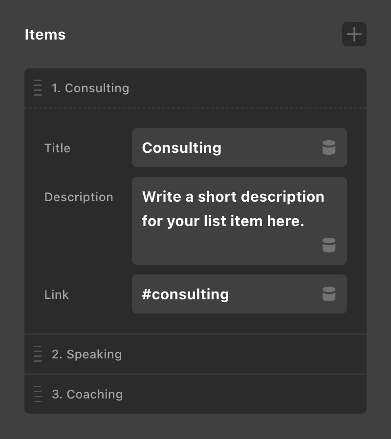
Lists are a more advanced feature of Parameters that can give you the ability to create iterable groupings of content that can be looped over using (you guessed it) Loopers in your builds. This can be very helpful when outputing components that are formulaic and feature the same general structure and styling over and over again (think lists, simple image galleries, et cetera). Lists are created by adding group[] as your type. The [] declaration symbolizes an array, which is essentially what we're creating here: an array (or list) of information to loop over later. Once finalized, your list may look something like the following:
To achieve that output, we will use the following mapping:
{
  "listItems" : {
    "type"      : "group[]",
    "label"     : "List Items",
    "itemLabel" : "{{index}}. {{title}}",
    "params"    : {
      "title" : {
        "type"    : "text",
        "label"   : "Title",
        "initial" : "Consulting"
      },
      "description" : {
        "type"    : "textarea",
        "label"   : "Description",
        "initial" : "Write a short description for your list item here."
      },
      "href" : {
        "type"    : "text",
        "label"   : "Link",
        "initial" : "#consulting"
      }
    }
  }
}
Take note that this format is exactly the same as our other group examples, the only difference here is that the type of group[] gives us the + in the upper-right corner, which allows us to add as many instances of this grouping of controls as we want. Each instance can be filled out with a unique set of values, which when looped over later will give us our final content.
Also, notice the syntax in the itemLabel option, which is what you can use to populate dynamic labels into the handle of each item in your list. Here we have provided {{index}}. {{title}} as our value. {{index}} is a special keyword that gives us the current number of our item, and then {{title}} is simply referencing the title parameter in our group.
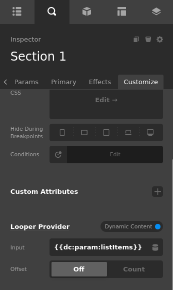
To then use this list in a looper we would use that parameter in the "Dynamic Content" looper provider. Adding in {{dc:param:listItems}} loops us through the lists array.
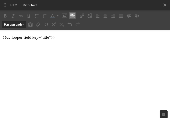
Then inside a looper consumer we can reference fields in our list items using {{dc:looper:field key='title'}}.
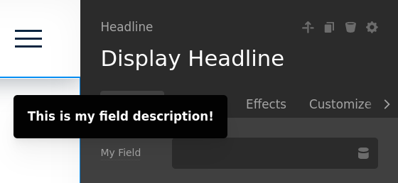
Creating a tooltip for a Parameter
@since Pro 6.3.7 / CS 7.3.7
Adding a description key will add a tooltip above the control label. This is also used in the Element API. The following JSON will look similar to the following in the UI.
{
  "myField": {
    "description": "This is my field description!"
  }
}
Using objects as values in Parameters
Using an object as a value in certain fields like choose can be useful for changing multiple values at once from one field. See the following parameters which is a choose that has object properties of font and padding.
{
  "size": {
    "label": "Size",
    "type": "choose",
    "initial": "2",
    "options": [
      {
        "value": {
          "font": ".75em",
          "padding": "1.5em"
        },
        "label": "1"
      },
      {
        "value": {
          "font": "1em",
          "padding": "2em"
        },
        "label": "2"
      }
    ]
  }
}
The parameter UI would look something like this. This is useful because for an end user they are doing a small action and could potential change a lot at once.
Using this is then accessed through dot notation. So to get the font key it would look like {{dc:p:size.font}} and for padding it would be {{dc:p:size.padding}}.
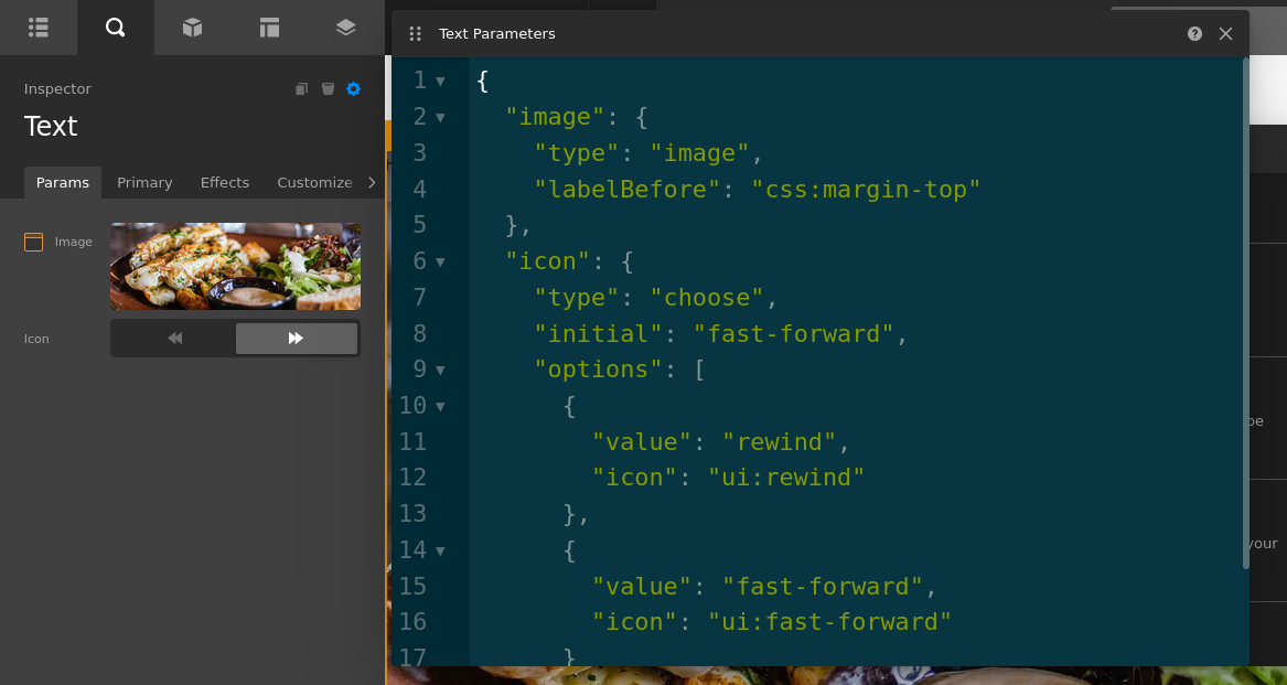
Parameter UI Icons
Parameters also offers a way to customize the display via icons. In a given choose or using the labelBefore you can customize the UI of your parameters. See the following parameters JSON.
{
  "image": {
    "type": "image",
    "labelBefore": "css:margin-top"
  },
  "icon": {
    "type": "choose",
    "initial": "fast-forward",
    "options": [
      {
        "value": "rewind",
        "icon": "ui:rewind"
      },
      {
        "value": "fast-forward",
        "icon": "ui:fast-forward"
      }
    ]
  }
}
This will look similar to the following.
List of Available FA Icons
Not prefixing with ui: or css: will result in the output of a FontAwesome Icon. See the list of FA Icons here.
List of Available CSS Icons
Prefixing with css: will give you the following options. This is not a comprehensive list and it is recommended to use the ui: icons or FontAwesome.
All of these offer top, bottom, left, and right. Just add a - between the type and the direction. Example css:margin-top
margingappadding
List of Available UI Icons
Prefixing any of these with ui: will insert an icon as an Svg. Example ui:circle.
- add
- assignments
- at
- auto-place-cell
- axisX
- axisY
- axisZ
- bolt
- caret
- caret-down
- changed
- check
- check-circle
- chevron
- circle
- circle-out
- clear
- clipboard
- close
- cloud
- code
- cog
- color
- component-brick
- component-export
- component-slot
- container
- copy
- cursor-default
- cursor-inspecting
- cursor-text
- darr
- database
- date
- dev
- download
- drag-indicator
- edit
- element-manage
- erase
- eye
- eye-dropper
- fast-forward
- favorite
- favorited
- filter
- flag
- flex-custom
- flex-fill-space
- flex-fill-space-equally
- flex-no-shrink
- flex-standard
- glasses
- grid-cell-editor
- hamburger
- help
- hidden
- horizontal
- image
- import
- info
- info-styled
- info-styled-square
- keyboard
- label
- larr
- layers
- layout
- lightning
- link
- load
- lock
- login
- logo-cornerstone
- logo-max
- logo-pro
- logo-wordpress
- logo-x
- logout
- looper-consumer
- looper-provider
- manage-library
- margin-x-auto
- margin-y-auto
- menu
- minus
- more
- move
- move-backward
- move-forward
- move-to-back
- move-to-front
- move-up-layer
- nav-document
- nav-elements
- nav-inspector
- nav-layout
- nav-settings
- nearr
- none
- num-0
- num-1
- num-2
- num-3
- num-4
- num-5
- num-6
- num-7
- num-8
- num-9
- order
- paste
- pause
- phone
- placement-x-around
- placement-x-auto
- placement-x-baseline
- placement-x-between
- placement-x-center
- placement-x-end
- placement-x-evenly
- placement-x-start
- placement-x-stretch
- placement-y-around
- placement-y-auto
- placement-y-baseline
- placement-y-between
- placement-y-center
- placement-y-end
- placement-y-evenly
- placement-y-start
- placement-y-stretch
- play
- plus
- plus-circle
- pointer
- power
- preview
- quick-center-flexbox
- rarr
- redo
- remove-spacing
- reset
- resize-ew
- resize-ns
- retina
- reverse
- rewind
- rotateX
- rotateY
- rotateZ
- save-library
- search
- select
- size-lg
- size-md
- size-sm
- size-xl
- size-xs
- sort
- sort-asc
- sort-desc
- strikethrough
- swarr
- tag
- template
- text
- text-align-center
- text-align-justify
- text-align-left
- text-align-right
- thru
- toggle
- transform
- transition
- trash
- uarr
- underline
- undo
- unlink
- unlock
- user
- vertical
- video
- view-grid
- view-list
- virtual
- visible
- wand
- xarr
- yarr
Example
There are many potential applications for Parameters, and in the tutorial above, we'll show you how to use them to essentially create native integrations with 3rd party tools that use a shortcode. Want to go even deeper? Use Parameters with Cornerstone's External API.
Summary
Parameters are an incredibly powerful feature that allow you to completely customize your site building experience. This can be especially powerful for client sites or sites where you want to tailor the management of Elements for certain types of users (for example, using Element Parameters to limit what someone can change in the builder). We hope you've enjoyed this in-depth review and are ready to start building!
See something inaccurate? Let us know