Mini-Cart
In this article, we're going to discuss the Mini-Cart Element and its settings.
The Mini-Cart is a standalone Element that outputs the stock WooCommerce cart markup found within their template files. This gives users a way to place their cart anywhere it is needed throughout their designs. It also serves as a nested piece of the following Prefab Elements:
- Cart Dropdown
- Cart Modal
- Cart Off Canvas
These Elements are made of their constituent Layout Elements (e.g. Dropdown, Modal, Off Canvas) and the Mini-Cart placed inside it. Each of these serves as a quick starting point to output the Mini-Cart in a few unique configurations for various design needs. Throughout this article we will breakdown the various control lists setup for this Element and discuss any controls of note.
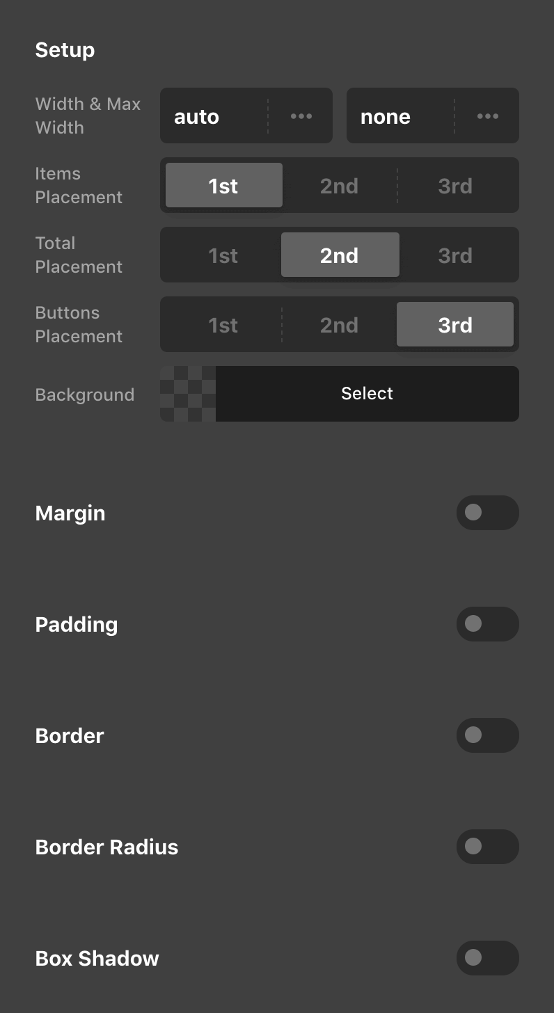
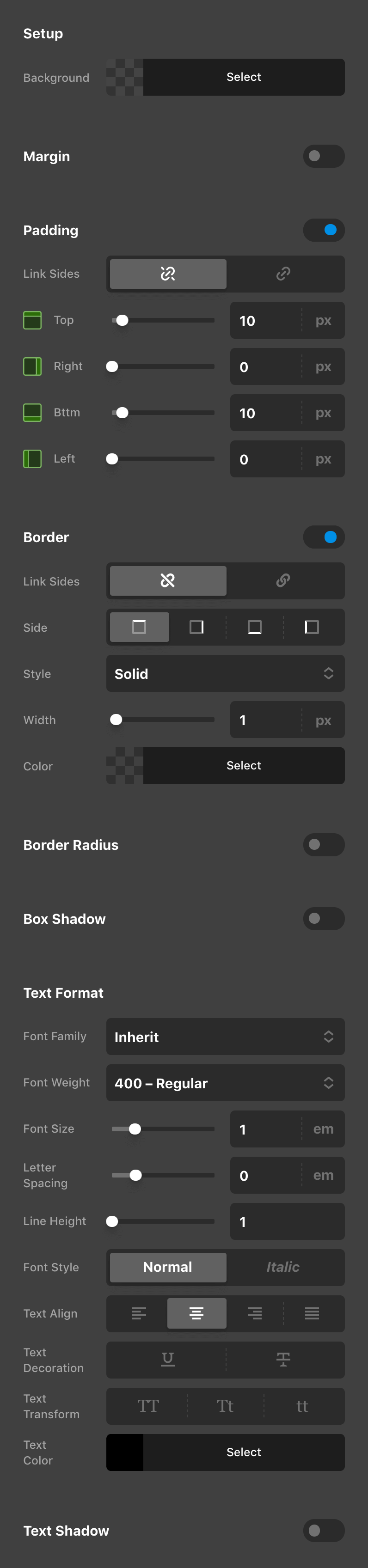
Cart
The Cart control group contains a few basic setup controls for getting the Cart working the way you want, along with the standard design controls typically seen on most Elements (e.g. Border, Box Shadow, et cetera).
Within the Setup controls, the ones to take particular note of are the various Placement controls, which allow you to reorder the content found within the Cart. For example, if you wanted your “Total” to appear above the “Items,” you can use these controls to do that:
Items
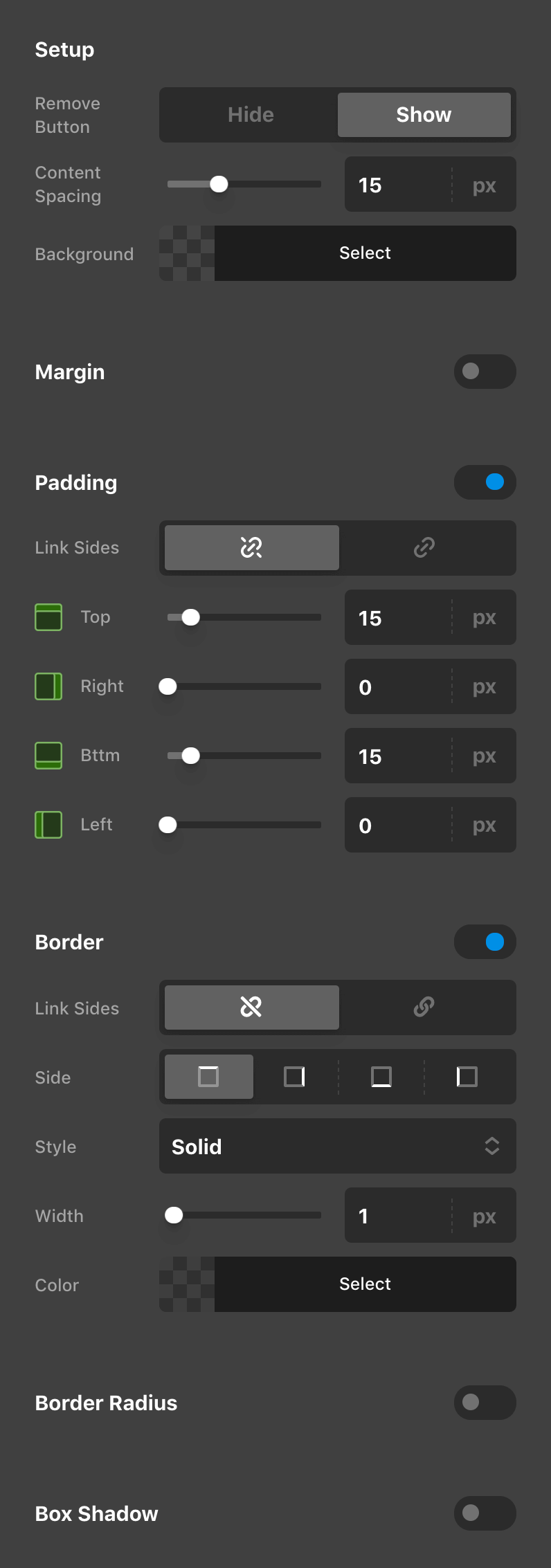
The Items control group is for setting up and styling the markup surrounding each item found within the user's cart.
Within the Setup controls you can optionally remove the “Remove” button if desired, and the Content Spacing is used to apply a margin-right value to the thumbnail within each item and a margin-left value to the “Remove” button if present. Since we do not have full control over the markup provided, this is the best way we have found to space this content out equally:
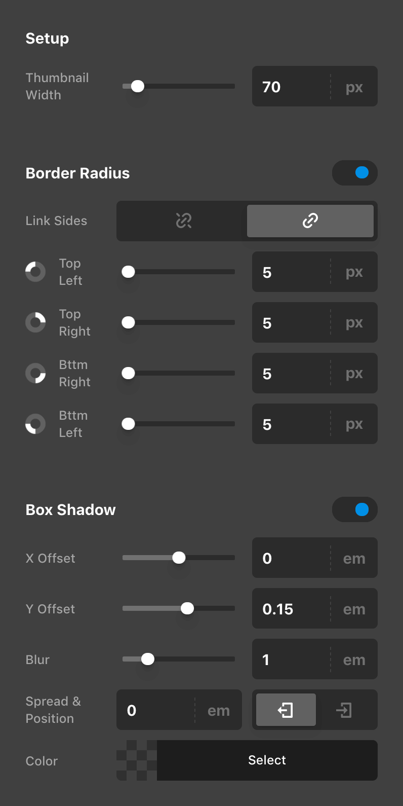
Thumbnails
The Thumbnail control group features a few simple controls for altering the appearnce of the thumbnails found within each item in a user's cart:
Links
The Links styling is used to set the color and formatting of both the item title and the “Remove” button (if present). Again, due to the nature of this markup being structured by WooCommerce and us not having full control, due to some nuances of how things are structured, we felt that the output was more cohesive when these styles were shared between these two bits of markup:
Quantity
The Quantity control group is used to set the color and formatting of the item quantity found beneath the item title in the Mini-Cart:

Total
The Total control group is used to set the general styling (e.g. Margin, Padding, Border, Box Shadow, et cetera) in addition to its text formatting and color of the “Total” output in the Mini-Cart:
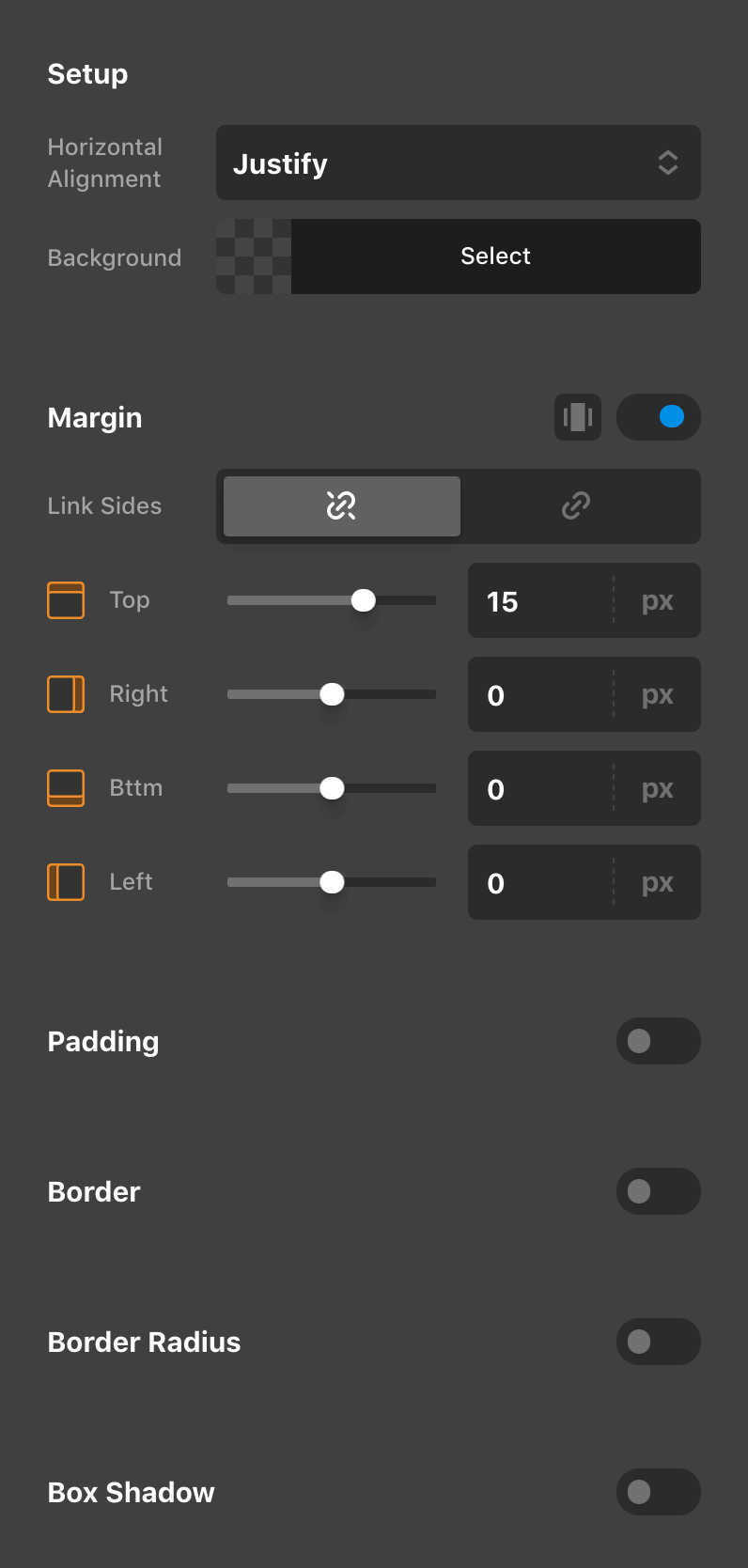
Buttons Container
The Buttons Container control group is meant to setup a basic style for the markup directly surrounding the action buttons found within the Mini-Cart. The Horizontal Alignment control can be used to orient the buttons across the horizontal axis using the common flexbox values used throughout other parts of the Builders (e.g. center, space between, et cetera):
Buttons
The Buttons control group is made up of the styling options available for our Button Element, so we recommend checking out that article if you are looking for more information about setting these up. Keep in mind that the styles set in this control group are applied to both buttons within the container, so you will want to take that into account when setting things like margin or any spacing that might need to be accounted for otherwise.
See something inaccurate? Let us know