Cornerstone keeps coming up with new ways to amaze and persuade. This release is no different and there is a lot to go through. We wanted to focus on making things easier to do in this release and with the new features in this release we think you will agree. We look forward to hearing your thoughts on this latest update.
See how to test the beta here.
Pressed on time? Check out the beta playground to test the new features on our sandbox site.
Table Element
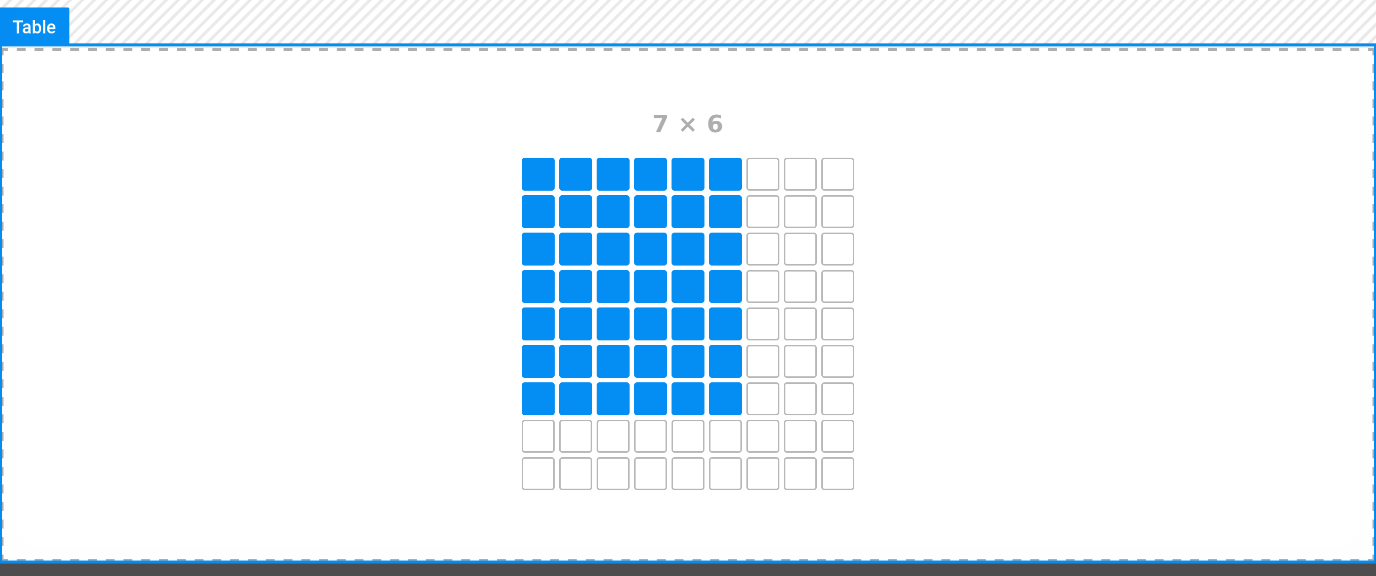
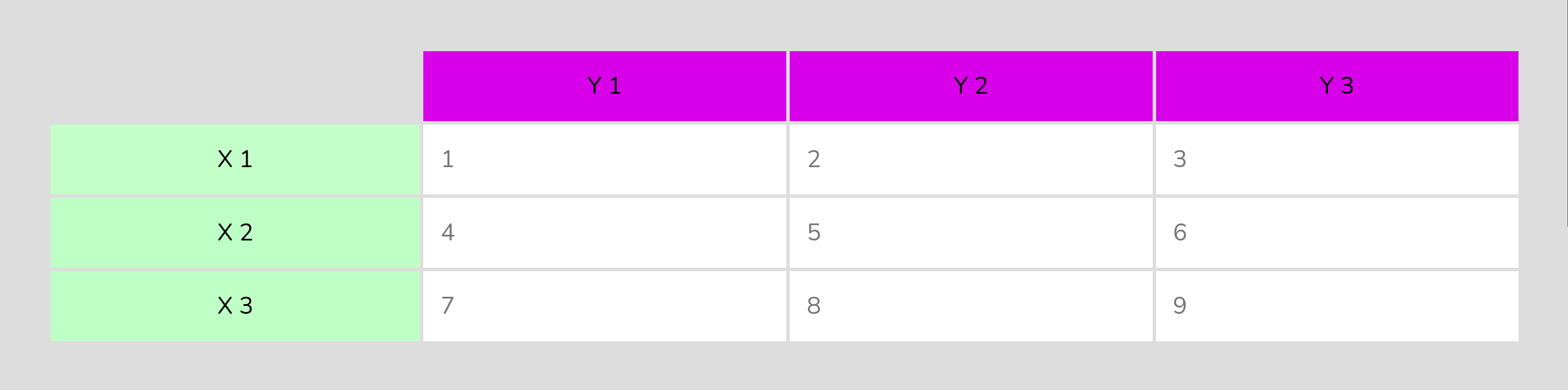
Somebody call the 90s because they want their element back. Tables have and always will be great at displaying unique data in a visual format. We take tables a step further in our new Max product Data Tables by adding in features to sort, filter, search, and AJAX complex table data. While we won’t recommend layouting your whole website with tables like it’s the 90s, we certainly won’t stop you.
Modified Controls
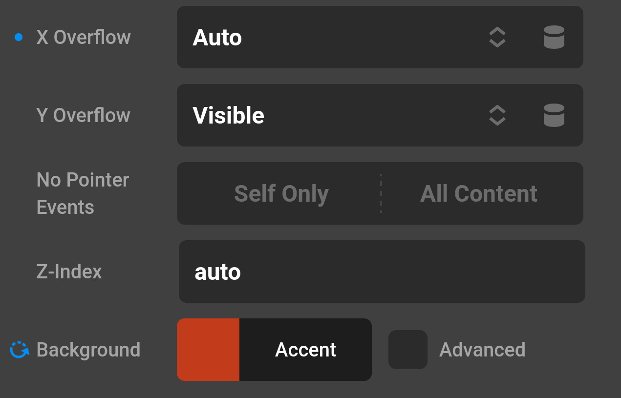
This one is actually my favorite new feature. Modified Controls will open up a whole new way to look at the controls of your elements. Easily navigate to what you have changed from the defaults of an element or Theme Options via the modified control UI. Clicking this modified button will also reset the control value to it’s default. With the “Toggle Controls Visibility” preference you can hide all controls that don’t have a changed value.
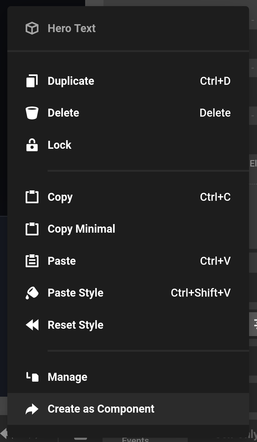
Create as Component Context Menu
We’ve all been there. You perfectly design an element only to find you want to use this beautiful element elsewhere on your site. Yes you can always create a new component and start copying and pasting. However, we wanted a quicker and better way. Open up the Create as Component context menu and you’ll be prompted to either create a new component document or add this element into an existing component document. After you finish the prompts, you’re new component will display and where the previous element is will now be the using new component.
Custom Document Assets
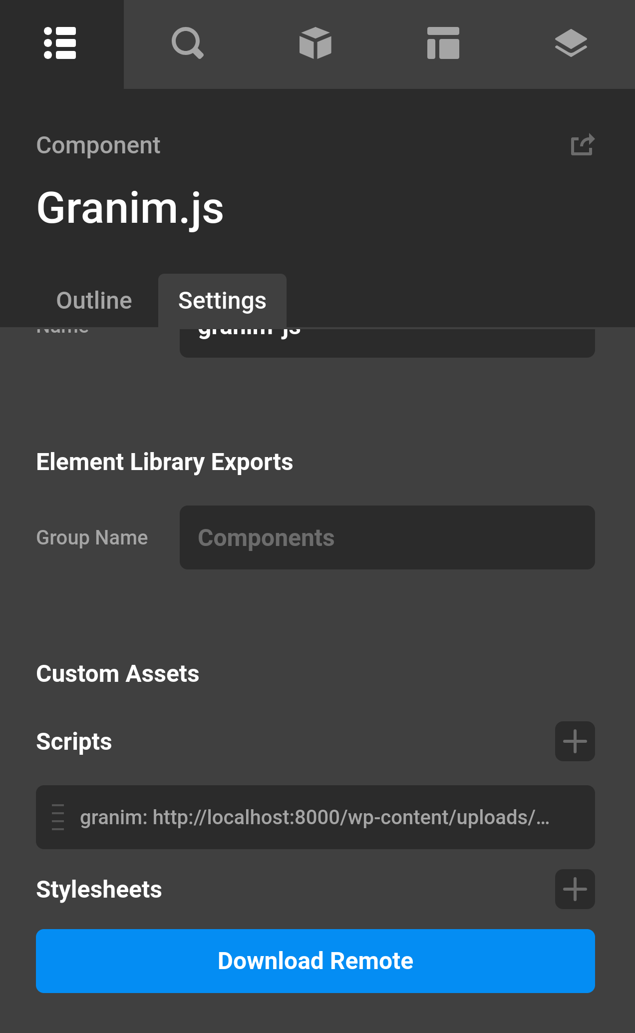
The days of setting up a new child theme only to add a certain external script are over. With Custom Document Assets you can easily add new scripts and CSS stylesheets right in the Theme Options or at the individual Document level. Combine that with Components and Parameters and you can create new custom elements that rely on an external JavaScript library.
Checkout my custom component using the Granim.js library.
Global Variables
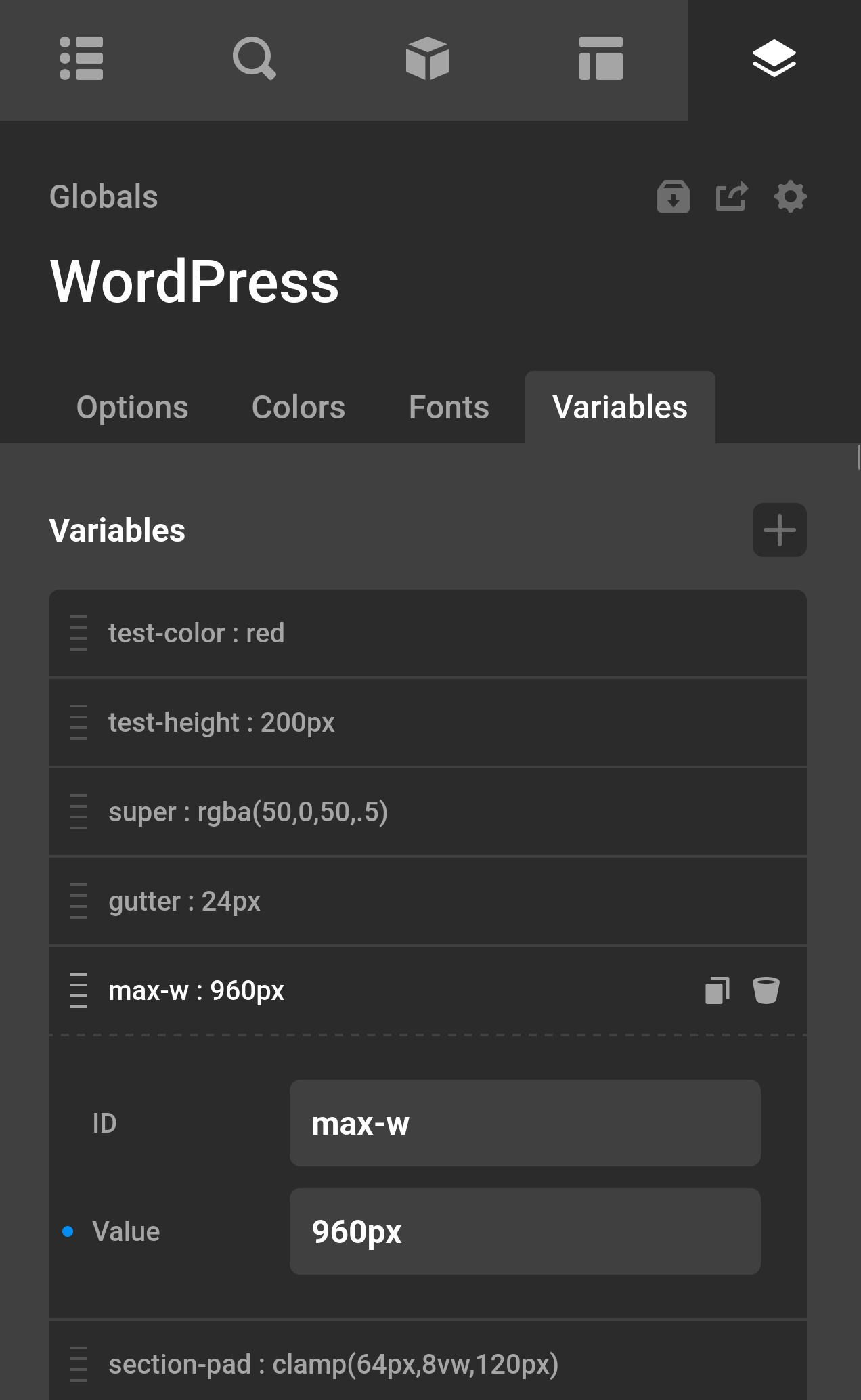
We fully lean into CSS Variables with this new Globals feature. Much like Colors and Fonts, you can now create any type of variable for reuse on your site. You can setup any type of data like a certain padding or gap value and utilize that throughout your site. Then if you decided you liked more padding on your site, you can easily go in and change this variable for your entire site. Best of all, you can set specific breakpoint values for these variables meaning you can setup different font size values for desktop and mobile.
Misc.
- All elements that had Looper Consumer controls also have Looper Provider controls.
- Changing a global color will also change the same colors if they were used on a separate document on the page, like a Header or Footer.
- Icon Dynamic Content let’s you add an icon anywhere it would accept HTML.
Data Tables
We are also starting testing of Data Tables, the latest plugin for Max users. When you have the Cornerstone Beta plugin installed and activated you will be able to install the plugin in your Pro dashboard page. Fully native to Cornerstone, it supercharges your display of advanced data with a number of different features and numerous styling options. If you need to paginate your data, utilize AJAX for large data sets, search data, order data, or filter data Data Tables has you covered. Data Tables is the complete visual data package, with no technical limit.
Purchase Data Tables (Lifetime Deal & Unlimited Use)
Thanks for all our Beta testers. I will be pasting the Changelog below.