Hi.
Today I built my first header via the PRO header builder, but to my horror, my header is not mobile responsive?
Take a look at http://juulli.gl/bestyrelse/
This may be a rookie mistake.
Thanks.
Hi.
Today I built my first header via the PRO header builder, but to my horror, my header is not mobile responsive?
Take a look at http://juulli.gl/bestyrelse/
This may be a rookie mistake.
Thanks.
Hey @jensjakobsen,
The Header Builder’s settings are responsive out of the box but it still allows for nonresponsive setup to achieve certain effects. To understand or fully utilize the Header Builder and all options in our builders that uses Flex Layout, you need to learn from this article https://theme.co/docs/use-flex-layout
If you want to shrink the image in your header, make sure its Container is filing up the space equally.
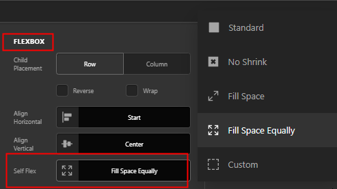
That will result to the following
I recommend that you set your Bar’s height to auto so that it will follow the height of the content, in this case, the image. You can add space above and below the image using the Top and Bottom Padding of the Bar.
Next, regarding your menu. The Navigation Inline element does not turn to a mobile navigation. What you can do is hide that element on smaller screen sizes using the Hide During Breakpoints feature. Reversely, show a Navigation Collapsed or a Navigation Layered in its place.
Hope that helps.
Thanks Christian, I will give it a good read,
One question though (before I read) - you said:
As a rule of thumb: I want the top menu to be visible on a desktop, but able to “fold” on a mobile - just like this: http://juulli.gl/ - is that at all achievable with the Pro Header builder?
Thanks.
Hey @jensjakobsen,
Yes. But, it’s not automatic like the Original Header. You need to hide first the Navigation Inline on smaller screens and display either a Navigation Collapsed or Navigation Layered element in its place.
It’s the same method used as the Original Header. It’s just not automatic to give users flexibility.
Hope that helps.
Thank you 
You are most welcome!
This topic was automatically closed 10 days after the last reply. New replies are no longer allowed.

