Hello Zenia,
Thanks for writing in!
1.) You are having this issue because your have set a 900 pixel maximum width to the DIV element in each of your slides. You need to set it to 90% or less for smaller screens. You can utilize the Responsive Styling of the DIV element by clicking on the word “Maximum Width”.
You may need to adjust the paddings, margins, etc. in each of the element inside the DIV element as well. If you are not yet familiar with the Responsive Styling, please check this out first:
2.) I have checked the page and I am seeing this image:
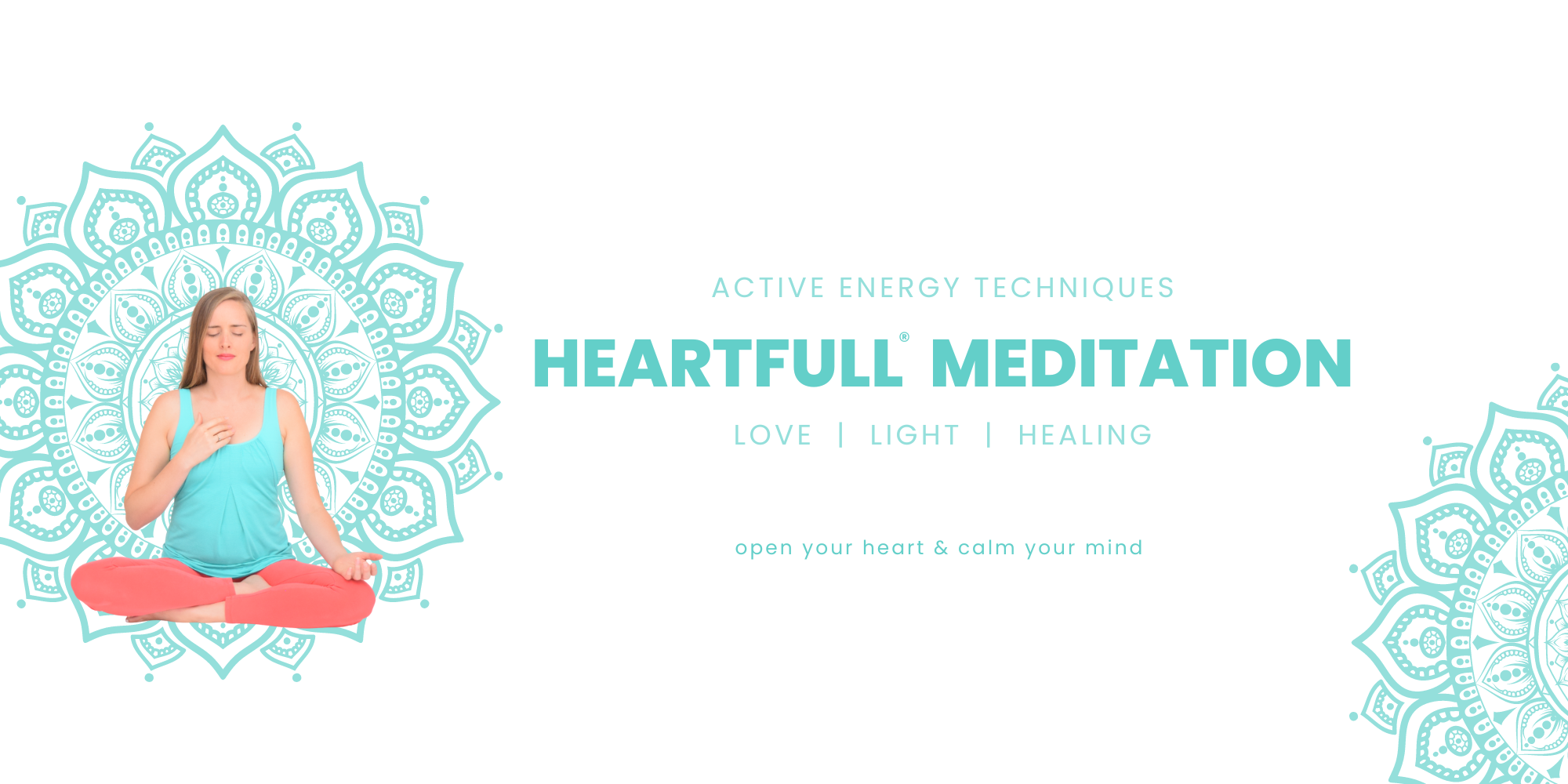
As you can see in your image, you have the patterns, headlines, texts and the woman in a yoga position. You have used the image as a background image which should not be done because for sure the image will be cut off and some of text will not be readable. To better understand how the background images works, please check out this first:
And to help you work with the Lower and Upper Layers, please check out these videos:
(10) Working with Background Layers (Part 1) - YouTube
My recommend to the image is NOT to use it as a background image. Please insert an Image element in your column and use that image source. Having it as an independent image will be more responsive because it will automatically resize according to the column width. If you want it fullwidth, you can disable the Global Container and set a 100% in your Row element, Row > Size:
3.) With the help of the Layout Builder, you can create your custom blog index design. Simply go to Cornerstone > Layout Builder and create an Archive layout. You can then assign this layout to the blog index. If this is the first that you have heard about our Layout Builder, please check this out first:
Or you can check out this video demonstration:
And by the way, you can assign your custom layout selectively as well. Please check out conditions and assignments documentations here:
Best Regards.

