Help on Navigation Collapsed

I am having troubles with my header design. I copying the positioning and details of another site of mine, but I not getting the same results. The header in desktop looks like this:


On my cell phone it looks like this, with no hamburger and remnants of a social media link:

The site is https://yalelatino.org
I can provide you with login info, if I can figure out your new forum’s habits.

As I noted above I have another site that uses the same configuration in a Pro Header and it works appropriately on desktop and mobile:
https://1stgenyale.org

I would greatly appreciate some guidance in making this header work,
Thanks
Hey John,

The settings are very different in the site with issue compared to the site that works. It just looks like they’re setup is similar.

The quickest way to copy the design of a header in site A to site B is to use the Template Manager. Save the header of site A as a template and import it to site B.

For your current site with issue, you need to Center the Align Vertical of all Containers in your header. Align Vertical is a Flex option so it would be best that you learn how to use Flex options here: https://theme.co/docs/use-flex-layout

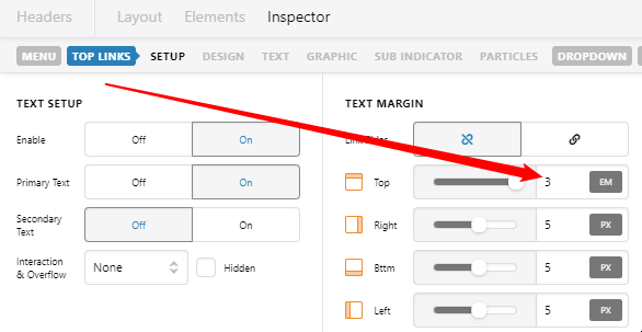
Also, reduce the Top Margin of your Top Links in the Navigation Inline element options.

image

For your mobile nav issue, you need to hide the Navigation Inline element on mobile screen sizes using the Hide During Breakpoints. Show a Navigation Collapsed element in its place.

Hope that helps.

This topic was automatically closed 10 days after the last reply. New replies are no longer allowed.