The Customer Journey by Steve Woody
December 13, 2015
This Customer Spotlight is a real treat! As you all know with our series, we like to profile some of the incredible people that comprise the Themeco community and pull the curtain back on what they are doing. Today, we're excited to let Steve walk you through his product launch process in addition to giving away the 3 high-converting Cornerstone templates he's used in the process. This is one of the most in-depth spotlights we've ever done, so without further adieu…take it away, Steve!
Your website is not about you. I'm sorry to be the one to say this because all too often, I see entrepreneurs, business owners and developers building websites based on what the site owner thinks they want, and this is one of the main reasons that landing pages do not convert.
Some questions I get often are “How should I market my website? Where should I get my traffic from? Should I SEO my website or invest in Pay Per Click advertising?”
My answer is always the same. Before you even consider marketing your website, you need to ensure that it converts. You wouldn't pour water into a leaky bucket, would you? The first step should be to patch up those holes. That is exactly how I want you to look at your website.
It's my honor and privilege after using X for so long to be in a position to give something back. As many of you know the X User Facebook Community was recently created and myself with a handful of users run this together because we are all about the community aspect. We know that being a business owner / developer can be lonely sometimes and having each other helps. It's why the Themeco Summit was such a roaring success because likeminded people had the opportunity to join forces, collaborate and work as a single entity towards a common goal.
It's my mission to help achieve this common goal, to help as many people as possible become successful so they can enjoy the limited time we have on this planet doing the things we all love to do.
If you have a product or service online then you need to be directing traffic through a journey. We call this the “customer journey” and I dedicated an entire chapter on this process in my international best-selling book, PLAN Your Website.
As I mentioned at the start, your website is not about you. It's about your visitors who are your potential customers and what they want and need. The purpose of your website should be to build a relationship so they know, trust, and like you in order to invest in the solution you are offering to their problem.
After all, that is why we are in business: To solve problems. We deliver value and in return are rewarded financially. The more value we deliver, the greater the reward.
So what's with all the philosophy? Where are the 3 high-converting Cornerstone templates? A great question and rather than just giving you the templates (which I will do) I wanted to first share the process I used to create them so that you can use this moving forward in other templates that you will create.
The Launch
Right now I am in the process of a global launch for my business, Online Mastery. I've been working for the last 2 years to craft a series of products and services that allow me to educate business owners and entrepreneurs to become successful online and get results. I've used everything on the market from Thesis, Genesis, Optimizepress as complete solutions, Bones and _S as blank canvases, and other themes as multi purpose solutions. In fact I've tested every framework, page builder and major theme that you can imagine.
I've invested over $10,000 on software trying to establish the best solution and for the last 18 months I've been developing solely with the X Theme because of its amazing ability to give me a solid foundation to focus on the customer journey and not on the code.
The biggest challenge I've always faced with clients is that they think they know what they want and feel they should build a website based on their own opinions. I've always said it's not about you; it's not about me. It's about your visitors and what they want. We could base assumptions on opinions but the only real way to know if a website works is to build it, launch it, gather data and then test and adjust. Let the figures speak for themselves and use facts to determine what works.
Just check out the signup rate for one of the templates that I am going to give you. Out of 126 people who visited the registration page, 121 or 96.03% signed up. I've been doing this for a long time now, testing and split testing, redefining what the customer wants, and finding a simple way to deliver it.

This is why I love the X Theme so much and with the Cornerstone builder, it's now even easier. I have an entire library of templates which I can use for myself and for clients to help them get the best results from the traffic that lands on their website (quick aside, I hear from Themeco that the Cornerstone template manager is getting a facelift so that creating, saving, and sharing templates is even easer in Cornerstone after their big announcement in 2016).
Ingredients for the 3 Cornerstone Templates (what you'll need):
- X Theme
- Cornerstone (included with your X Theme purchase)
- Modal for Cornerstone (free Element I created that is listed on a community-run, non Themeco site)
- Gravity Forms
- Woocommerce
- A CRM System and Autoresponder (optional)
You can use other plugins but these templates I am going to share have been setup to work best using the above. They are the ones I highly recommend to most people.
I don't want you to experience the same mistakes I did, losing conversions by building websites that do not get results so I am going to share with you the 3 templates which I use to create my customer journey.
To learn from your mistakes is knowledge. To learn from someone else's is wisdom.
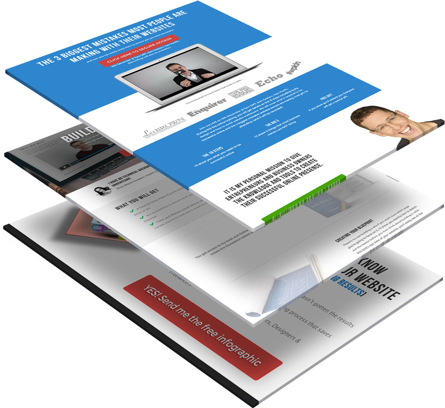
This is one of many funnels I use to bring people into my business and it is comprised of four elements:
- The Opt In page
- The Sales Page for the Initial Product Offering
- The Sales Page for the Core Offer
- The Upsell (which I use as a popup on the WooCommerce check out page)
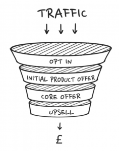
Each of these pages should have just one outcome, be free from distractions and external links and focus on converting the visitor into a customer.
The Fine Print
What does it cost? There are costs for the Gravity Forms plugin and your CRM system and autoresponder. Normally, these Cornerstone templates are included in Online Mastery's course, Build Your Website ($750) but as a member of the Themeco community, you're getting the 3 templates for the super sweet price of $0 (which, incidentally, is £0 and €0).
How long does it take? If you sign up to get the templates (which you can do from clicking the live demo button below), you will have the Cornerstone template file on your computer and uploaded to your website in less than 5 minutes. Reading through our tips of what and what not to customize may add a bit of planning time, but it will save you in the long run.
How technical is this? The fact you managed to locate this blog post means you are more than qualified to watch a short video, press some buttons and copy some text. That is what is required here. If you can update your Facebook profile, you can create this process.
So let's jump into the reason you are here :)
1. The Opt-In Offer
Desired Outcome: Simple! We want to obtain the visitor's email address. If they leave the website, we want to ensure a way to continue communication. At the very least, you want an email address, and maybe a first name with it. The more details you ask for, the less likely they are to complete your request (personally I like asking for just an email address and on the thank you page asking for their name. That way, you already have the email and it continues the conversation and also starts to educate the visitor to engage with you in a very simple way).
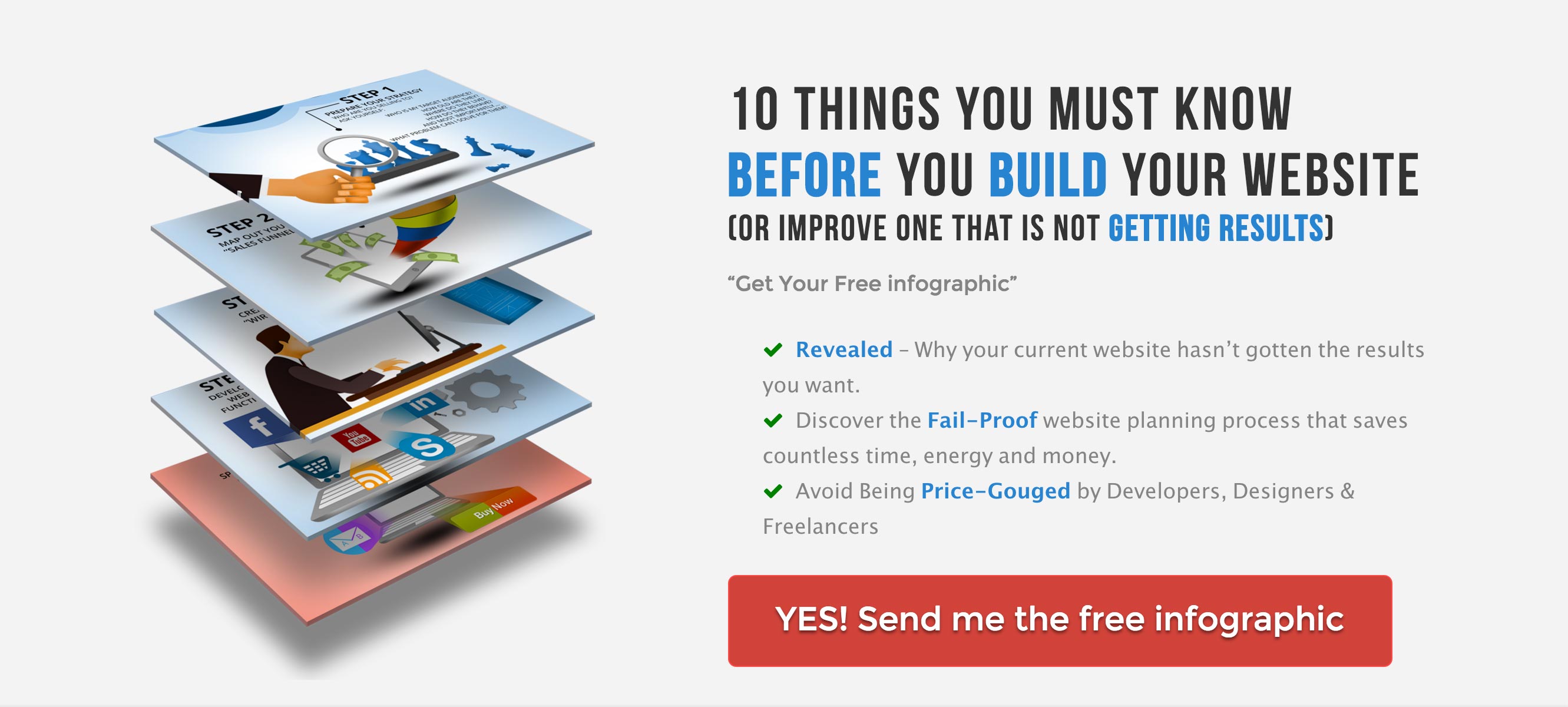
What should you give? Your opt-in offer needs to contain real value. So many people rush a cheap opt-in offer and then wonder why no one is converting into a customer. It's because the first impression counts and if they think you rush things and provide a sub-standard of work, they are less likely to want to continue. It's why your opt-in needs to be some of your best work. It needs to show such value that the recipient is aware of how much effort went into creating it.
It's this awareness that is so important. Value is only worth what the recipient can see. If they can't see the value, you might as well not put it up. What you create should be enough to solve an immediate problem, showcase your potential and leave the visitor wanting more.
Here is my opt in: https://onlinemastery.co.uk/start/
The chances are good that you're already giving away a free gift (or thinking about it). And if you're not, you should be. The opt-in template we've built for Cornerstone is a classic! It focuses new subscribers' attention on the right things, increasing the likelihood they type in their names and emails in exchange for your valuable e-book, training video, infographic or checklist.
Feel free to customize:
- Colors: To draw the maximum attention to the “sign up” button, make it a unique color that is totally different from anything else on the page.
- Your specific message: Because there's so little text on the classic Cornerstone Opt-In, you want to spend time double-checking that your message is right.
- The image: Whatever you e-cover or image you feature in the left column, it's worth investing some time and/or money to make it as appealing as possible.
Consider leaving it as it is:
- The classic layout. A high-converting opt-in page needs to have a lot of “white space” or blank area to focus the visitor's attention on your message.
2. Live Training / Webinar Registration
Desired Outcome: You want to develop your potential customers' trust in you. The best way to accelerate that process is by letting them watch you speak. Opt in gifts are great, but you'll have the biggest impact on potential customers in live trainings and webinars (even if you are camera shy). By putting yourself in live video broadcasts, potential customers get to know you.
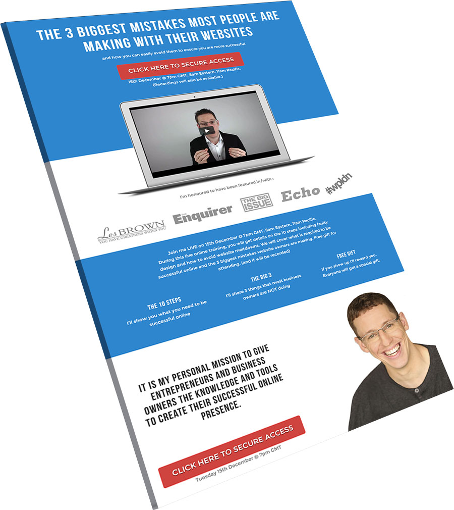
But first, you have to get them registered so they know how to arrive in your little virtual training. Again, simplicity is crucial. The Cornerstone “Registration” page template makes it easy to make a mundane moment special (especially if you customize it with a video).
Here is my live training registration page: https://onlinemastery.co.uk/live/
Make sure to slim down the right side of your browser to see what happens to the video / laptop image. Tell me that's not slick?!
Feel free to customize:
- The text. You'll see there are lots of places to make this page all about you and what you're offering. Don't get carried away though. Simplicity is critical. Notice that my headline is limited to 65 characters and the subheading to 70 characters. Use a website like CharacterCountOnline to be certain.
- The video / image. If you're brave enough to make a quick video, you'll discover that the long-term rewards are great. At the very least, put up a quality photo of yourself or your team.
- The colors. I don't want to bore you, but everything I said above for customizing colors on the opt in page is true here, too.
Consider leaving it as it is:
- The classic layout. Just like with the Cornerstone Opt-in template, you still want to direct your visitor's attention in a strategic way to help them take action which means not switching around or deleting the sections.
3. Short-Form Sales Page
When it comes to selling your services, there are a lot of ways to go. You may have noticed some online services have really long sales pages (you know, 2 meters of scrolling). Then, there are things like Amazon. What you choose to do is ultimately up to you, but there are some classic elements should always be there, no matter what you're selling. I am confident that the Cornerstone template for my short-form sales page is going to save you time and keep you on track.
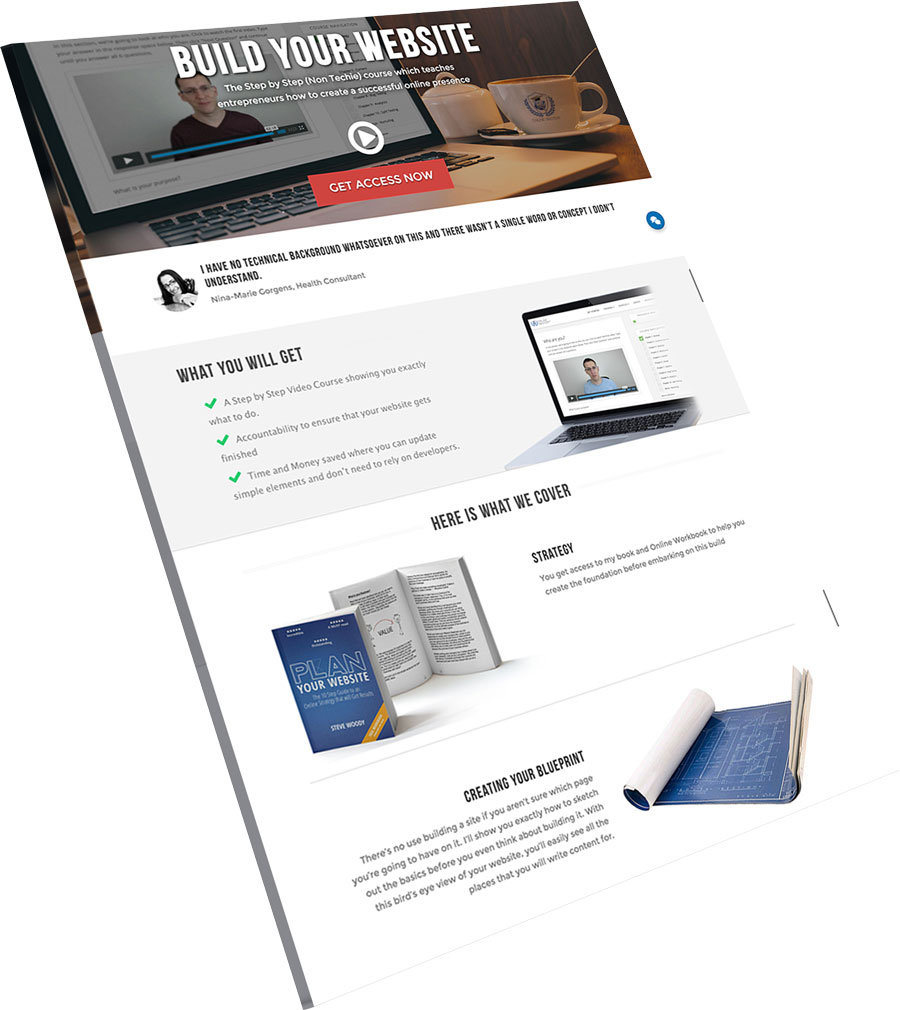
Here is my sales page. Feel free to customize:
- The content: You'll need to gather FAQ's and testimonials or other “social proof” from existing customers. Be patient here. It's totally realistic to spend 15 to 20 hours writing and gathering the content for a sales page.
- The colors: You want all of your pages to feel consistent and branded, so be sure to repeat the same background, button and font colors that you used on your Opt-In and Webinar Registration pages.
- The images: There are only so many fonts that anyone is likely to use on a website, so there's a bit of a limit as to how unique your fonts will (or should) get. Take time to get the images right because they really make your sales page stand out and develop a personality of its own. Images are also one of the elements that contribute to (or drastically reduce) the phenomena known as “website shame.”
Consider leaving it as it is. There are some things that every good sales page should have:
- Headline that hooks the visitor's attention
- What the product is (including a title and description)
- How it can help the customer
- Details about what it contains / how you deliver it / how it's used
- Social proof (in the form of testimonials or reviews)
- Information about the author or creator
- The price
- FAQs
- Any guarantee or disclaimer information
- Links to your Terms & Condition and Privacy Policy (yes, it's boring but it makes you look professional and the templates I'm giving away have you covered)
Click Here to Download the 3 Cornerstone Templates
Steve has graciously made available his exact sales templates built in Cornerstone as a free gift to Themeco customers, and we are thankful for him and his efforts within the community. If you are having any trouble downloading, accessing, or using the templates you will need to contact Steve through his site. We routinely like to showcase customers doing exciting things with X and Cornerstone, so if you would like to be considered in a future Customer Spotlight, we'd love to hear from you.
