Hello. I’ve got the navbar inline for desktop/laptop view but I’d like to control it’s position differently in responsive view, particularly mobile view - I ideally would like to stack it underneath the logo, centred.
Hello @jimmillard,
Thanks for writing to us.
If you are using the default header, the logo will automatically be centered, with the hamburger menu displayed below it. If you are using the Pro theme, you can create a custom header using the Header Builder, which allows you to position and align the hamburger menu element according to your requirements. Please refer to the Header Builder documentation for detailed instructions on creating a custom header and aligning the hamburger menu.
If you are using the X theme’s default header and the hamburger menu icon is misaligned, please share the exact page URL so we can investigate the issue.
Thanks
Thanks. When I click on the plus sign on cornerstone, it doesn’t offer me a header option just page or component.
Hello @jimmillard,
Please ensure that you have installed the Pro theme since the Header/footer and Layout Builder are only available in the Pro theme. If it doesn’t work, please share your details in a secure note. Please provide the following details
- WordPress Login URL
- Admin-level username and password
You can find the Secure Note button at the bottom of your posts
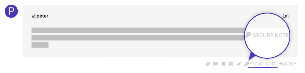
Thanks
I don’t have PRO, I only have the X theme. I could use some CSS which controls the logo size and burger menu size/position
Hello @jimmillard,
If you are using the X theme, please share your site URL so we can review it and provide custom CSS to achieve your desired layout.
Thanks
This topic was automatically closed 10 days after the last reply. New replies are no longer allowed.