Menu on custom header doesn't work well on mobile devices

I’m using the Pro theme 3.2.3 and Wordpress 5.5.3 PHP 7.3
I have a multi level menu on custom header, in PC works very good as seen on image part (1):

But the same menu on mobile devices does not show very good. See image part (2)

The menu have 2 child options and only shows partially one.
Is there any way to child elements appear below parent? or any other way to fix that?
SIte is https://bolsadevaloressinsecretos.com menu item (Propuesta)
Thx in advance
Hello @aibanez,

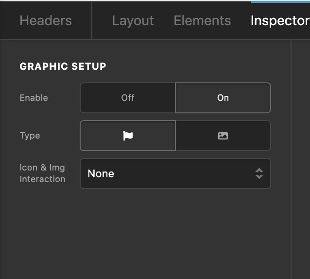
Thanks for reaching to us. I have checked your site and I found out that on desktop, you are using the Navigation Inline element. On smaller screens, you used the Navigation Dropdown element. If you want to display the icons in the navigation dropdown, you will need to enable the Graphic Setup which can be found in the Navigation Dropdown element settings, Menu > Links > Graphic Setup.

By the way, please be advised that the Navigation Inline and Navigation Dropdown element are best to use in desktop screens while the Navigation Layered, Navigation Collapsed and Navigation Modal elements are great to use for smaller screens.

Hope this helps.

Thank you!! Worked like a charm with Navigation Collapsed!!

Hi @aibanez,

Glad that we are able to help you.

Thanks

This topic was automatically closed 10 days after the last reply. New replies are no longer allowed.