Global Block Footer not formatting well on mobile and smaller screens

I created a Global Block to use as the footer for my site at evsdev.444.media and when viewed on mobile the elements are all over the place on the smaller screens. I changed the margins to be a % (vs px or em) as I had seen in a ThemeCo YouTube vido that doing this to elements helps them size better to anything smaller than desktop(?) But that didn’t work.

Can you look at the settings and see how I get get it to look nice on screens smaller than desktop?

It’s the only Global Setting item I have and it’s called “Footer”

Thanks

Chris
Hello Chris,

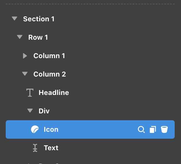
Thanks for writing in! You have this issue because of your nested rows which created a conflict instead. Be advised that the columns have widths. It is best that you use Div elements instead and enable the Flexbox option. With the help of the padding, you can have enough space between the icon and the text element.

The first row was edited to demonstrate how should the element be structure to prevent any conflict.

Hope this makes sense.

OK…thanks! I have never used the div elements nor the flexbox. Is there a support article link you can point me to on these things? I’ll try and figure it out based on your response, but I would like to learn more about flexbox…no idea what that does, but seen it there.

Thanks!

Hi Chris,

I would suggest you go through the following article on Div element and Flexbox options.


Hope it helps.
Thanks

This topic was automatically closed 10 days after the last reply. New replies are no longer allowed.