Nice, thanks for considering implementing this.
@Charlie any chance we could get the FontAwesome Pro update soon? (Even if duotones wait a bit more)
I’ll make sure we update to Font Awesome 7 in Pro 6.9. Have a great day.
3 Likes
Would it be relatively easy to implement support for FontAwesome’s icon animations, or upgrade the effects controls with better animation capabilities? Currently we still need custom CSS.
1 Like
While this is cool. I do envision Cornerstone having a more holistic approach to animation where it could create, timeline, and do wonderful things. There is a new feature coming to Pro 6.9.0 around adding in Custom Style sheets easily. With that you could easily add these custom animation classes to your icons I think. I’ll take another look at this after our next major release.
1 Like
@charlie I know full duotone support would mean hooking up multiple colors and transparencies - but when you get in there for the next FA update, want to just try enabling Duotone with a single color and see how it looks?
The way they handle colors makes me think even just giving a single color control could look pretty nice out of the box. (The secondary color does something like 40% transparency by default if a second color isn’t set)
Might be a nice upgrade on the way to richer controls.
1 Like
Let me try playing around with just getting Duotones in without the additional color choice and I can see if that’s going to work. Have a great day.
1 Like
Awesome, thanks for taking a look! Appreciate you 
1 Like
FontAwesome 7.3.1 is out since July 15 
Whatever is the latest release of Font Awesome, I’ll update it to that before we go to Manual updates.
3 Likes
Have you had any thoughts about the duotone as you’ve tried it?
1 Like
Singular color Duotone will be released within Cornerstone 7.9. It might be in the RC or it’ll be a point release, since it’s not too big of a code change. If it’s ready it’ll be available tomorrow in the next beta release.
3 Likes
Amazing – thank you sir!
1 Like

You can try this out now in the RC release. Have a great day.
4 Likes
Very nice, it works. Thanks for adding this in now.
1 Like
@Charlie one quirk I did notice is that some of the layers of the icons in the picker get shifted slightly. In this example, look at the lightbulb highlighted in the picker – note how the part that would screw in is offset from the bulb, but it looks fine in the blue shape to the left?

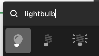


1 Like
Same here. Only seems to be these lightbulb icons?