Beta 6.0 - Initial feedback

It was worth the wait!

Congratulations on this amazing update! I love the new UX.

Unfortunately it came on the last day of my free time this summer, so I will have to get back to testing later.

Right now, I have some initial feedback:

  1. Clicking “Cornerstone” in the backend (WP left menu) doesn’t lead to Documents, but to the “Settings page”.
  2. I cannot edit any page. Inside a page tab, when I click on any element, I get a black highlight saying “Edit page”, and nothing happens. I cannot add new elements to the page either. (Edit: tried on another install with an existing website. Everything inside CS is broken and uneditable).
  3. The elements pane starts with the Templates instead of the actual elements.
    image
  4. There is no way to get into WordPress from Cornerstone (Edit the page in WordPress to access ACF fields for example). It is a two-click journey with going to the front-end first.
  5. Right-clicking on tabs to access “Duplicate” and “Delete” would be great, since the current document is not highlighted in the Documents list. So it has to be searched first on the longer lists.
  6. Documents list: Small Anchor links or icons to scroll to Headers, Footers and other standard parts would be great, since those are not in the top dropdown anymore. Now we have to scroll to get to them, which makes it longer than before.
  7. Clicking CTRL to open multiple documents still closes the documents pane, instead of leaving it to click on more documents.
  8. I use the Dev toolkit all the time, and I must say that I don’t like the fact that it is now hidden behind another click. I’d prefer it back, next to the “Custom code” button. Those who don’t turn it on, won’t see it anyway. Those who enable it, they need it and they appreciate having it radially available. (Copy pasting elements between the tabs is a continuously used option).

That’s it for now! Will get back to it! :slight_smile:

4 Likes

:wave: Howdy, @Misho!

Thank you for your kind words…that means a lot coming from you in particular as I know you have a very deep knowledge of the tool. I’m glad you’re finding the initial experience positive. :slight_smile:

I’ll take your points one at a time here:

  1. Yes, I agree with you here…some of the WP Admin UX needs to be nailed down. I agree that clicking Cornerstone at the top level in the sidebar should take you to the same location as the WP Navbar does.
  2. That is odd as we haven’t run into this issue personally, but we will figure out what is happening! I will check the examples you have provided.
  3. Our thought here was that users might wish to see their personal Template and Components first before the standard library as those are things you’ve built out for your specific use-case. I’d be curious to know what other people think about this as well if they would like to see “their stuff” first, or always show the standard Element Library first.
  4. At the bottom of the new “Cornerstone” menu where all of your Documents can be found, there is a fixed footer with action links for Help, Preferences, Dev Toolkit, and then on the right side is an “Exit” link, which provides contextual navigation back to the WP Admin. For example, if I click “Exit” on a Page or Post Document, it will take you directly to that entry in the WP Admin.
  5. I can see how adding “Duplicate” and “Delete” as a context menu on the tabs would be a nice touch!
  6. If you click on the “All Documents” select at the top, you can filter your results by Document Type (i.e. only Headers, only Footers, et cetera). Additionally, the fuzzy search at the top allows for super quick filtering of specific assets. You can search by Document name, but you can also simply type in “header,” “footer,” et cetera and it will show all relevant Documents of that type as well.
  7. If I CMD + click on my Mac, the Documents pane remains open, so there might simply be some adjustments to make there to ensure it performs appropriately on Windows.
  8. I totally hear you on this one, I also use it all the time! We wanted to be mindful of the toolbar space since it is combined with the breadcrumbs now, so that was the main reason for taking it out. The great thing about this release though is we’ve introduced customizable keyboard shortcuts. If you open the Dev Toolkit and go to the Tools tab and then under Data Store click on Preferences, you should see a "keybinding" key in the revealed JSON. I have a line item in there for "open:dev-toolkit:tools": "mod+d", which means that when I press CMD + d on my Mac, it opens the Dev Toolkit directly to the Tools tab. This is something I realize I need to document better, as it’s something that will open up a lot of customization for users to suit their workflow. Would love to know your thoughts about this after giving it a try and see if it addresses your general concern of quick accessibility.
3 Likes

@Misho, is there any way that you could get us a copy of:

  1. A complete copy of your DB in WordPress for one of the sites sent in your Secure Note.
  2. A .zip of your whole WordPress installation with plugins and themes and all that?

We’d like to try and recreate your entire setup locally as this “Edit Page” observer issue is causing us to scratch our heads over here since we can’t seem to replicate it ourselves at all, and we have some tooling locally that would allow us to debug things better.

Perhaps you could create those assets and host them on your server temporarily and give us a link to them to download? You can put these links in your Secure Note.

You guys have access to my site. I am having the same issue where I can’t edit pages. Updraft Plus Pro is installed you are welcome to take a backup if it will help.

You have the details in the secure note of this thread.

Thanks, @urchindesign. I will pass that along!

Hi @kory!

Sorry for my late reply. I updated the secure note with the link to the DB and files.

Thanks!

Hi @kory!

  1. Let’s see what other people think. For me, this is definitely not ideal. For most people and especially beginners, it will take time to get to the point where they will have “their stuff”. Even advanced users need to use the elements first before creating their stuff, so it will always be a point of frustration in my opinion. Elements are the fundamentals and I’d say they need to be super quickly accessible. The quickest in the entire Cornerstone in fact.

Another thing I’d suggest in the elements pane is the ability to CTRL+click on accordions to collapse all, just like with the inspector pane.

  1. Maybe also a “reload tab” when clicking on a tab, and “Reopen closed tab” when clicked in the area outside the tabs? :slight_smile:

  2. I tried to add a line with my shortcut to the dev toolkit as you suggested, but it didn’t get saved so I cannot try it out.

Anyway, shortcuts are great but I still find this is not a tool to hide. Shortcuts increase cognitive load and slow down compared to a direct click, and those who enable the Dev toolkit are probably aware of its power so much that they are using it constantly. At least until copy/paste of elements get into the production, possibly to the context menu.

Or perhaps add a preference to add the Dev tool’s copy/paste elements to the context menu? Wow, that’d be even cooler. Maybe call it “Copy JSON” to make it more nerdy and distinguishable from the standard context-menu copy element option? This would be then something most people don’t see, but those who want it, would get it in the best possible place.

2 Likes

Another suggestion:

For years, the fact that the page with the sidebar is being created by default is the source of confusion for new users, and the unnecessary load for everyone else since mostly the version without sidebar is being used.

Perhaps a right-click to the Page icon could at least open the context menu to choose the template, so we don’t have to go in after the fact?

image

I do have the functions.php code to make the template without the sidebar the default one, but even better would be a preference to make that choice natively.

5 Likes

All good stuff here, @Misho! I have noted everything down and it will be reviewed / discussed internally. We’ll see what we feel we can get in at this time.

2 Likes

Hey Kory, those action links are quite small. Especially the “Exit” link could be a little bigger and more prominent like it was before. It actually took me a while to find it the first time.

Totally agree with you @Misho the full page template should be the default. Can you Share your functional.php code please fir this as its one thing I change on every site I use Pro for.

In the next beta, “Fullwidth” will be selected as the Theme Options default layout in addition to the “Blank - No Container | Header, Footer” template being set as the initial value for new Pages created. This will force a true fullwidth canvas for everyone and set things up more in alignment to what people tend to want / expect nowadays.

9 Likes

@kory :tada: - thank you!

No problemo, amigo.

Hi everyone! Just arrived here in the beta forum. I’m testing out the new beta and I already liked the new UI overall, I have just some considerations:

  1. I’m missing the “Load template” and “Save template” buttons right above the page outline:
    image
    The same thing for my elements presets:
    image
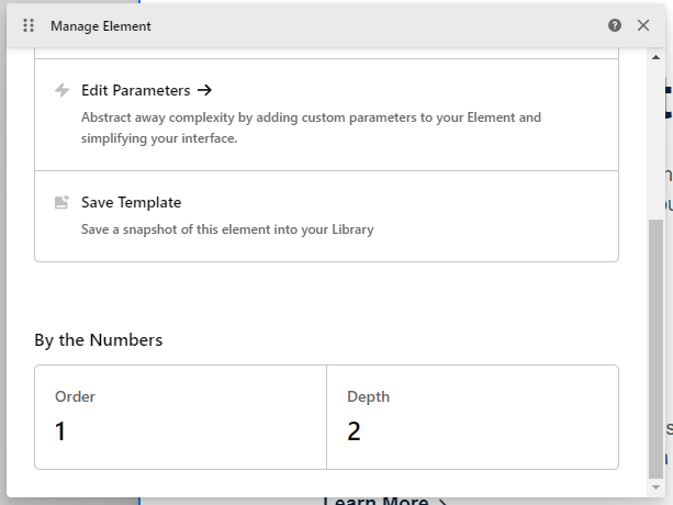
    I see that now we can save elements as templates here:
    image
    But it seems that the only way to load this template is adding a new element on the Elements panel. It would be great to have both options, like we had before.

  2. I understand why you made the changes in the UI to keep things organized between documents tabs, tools panel, breadcrumbs, etc. I already used a similar setup (but with breadcrumbs at the top and tools panel at the left side). What’s bugging me (and my “OCD”) is this black overlay when you open the Cornerstone menu:


    While the tools panel is right oriented, it seems more “ok” to me, but as soon as I changed my panel to the left and saw this, I missed the way it was before:

    I “fixed” this just by adding “.tco-content-nav-overlay {background-color: transparent;}” into my UI CSS in Dev Toolkit and, for me, it looks way better like this:

  3. One last thing is the “Run” option in Page JS and Global JS that I use a lot when something goes wrong with the preview rendering. I see that now we can navigate between tabs to “reload” then (and we still have the “Run” option one more click away now), but I think it would be very helpful if we had a dedicated “Reload” button that would refresh just the preview to fix those rendering errors that occurs now and then.

And that’s it, those are my initial thoughts about the new UI, but as I said before, I already like it a lot and can’t wait to use the new Cornerstone to build, hope the final release comes soon!

Congratulations to the team and keep up with this great work!

congratulations for a new design and the added functionalities I love how it looks. I would like to be able to hide the left toolbar to be able to make adjustments from the mobile without activating the desktop version.
My current view from mobile https://ibb.co/DCLmP9v
If you can tell me the code to hide it and show it with a button from the mobile

Thank you

Howdy, @RDADALTE! Thanks for writing in and for you thoughts. Allow me to address them one by one:

  1. Please see my comments here on the application of Element Templates (formerly known as Presets). As for the “Save Template” / “Load Template” option for Section Templates, this is not currently present on the Outline pane but will be coming back before the beta cycle is complete.
  2. We appreciate the feedback here, the new menu will stay as is for now. You are certainly free to modify things as you wish using the custom UI CSS feature in Dev Toolkit as you referenced.
  3. I’ll see what we can do about a “reload” action on the tabs…it might be something that’s tucked away under a right-click context for them if we do it.

@jacquelinemq, thanks for writing in and for your feedback as well. We’re glad that you’re enjoying it overall! As for your request, we have never marketed Cornerstone as a builder that can be used on mobile devices for editing. The entire building experience is based around working on a desktop as all interactions from the ground up are thought of in that manner. For that reason, there isn’t a quick fix or way to easily add a button to show / hide the sidebar as you’re discussing here. For now, we ask that all users utilize Cornerstone in a desktop environment to fully take advantage of all the features it has to offer. Thanks!

3 Likes

Just wanted to send a kudos to the team after finally putting this up on a dev site to try out. Other than having to get reoriented to the layout, 6.0-b2 is fantastic. Well done!

Side Note: it’s running on WP 6.1-b3 and PHP 8.1.2 with zero issues.

Thank you for the kind words, @xRae! That’s wonderful to hear and we’re glad that you’re getting along well with things. :slight_smile:

Hi @kory! To continue on the thread, I have some more UX concerns.

  1. Inside the Outline, we have a mix of Containers and elements. We can also rename the containers, at which point we have no clue about the type of the container. Is it a Div, A Column, Row or even the “Slider Container”, which is actually a specific container with additional options. I catch myself spending a lot of time trying to identify the type of the container I’m currently in.

  2. Inside the Outline, “Add section” is replaced with “Add element”, making adding the new section a longer task. It requires a click, scroll and another click. I find this too much considering adding a Section at the top level is still the most common task.

Scroll is happening if we have favorite elements above, pushing the “Layout” part below the fold. To make things worse, Section is placed last on the list. :slight_smile:

I believe that we need a quick way to add new sections inside the element pane. I’ve noticed that “Add classic section” is gone when we CTRL+click. If that was intentional, then perhaps CTRL+clicking “Add element” could insert a section directly.