I’m trying to optimize screens for mobile & desktop, and in doing so noticed that the front end does not match the back end at all on any of the devices - specifically images. In the attached screenshot you can see the logo image at the top is squeezed very tightly into a line on the front end (same happens on mobile). The picture of the students also cuts the top & bottom off on the desktop view and completely cuts out of the mobile version.


Hello Raymond,
Thanks for writing in! Cases like this could mean that there has been a broken HTML or invalid custom CSS inserted on the page which created the issue. To better assist you with your issue, kindly provide us access to your site so that we can check your settings. Please create a secure note with the following info:
– Link to your site
– WP login URL
– WP username
– WP password
– WP Administrator Role
- Confirmation that we can access and make changes to your site
To know how to create a secure note, please check this out: How The Forum Works

Best Regards.
Hello Raymond,
You have added a section with a background image. This section has a row with an empty column. Be advised that the background image is set to cover the section. Keep in mind that the height of the section is dependent to the height of the row and column elements. It is best that you set a minimum height for your column.

I went ahead and inserted 30vh as the minimum height of the column. This will give you enough space to display the background image.
Check your page now.
Hi Ruenel, that fixed the desktop view perfectly, but the mobile is not showing the middle picture at all (pics attached). The mobile version doesn’t seem to have the same option to adjust the column height, so I’m not sure what I did differently. Appreciate your help!


Hi Raymond,
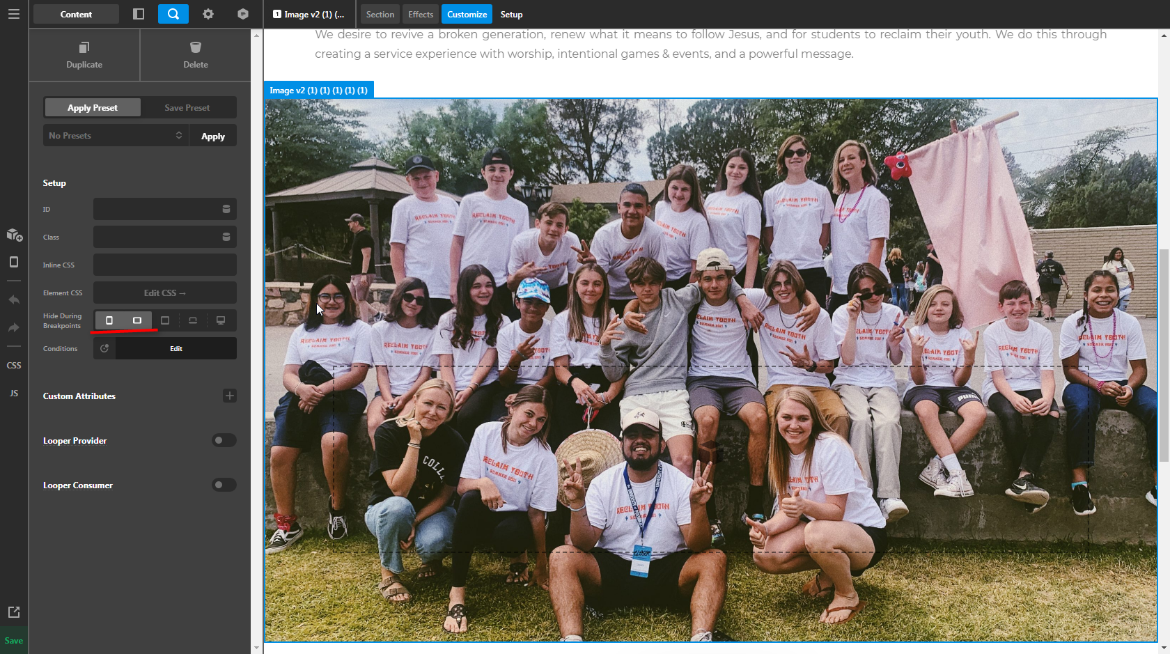
That section is hidden on small screens using the Hide During Breakpoints feature.
I assume you want to show the entirety of the image regardless of the screen size, if that is the case, you should not add that image as a Section’s background, but an Image element that way it will respond proportionally to its own width, not on the section’s height.
Hope it helps,
Cheers!
Hi Friech, there are two versions. One is hidden for desktop one hidden for mobile. Neither is showing up on the mobile version. It shows up on the back end, but not the front end.
Hey Raymond,
The same thing happens in the mentioned section. It is an empty section which is why it does not display on mobile. Setting the minimum height of the column to 35vh should make it be visible on smaller screens.
Check your page now.
Hi @ruenel, Now it’s showing just a line. I tried to increase the vh up, but it didn’t make a difference. Any ideas?

Hi Raymond,
I’ve fixed it, it supposed to be the min-height not the max-height

Always remember to clear your caching plugin, because it’s a bit aggressive it does not show your edits immediately sometimes.
Hope it helps,
Cheers!
Thank you!
The rows on the home page (mobile) are not lining up, though the back end is showing that it is correctly aligned. Any tips on how to resolve this? Thank you!


Hi Raymond,
Please set the column’s text-align option to center.

The text should not be affected since it has its own text-align set to left.
If you have additional questions, please write them on a new thread as this one is getting mix and longer.
Hope it helps,
Cheers!
Hi Friech, that helped align them, but I’d like the MORE button to be left aligned, not centered (as it looks in the backend image I sent previously. Is there a way to do that and keep the text & image aligned?

Hi Raymond,
To fix your issue, go to your button settings and locate the customize tab then click the edit CSS.

Then add this CSS Code, this will force the button to align left.
$el {
  float: left;
}
After that, you need to adjust the padding left value to match your design.

Please note that custom CSS code is outside the scope of our support. Issues that might arise from the use of custom CSS code and further enhancements should be directed to a third-party developer or you can avail One where we can answer questions outside of the features of our theme.
Hope that helps.
Thank you.
This topic was automatically closed 10 days after the last reply. New replies are no longer allowed.