Please help, I have gotten myself totally confused. I’ve read too many articles (docs&forums). I need to speak to someone on the phone. I can upgrade service, pay for service anything. I told the client I would have this fixed by Monday morning and I think I am making matters worse. My head is spinning.
Hi Angela,
Thank you for reaching out to us. Can you please explain the issue that you’re having so we can take a look? Regretfully we don’t have a phone service however you can avail our Care service and our team will take care of your website.
To learn more please see https://theme.co/docs/managing-your-care-plan
Thanks!
I am having a few different issues.
- Alternative Menus. I can hide the menus but I can’t find where to add an alternative menu to the mobile/tablet views
- Inline text graphic. When in mobile view. Graphic remains next to the paragraph, making the text 1/2 inch wide. Is there a way to get the paragraph to appear under the graphic or hide the graphic in mobile/tablet view.
- LayerSlider. Is there a way to change the height or section ratio to resize to the layer slider size/ratio so it is scaled down together. I currently have the slider in the background because that is the only way I could get the layer slider full width of the boxed site.
Looking for any suggestions you can offer me. thank you and God bless.
Hello Angela,
Thanks for updating in!
1.) You can use navigation inline and navigation dropdown elements for desktop screens. For smaller screens, you can make use of the navigation collapsed, navigation modal or the navigation off-canvas. You can insert both elements in the bar container of your custom header. You can then use the “Hide During Breakpoints” option to show or hide the menu on specific screen sizes.
2.) You should use two columns and you can insert the text element on the left column and the image on the right column so that on smaller screens, the image will be below the text element.
3.) You will have to set your Layerslider to “Responsive”.
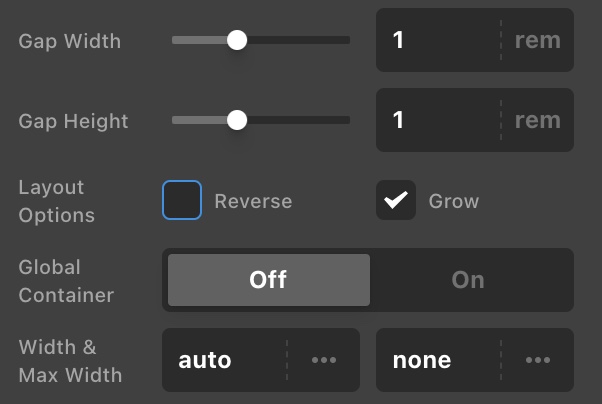
In your row settings where you have inserted the slider, you have to disable the Global Container.
Kindly let us know how it goes.
This topic was automatically closed 10 days after the last reply. New replies are no longer allowed.