As I am creating this design for price . How can I over lap the middle column like the design .

Hey @KaziTouhid,
For that design, I won’t recommend overlapping the columns because you’ll just add complexity to the setup. If you look closely at the design, it’s just 3 columns sticking together. I’ll detail the Row setup below. If you’re not yet familiar with the New Row element, please check the following links first.
| – | – |
|---|---|
| 1. Add 3 columns to the row | 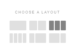 |
| 2. Adjust column size |  |
| 3. Close the Column Gap | 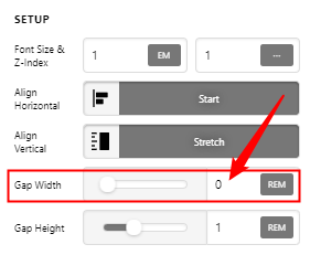 |
| 4. Set the Align Vertical to Center | 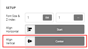 |
After that, you should be getting a layout like the screenshot below. You won’t see the effect of the Align Vertical at point because there’s no content. That option by the way is part of the Flex options in our builder. If you’re not familiar with Flex yet, please first see the documentation here: https://theme.co/docs/use-flex-layout
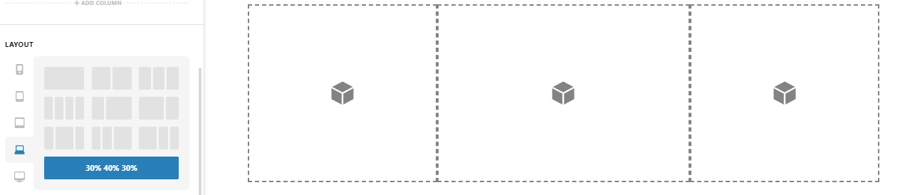
If you add content like the Gap element for example, you will realize the effect of the Align Vertical option. You should be getting a display similar to the screenshot below.
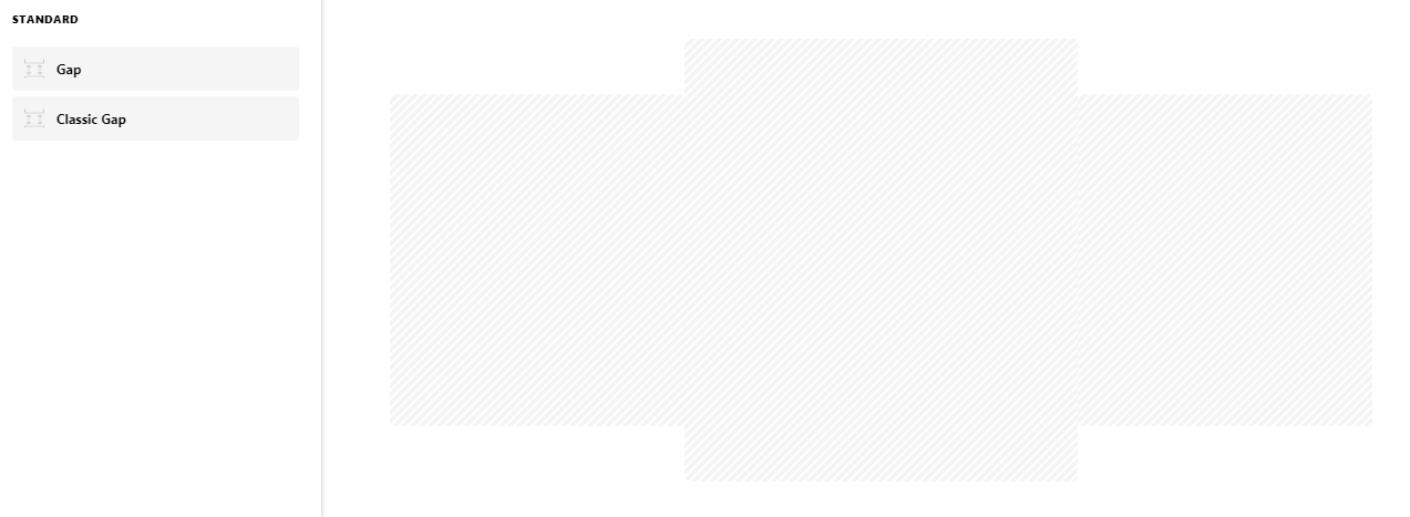
If you assign a background color to each column, you’d be getting similar to this:

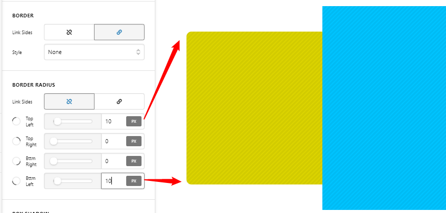
Now configure the each columns individual Border Radius for the left and right most columns.
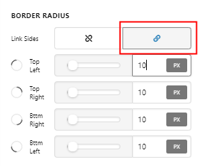
You can link all border radius values for the center column.
You can set up column box shadows too. Just make the Z index value of the center column to 2.

Hope that helps.
This topic was automatically closed 10 days after the last reply. New replies are no longer allowed.