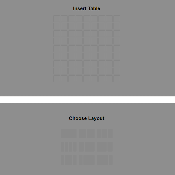
The label “Insert Table” deviates from the row and grid picker labels which use “Choose Layout”. Since you’re picking a table layout here it could also say “Choose Layout”?
The spacing between the labels and the pickers is different for each picker type (row, grid, table).
The general visibility issue of the pickers remains when you have certain background colors behind them (as seen in the screenshot) but the table layout picker is even harder to see because it uses borders vs. solid backgrounds.
The table picker dynamically shows the layout (3 x 9 for example) as you hover over the picker. That’s a cool touch. Perhaps the same could be applied to the row and grid pickers. Those could show “50% 50%”, “1fr 1fr” and so on?