Sizing On Content Area Modal Toggles

I need some help please on the sizing of the Content Area Modal Toggles. I am using them as a virtual business card and am having problems keeping them sized and spaced as I go through the different responsive sizes. If you have a tutorial I haven’t found or something that will show me how to create a rectangular toggle that responsively sizes as the display size changes. Here are some screenshots.

Thanks

Hello @mcjensen,

Thanks for writing in!

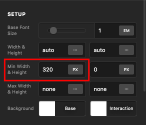
You can also set a maximum width in each of the content area modal element settings.

  • hdGgVvDHTn20ZXDSRIYjBA

And then if you have added the content area elements in just one single column, you can enable the flexbox option in the column. You can use this setting, which can be found in your column settings, to align the content area modal elements. To learn more about Flexbox option, please check this out:

Or to avoid any hassle, it is best that you create a row with 5 or 4 columns and then insert the content area modal in each of the column. This is the best way that the content area modals will responsively align to each other.

We would love to know if this has worked for you. Thank you.

Hello! I sincerely appreciate your comments and help! With your suggestions and some additional research I have the issue solved! Thanks again!

Hey @mcjensen ,

You’re welcome! We are just glad we were able to help you out.
Thanks for letting us know that it has worked for you.

Cheers.

This topic was automatically closed 10 days after the last reply. New replies are no longer allowed.