Revolution Slider 7 - Text Moves Around Now

Hi there,

I have been using your bundled plugin Revolution Slider for many years, being very happy generally. I am getting to grips with the new version, and there is something I just can’t figure out.

When adding 2 text layers, the old version used to keep the gap between them the same even when screensizes were different. In the new version, if you change the screen dimensions, the text layers move all around the place and the gap between them isn’t respected.

I find this an odd choice to include as a default, as this has not been the case with previous versions.

Please let me know how I can switch this off, so the gap between the text layers is respected on all screen sizes

Video below
Hello @EarlySigns,

To help you with your concerns, we need to check your settings. I would request please share the admin login details meanwhile I would suggest you troubleshoot a few of the common issues before we investigate your settings. Please share your details in a secure note. Please provide the following details

  • WordPress Login URL
  • Admin-level username and password
  • Exact page URL

You can find the Secure Note button at the bottom of your posts

Thanks

Secure note added, thanks

Hey @EarlySigns,

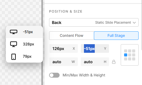
Play around with the Position and Size:

image

Default -> Back
Content Flow -> Full Stage

And check out this video tutorial as well:
https://www.youtube.com/watch?v=rUQUfjp5i7s

Best Regards.

Hi there, thanks for this, but this doesnt fix the issue.

Also, the video you have sent me is over 6 years old, when the issue I have is with the new version of Slider Revolution (issued less than a couple of months ago).

The previous version would simply change the position of the different text layers in the screen left to right - it did not change the position of the text layers from top to bottom. Even though I have changed positioning and clicked on full stage for both text layers, and on the two desktop breakpoints you have shown here, the layers move top to bottom and ‘crash’ into each other when the screen is resized. This happens when the screen break points are towards the smaller end of the screen dimensions.

I just cant understand why this functionality has been brought into this new version of Revolution Slider, when it wasnt there in the last version. This looks terrible for smaller screens and for tablets (ironically, a breakpoint that seems to be missing entirely from their new layout options).

Please see additional images of the text layers crashing into each other at smaller sizes. Any advice greatly appreciated, or Im going to have to revert back to the old version.

Wider Desktop Image

Smaller Desktop at smallest break point
(text layers starting to crash into each other)

Tablet sized breakpoint (text layers fully overlap)

Hello @EarlySigns,

I have played around with the positioning. It seems that this is a known change in behavior with Revolution Slider 7 (SR7). We are not alone in noticing it, as other users have reported the same issue.

The core of the problem is that SR7 introduced a new, more complex responsive engine. Unlike the previous version, it doesn’t maintain the absolute pixel gap between layers by default when the screen size changes. This often results in layers overlapping or the spacing between them becoming inconsistent.

If you only want to maintain the distance between the two keywords:

Bespoke Signage
Modern Signage Solutions for Contemporary Businesses

I would recommend that you group them like this:
image

And then position the Text elements relatively:

You can then position the Group element within the slide:

Kindly let us know how it goes.

Hi there,

Thanks so much, this is exactly what I was looking for!

If anyone else wants to do this, the ‘group’ element is found in the ‘add’ section under the ‘container’ menu. You then need to follow making them relative for each text layer, and they jump to the top left corner. You can then position the group by moving the blue square at the top right of the group.

Youll then need to do this for the wide breakpoint and then desktop breakpoint.

Took some fiddling but I got there!

Thanks again!

Hello @EarlySigns

You’re very welcome! I’m glad to hear you got it working. Thanks for sharing your solution as well—it’ll be helpful for others.

Thanks

This topic was automatically closed 10 days after the last reply. New replies are no longer allowed.