Mobile friendly website

Hi,

I am making my website mobile-friendly and I have found a few problems in the way. I hope you can help me.

1)In the home page, it doesn’t appear a button to go to the other pages.

I would like to put something like this on the top right in black:

IMG_1422

2)I would like to make my logo look smaller for the mobile version and put it on the top left of the page. I write to you the link to my website, so you can take a look at how it is now.

3)At the moment my pop-up to subscribe to my newsletter looks like this:

However, I would like to make the letter smaller and make it appear from the bottom up, instead of in the middle of the page. I show you an example of what I mean:

  1. I would like that my cookie banner takes a longer time to appear in phone devices, around 15 seconds.

Thanks in advance,
Marina.
Hi Marina,

Thank you for writing in, the mobile menu is there, but it is hidden via this custom CSS.

#x-btn-navbar {
    display: none;
}

Please remove that, on top of being hidden, it is white on a white background, please navigate to Theme Options > Renew and change the Mobile Button Color and Mobile Button Background.

  1. You need to use a Media Query CSS, to apply a rule to specific mobile size.

What is a Media Query?
Media Queries for Standard Devices

You can find the proper CSS code selector using the Chrome browser Developer Toolbar
For the CSS code itself, I suggest that you get started with this tutorial

  1. Please edit your ConvertPlus Modal and see Designs > Modal Animations and choose for the Entry Animation Effect that you need. Modal Width option is under Design > Advance Design Options
  1. Is that the Cookie Notice for GDPR & CCPA plugin, it seems it does not have a delay option, please contact their support to confirm.

Cheers!

Hi Friech,

Thank you for your answers, they were really helpful. I have a few more questions.

  1. Where could I edit the length and width of the menu lines in the mobile version?

  2. I found this code that your team previously posted and it worked out. However, I would like to know how could I add more margin between my logo and the image below.

@media (max-width: 978px) {
.x-navbar img {
width: 150px !important;
left: -15px !important;
top: 12px !important;
}
}

Thanks,
Marina.

Hey Marina,

There are no options for what you want to achieve so you’d need to override the styles of our theme. I answered several of your posts and I believe you already know that we do not provide custom development as part of our theme support.

The codes we provide here are only for guidance or to help users get started. We do not fix custom codes nor enhance them. This is why Friech led you to some resources where you could learn CSS and how to use the browser developer tools.

Because I answered your other thread, I know that you don’t want to use the Pro Header because you want the design of the Original Header but, the Original Header is not as flexible as a Pro Header.

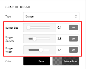
For instance, the Toggle / Burger in the Pro Header is customizable so you can achieve a custom line length and width.

image

I know that is not helpful because I’m not providing specific codes. I personally write custom CSS in the past but I noticed that users request a lot of custom code if I continue to do that. This is also one of the reasons why Pro was created.

I hope you understand.

Hi,

I would happily use Pro, as I bought it too.

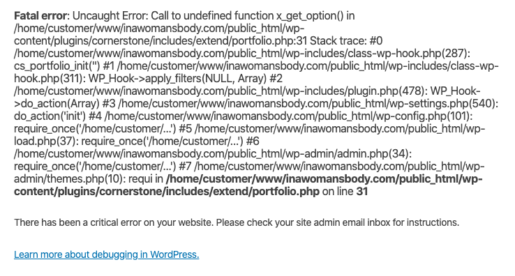
The problem is that each time I instal it my website goes down and it appears this message.

If you could tell me how to actually solve this problem, it would help me and I wouldn’t need to ask you any other CSS questions.

Hi Marina,

Yeah, that fatal error usually happens if you activate the PRO while not deactivating the Cornerstone first.

In X the Cornerstone is required, but on PRO it is not needed, in fact it causes that fatal error. Please deactivate Cornerstone and clear the Cloudflare cache before activating PRO.

Thanks,

This topic was automatically closed 10 days after the last reply. New replies are no longer allowed.