Edit the menu botton in mobile devices

Hi there!

When I go to my website through my mobile it appears a weird line below the three lines of the menu. And I would like to know if you could let me know how to delete it?

I attach below a screenshot of what I mean:
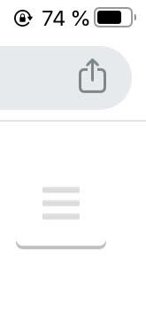
unnamed (7)

Also, I would like to know how I could the menu on the left instead of on the right side?

Thanks,
Marina.

Hey Marina,

That is the design of the Renew Stack’s X Original Header so there’s no option to change it.

I see you’re using Pro though so you can have a custom header design by creating a Pro Header. Use either the Navigation Collapsed or Navigation Layered element for the mobile nav.

In case you don’t want to create a Pro header, you’d need learn CSS as well as learn how to use the browser’s element inspector to override styles of our theme because custom development is outside the scope of our theme support.

Hope that helps and thank you for understanding.

Hi,

It doesn’t really help much your answer. Aren’t any way to make that shadow basically transparent?
I would be happy with the navigation dropdown option, but it doesn’t work for me because I want to place to menu dropdown in the navbar and it doesn’t give me that option.

Best,
Marina.

Hey Marina,

Yes, I understand that it doesn’t help much because you’ll need to learn CSS on your own.

To answer your question:

As I’ve said, you need to override our theme’s CSS. I’ll provide the override CSS for now but you need to learn CSS and how to use the browser’s developer tools if you’ll have more theme customizations to do. With that said, please add the following code in Theme Options > CSS.

.x-btn-navbar {
    box-shadow: none;
}

Thanks.

This topic was automatically closed 10 days after the last reply. New replies are no longer allowed.