Layout order mobile view

Hi,
Just wondering if you could help me with a styling issue.

I currently have 2 sections on my site. Section 1 is left text and right image. Section 2 is left image and right text.

This is fine on PC / laptop. However doesnt look right on mobile devices as it shows text, image, image, text. Is there a way to rearrange the layout when the screen size changes to mobile view so it changes to text, image, text, image??

Any help would be appreciated
Hey @dan231185,

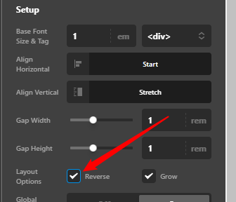
If you’re using the V2 Row which is the default Structural Element, you can set all the image to the left column then just reverse for the alternating setup.

image

Watch the video below to see what I mean. Just pump the column up as the voice can’t be heard.

Hope that helps.

Great it worked thank you very much

Hi @dan231185,

Glad that we are able to help you.

Thanks

This topic was automatically closed 10 days after the last reply. New replies are no longer allowed.