Hello, I am having some issues getting certain sections of my page to scale properly. For example, the images I use next to testimonials. I’ll leave more detail in the secure section.
Hello Nick,
When I check your site, I am seeing this:

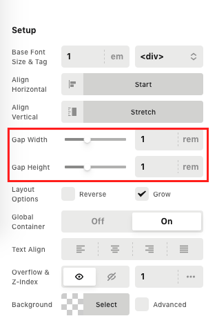
This is happening because of your -85 pixels left margin in the image element. Please have it removed and then use the gap width in the row settings if you want to move the image away from the text.
The headline text is using 65px as the font size. We highly recommend that you use em so that the font sizes will be responsive. Kindly check out the documentation to know more about the Typography and the root fonts.
- https://theme.co/docs/typography
- https://theme.co/docs/typography#how-to-set-root-font-characteristics
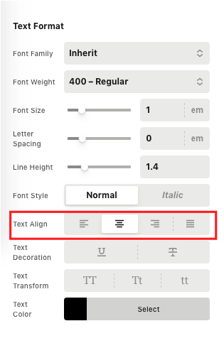
To align the start to left side, please align the elements to the left first in the column settings. If you want the headline and text to align to the center use the Headline and Text element settings “Text align” option instead.
For the column settings:

For headline and text element:
Hope this helps.
Hello Ruenel,
Thank you for reaching out to me for support. Now I am a little confused.
In a previous thread, a staff member told me to use PX for my text size to maintain responsiveness. Here is a screenshot.

In addition, I’m still unsure how to change the text color of the “Classic Icon List” to white. It is currently a gray color.

Hi Nick,
The reason why I recommend using px on the previous thread because the font size you set for em was so small and it is advisable to use em if you have a bigger headline text like 65px.
On the other hand, to change the text color to white in your Classic Icons list, just add this code **color:white;**in the style option.

Hope that helps.
Thank you.
This information is very helpful. Thank you so much.
Regarding the images in the testimonial, if I use the gap width it does move the image away from the text but it doesn’t offset the image in relation to the white container. I would like to keep that offset for the layered look as it currently appears on desktop.
Hello Nick,
Please do the following:
1.) Set the Small screen layout to have 1 column in the row settings.
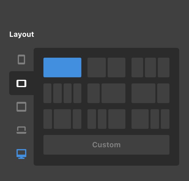
2.) Also include the Extra Small screen layout
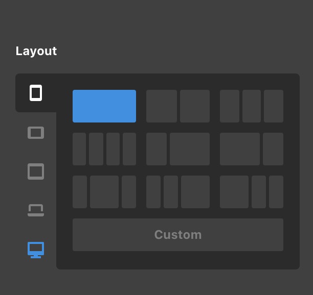
3.) In your image element settings, remove the -85px left margin and set it to auto
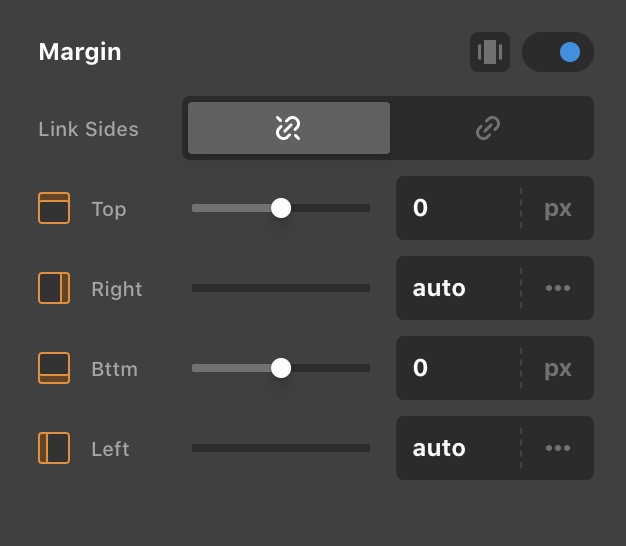
4.) And then in the image element settings, find the “Customize” tab and insert this inline element CSS:

@media(min-width: 768px){
  $el.x-image {
     margin-left: -85px;
  }
}
This CSS code will make sure that the image will be offset in larger screens and return to normal in smaller screens.
Hope this makes sense.
This topic was automatically closed 10 days after the last reply. New replies are no longer allowed.