First of all, I’ll just say Icons are tough – and people have all sorts of opinions about them (much like logos). I’m sure you guys were as thoughtful about the icons as you were about everything else. I just have a few thoughts after using everything for a week.
A lot of this echoes feedback shared by folks in other threads, but I wanted to group all my icon-related feedback in one place. So, apologies for any duplication.
(No rush on any of this by the way, it’s mostly “fit & finish” feedback)
< 2 ¢ >
Save Icon
I appreciate that the new icon communicates save state while also functioning as the save button. However, the exclamation mark looks like an “info” button to me every time I see it. I wasn’t even sure it was the save button at first.
I think part of the reason I get that impression is because of the blue color and that it looks similar to the info icon Apple used to use throughout iOS (and as their “inspector” icon back in the day).
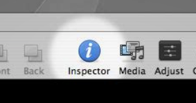

So I wonder if using a different color to emphasize the “not saved” part of the message might help. For example, using a subtle shade of orange or yellow could communicate that it needs attention while not being overly distracting. (Quick example below)
Icons for the tabs
I wanted to sit with the changes for a while and make sure I wasn’t just giving you a knee-jerk reaction… but I prefer the previous version of the tco-workspace where the tabs used labels rather than icons. (I imagine you switched to icons because there are now 4 tabs, which would be too crowded with labels for all of them)
However, I also still don’t think the Theme Options should take such a prominent position in the builder. So it occurred to me that one way of addressing both pieces of feedback is to use labels for the other primary tabs and just an icon for theme options. (Quick mockup below)

(Theme Options would probably need some sort of heading to make it clear what that tab is. And I know you had put the type of builder in the tab names (e.g. “Layout Outline”) to help make it more clear which builder you’re in, so that would still need to be solved for. Also, you’ll note that I used a different icon for that tab because of the next point…)
Settings vs Options Icons
I mentioned this in one of the other threads, but I want to bring it up here too. If you’re going to keep the icons for the tabs, I really think the Settings and Theme Options icons should be reversed.
Running a quick Google Image search for “settings icon” and “options icon”, the most common icon for “settings” is the gear. And while “options” is also commonly represented by a gear, the toggle icon is also pretty common.
So, there’s definitely overlap between the icons used for those two terms. In this case, because both are used side-by-side, I think they should map to their most common usage. In this case, since it’s more likely that a user will be going to the settings tab, and the most common representation of settings is the gear, I think those two should be used together.


Elements
Since the element icon is new for the sidebar, I wonder if people will recognize it as the place they should go to “add elements”. Since many other apps use some variant of a (+) button for the “Add a thing” part of their UI’s, I wonder if it would be helpful to add a + to the elements icon. (Super quick mockup below)
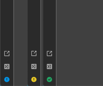
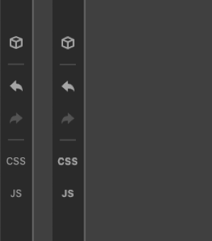
CSS & JS labels
These labels look a little out of place because of their thin font-weight. I’m not sure if you were planning on making little glyphs at some point, but I think they’d look a bit cleaner if they matched the line weight of the other icons (Mockup below just uses font-weight:800 on the existing label).
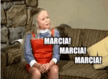
Inspector
I wonder if there’s another icon that can replace the magnifying glass for the inspector? The magnifying glass is doing a lot of work serving as the visual indicator for both the search fields and inspector, and it’s starting to get more confusing now that it’s being used as the icon for the inspector tab too. (Quick mockup using an Info icon below)
< /2 ¢ >