Hey Isabella,
Thanks for your feedback about the interface. I’ll forward it to our designers and developers.
The page width or Site Max Width in Theme Options > Layout and Design is 1400px. All the images that should span the width of the page should also be 1400px.
Your image in the screenshot is only 900px and it could be scaled up using custom CSS but it’s not recommended to do that because it will make the image blurry or pixelated. This is why there’s no option for this in our theme and builders.
If it’s ok for your image to be blurry, what you can do is make the Image element span 100% of the width of the container first. I’m assuming the Row’s Global Container option is disabled and it’s spanning 100% also.
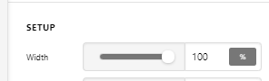
Then, you need to make the image inside the Image element span 100% too so in the Image’s Element CSS, add the following code.
$el img {
  width: 100%;
}
Please just note that the code I’ve provided serves only as a guide or I’m just showing you how to customize the Image element using custom CSS. If you need more customizations, you will need to learn CSS and also learn how to use the browser’s element inspector.
Hope that helps.


