Headline Spacing Issue

Hello,

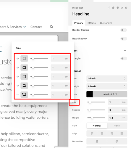
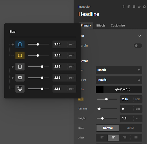
I am working on a new site and everything has been working great. However, I recently changed up some headlines and while it looks correct in Cornerstone, the display is adding space above both my headlines and my sub-head. I have totally rebuilt the section multiple times, removing the Classic Headline and replacing it with the current version of the Headline, but it keeps adding the space. It’s only happening on this one page. I have compared the setup to other pages that are displaying correctly and everything matches. While inspecting the page in Chrome tools, I see the extra space above both the headline and sub-head, but it’s not showing me where it’s coming from. I was hoping you might be able to take a look and help me figure out where the extra spacing is coming into play.

Thanks,
Dawn
Hello Dawn,

Thanks for writing to us.

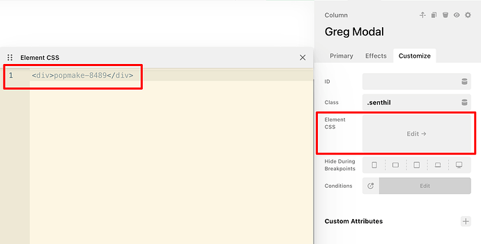
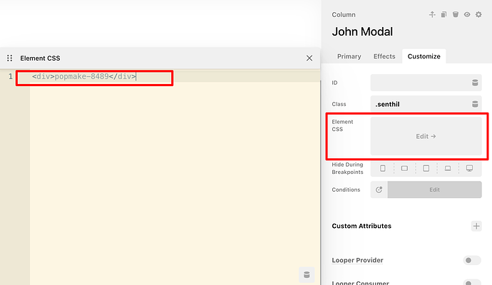
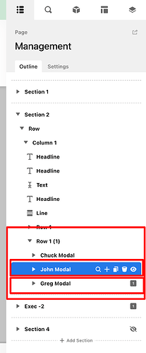
I have checked the page URL you provided and noticed that a broken HTML error is the reason behind your issue. It appears that custom HTML was added to the element CSS section, which is not correct. The element CSS box should only contain CSS code. Please review the screenshot below for reference.


Hope it helps
Thanks

OK, not sure how that code was placed in there… but I found it and yes, it cleared up the headline issue. I definitely did not look at the modals when trying to figure out the headline issue.

This might need a different topic created, but since you pointed to the error being in the modals, my next issue is that the modals don’t seem to be responsive. Please let me know if I need to create a new topic for help with that.

Thanks,
Dawn

Hello Dawn,

I would suggest you please have a look at this documentation to learn more about how to style responsive layouts using the Cornerstone element settings.


If this does not resolve your issue, kindly create a separate support thread and share detailed information along with a marked screenshot. This will help us replicate the issue on our end and provide you with proper guidance.

Thanks

Thanks. I’ll review the video. I’ve made some tweaks and it’s looking better on desktop and small screens, just funky on the in between sizes.

That was a good refresher. I think I have it all straightened out now. Appreciate it!