We recently launched a new site based on PRO at https://www.rockyriverwinebar.com
We are having some challenges with the header layout. There are two version of the header, one for Desktop/Laptop , one for Tablet/Mobile.
-
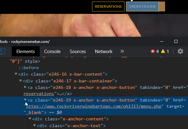
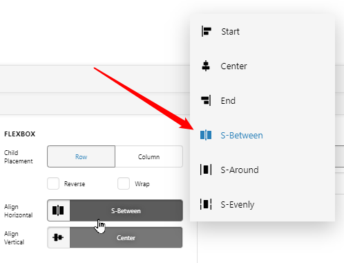
On the desktop/laptop version of the navigation, the 3 buttons in the middle are not quite centered (they are shifted a bit to the left) and we are not sure why. Can you help with this?
-
On the tablet/mobile version, there are just two buttons that are also not centered, also shifted a bit to the left. Hopefully the same fix as above will fix this. (This header is set up with a structure of 2 stacked bars)
-
In addition, the logo and the navigation menu “open” button (wine glass) on the mobile header are not positioned where we would like. We would like to have the logo positioned near the left side of whatever the viewport size is of the device viewing the site, and similarly the logo near the right edge (much like they appear on the desktop version of the header). We have viewed this current setup of the mobile navigation on various smartphone screens and the logo and the menu button end up in various positions, including a situation where the nav menu open button is pushed off the viewport to the right. What can we adjust to fix this?
Thanks for you help!