Hi,
I am working on an update of a PRO website (test-site).
The site had 2 rows of (transparent) images with link used as buttons (so background colour base / interaction set differenty) to other pages in the site. Now I want to create them with the new Grid tool, because I think it is great for this.
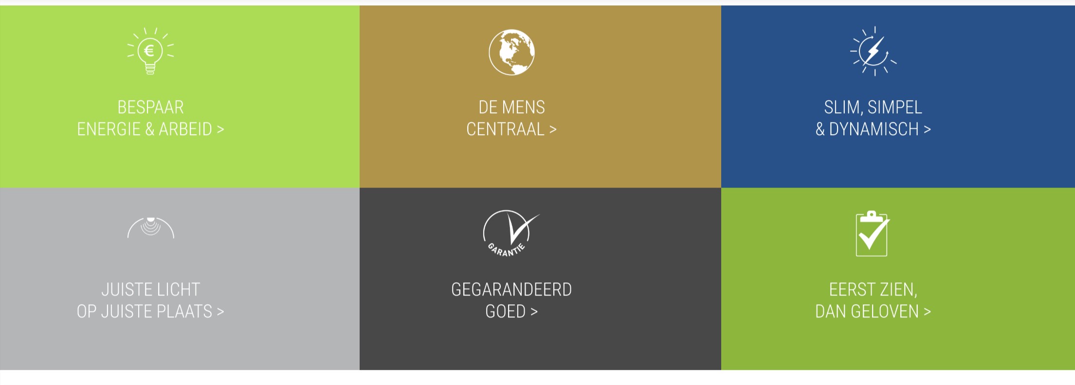
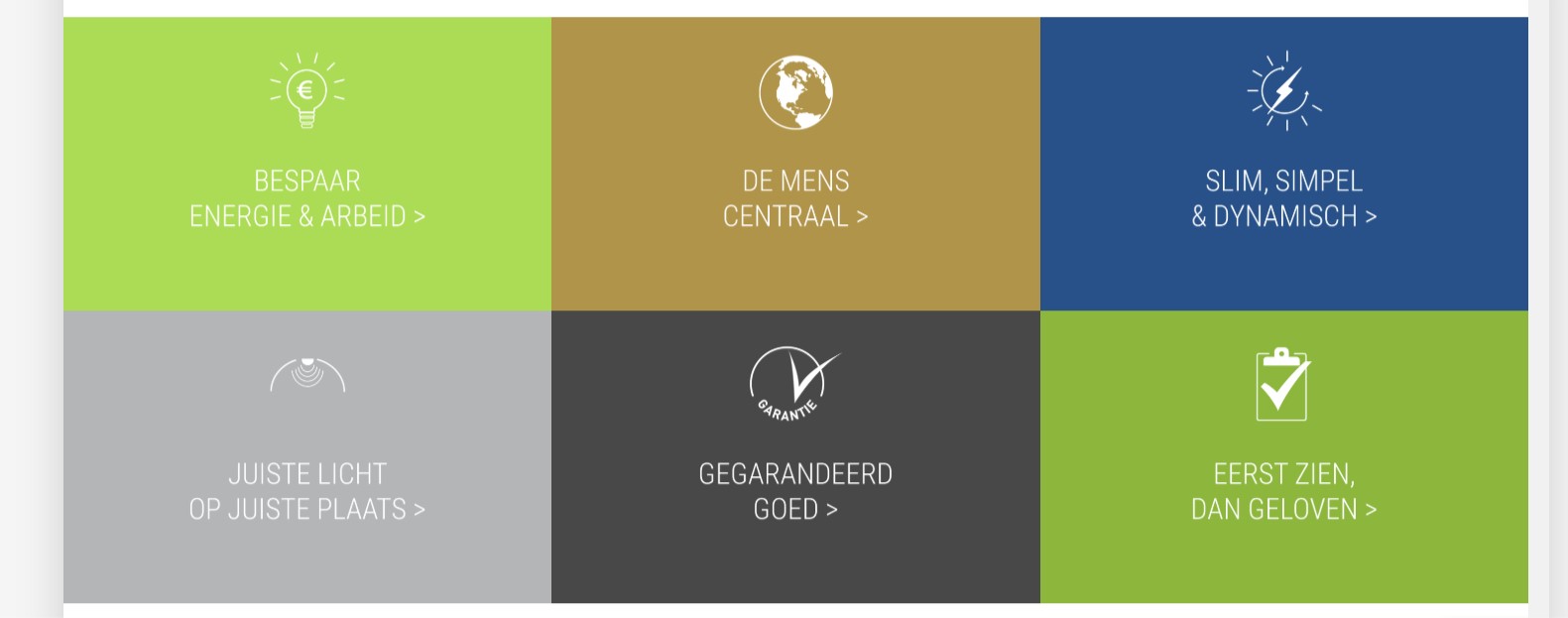
But I cannot seem to get the images stay centred on larger screens. The images stay aligned left. Most screen-sizes they are oke. But larger screens they are out of sinc.
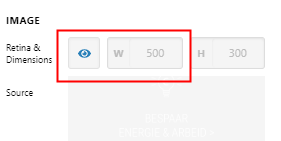
Size of the images are 1000x600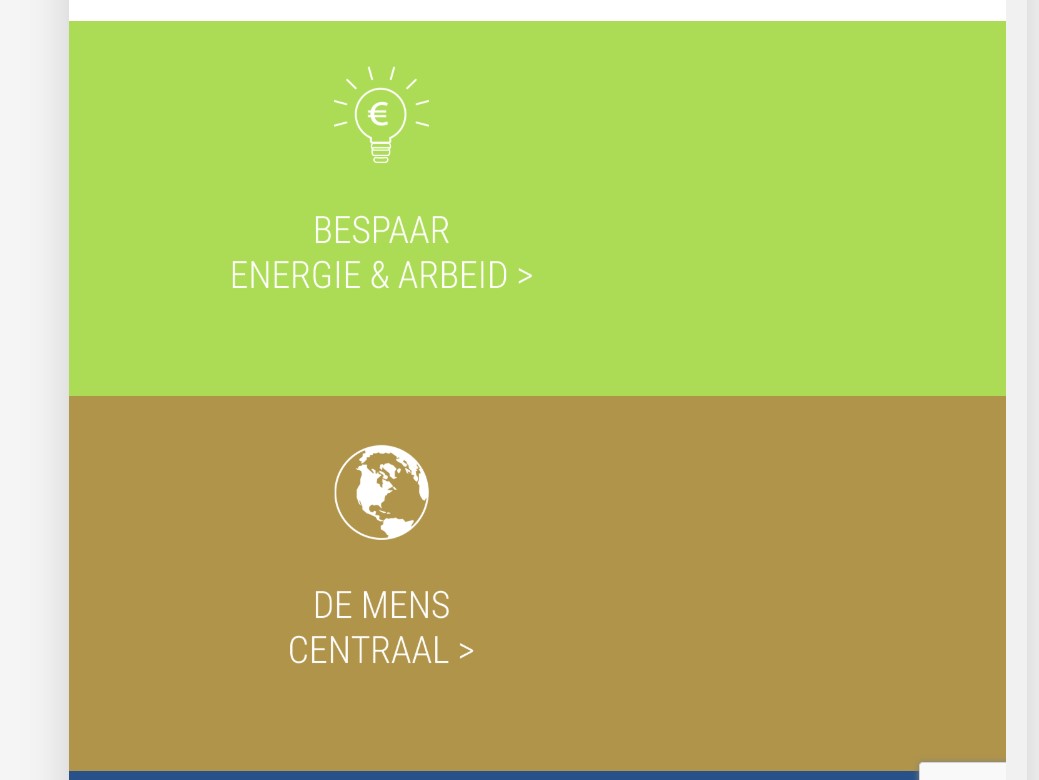
What I did:
Row: Align horiontal Center / vertical: stretch - no gaps - container
Column: flexbox on - childplacement: column (wrap) - align hor.: stretch / vertical: center
Grid: 6 cells (3 on top and 3 below) - setup: x&y content: center - x&y items: stretch both - global container: off
Cell: flexbox: on cild placemtn: column / wrap / align hor.:stretch / vertical:center
these last alignments give the cells fully coloured.
Could you please advice what I can do to have these ‘buttons’ aligned? Perhaps my approach is not good…?
Thanks in advance (again).
Liesbeth