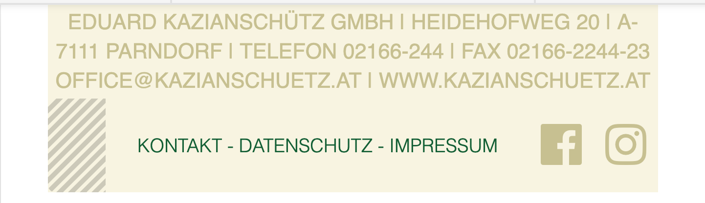
Full width site but footer should look like boxed

hi there,

i have a fullwidth layout of the site.
but my footer should be limited to 1200 px width.
i did 2 bars first with text only centered.
second a centered text and 2 social icons left. i did center all with a gap on left side.

but now i have the problem when i view this footer with smaller devices, the social icons got compressed and the centered text is not centered anymore.

is there something i made wrong?

thanks in advance

cheers

Hi Harald,

Thank you for writing in, please set your second bar to Wrap Children and set the height to auto


You should also apply your tan background in the bar itself.

Then set your containers Self Flex to Fill Space Equally.


Hope it helps,
Cheers!

hi,

thanks for your reply. i did all changes but the footer looks not like it should.
here is the footer how it looks after the suggested changes:

but it should look like this:

again many thanks for your help
cheers

Hey Harald,

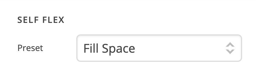
Firstly, please set the Preset option of the third container in the second bar to Fill Space.

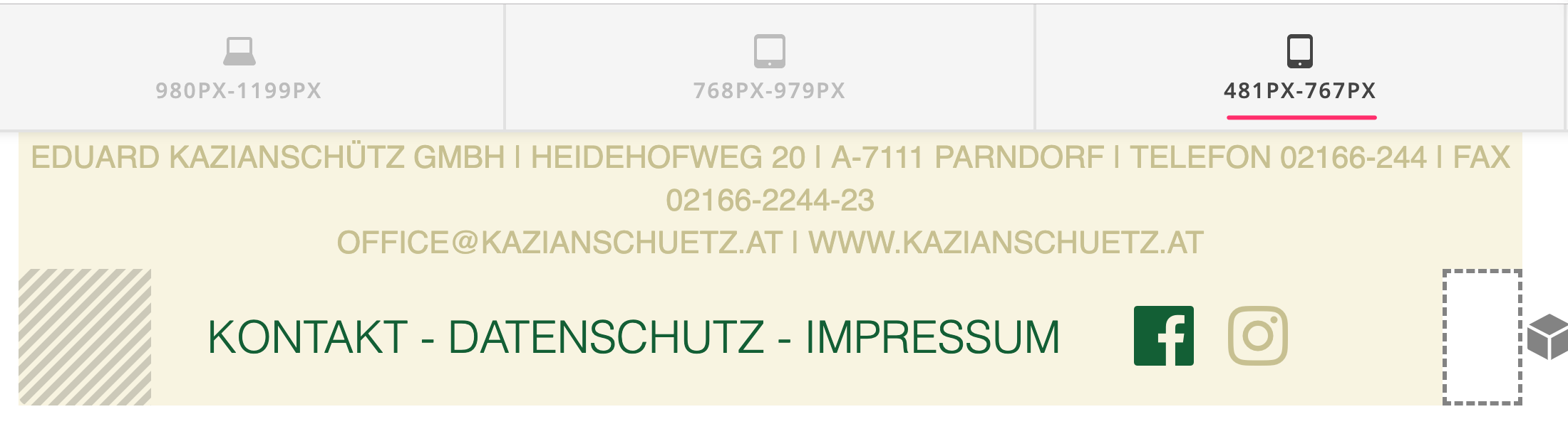
Once you do that, the result should be like this:

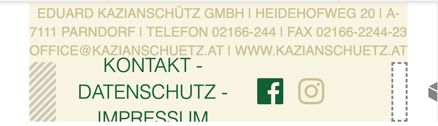
If you switch to 480px & Smaller view, you will get:

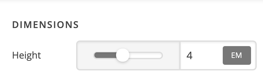
This is because there is fixed height set to the bar that contains the 3 containers.

So that solve that, you could either set the height to auto or add this code to the element CSS of the text element that is in the second bar:

@media (max-width: 480px) {
    $el {
        font-size: 0.8em !important;
    }
}

then this code to the element CSS of the container of the social icons:

@media (max-width: 480px) {
    $el {
        padding-right: 0 !important;
    }
}

The result should then be like this:

Hope this helps.

hi,

thanks for the help. will try it tonight.

cheers

You’re always welcome!

Cheers.

This topic was automatically closed 10 days after the last reply. New replies are no longer allowed.