Footer Settings for Mobile

Hello so i made a footer in Pro that has 3 columns, each containing text :

Copyright Notice
Design Link
Social Media Icons

My problem is on the mobile version of my site the footer is acting weird. I haven’t used no custom css. So i would liek to keep my desktop design as it is now and have a row design on mobile like on the image 3 provided.
Desktop :


Mobile issue:
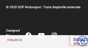
footer2
Mobile fix :
footer3

Can you guide me with some proper settings for this to auto flex properly on mobile ?
Hi Alexandru,

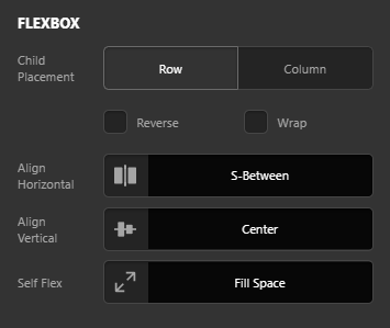
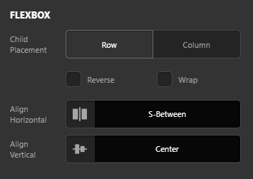
Thank you for reaching out to us. Try out the following settings: Inspect your main Bar, under Flexbox > Align Horizontal select S-Between

image

Now inspect your first container since it occupies larger space, go to Flexbox settings > Self Flex and select Fill Space:

image

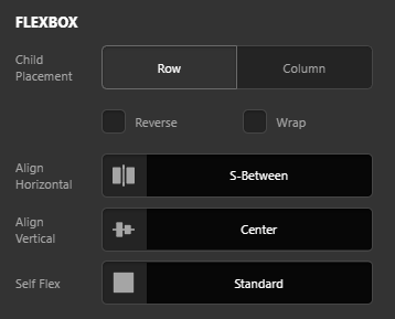
Now Inspect other two containers and make sure the Self Flex is set to Standard:

image

Let us know how this goes!

So these are my settings :
Whole Bar:


First Container:

Second Container:

Third Container:

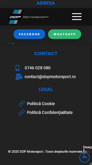
And the result on mobile:

Hello Alexandru,

Thanks for writing in!

For the footer bar settings and layout, it will will display across the screen sizes. If you want to have a different layout for mobile and smaller screens, it is best that you create two bars. One bar should be dedicated to desktops and large screens while the second bar will be exclusively for the mobile and smaller screens. You can show or hide the bars in respective screen sizes by utilizing the “Hide During Breakpoints” option. To learn more about this option, kindly check out this documentation: https://theme.co/docs/hide-or-show-content-by-device-size

Hope this makes sense.

Managed to get it to work, i made a copy of the bar, sorted it as column in flexbox, hidden the view on desktop and laptop, and changed the hidden view on the first far for mobile devices. But i need another hint on how can i align my 3 containers to start at the same line :


I want to specify that all 3 containers have the same settings as the first selected one. I tried using padding but it seems to break some stuff.

Hey Alexandru,

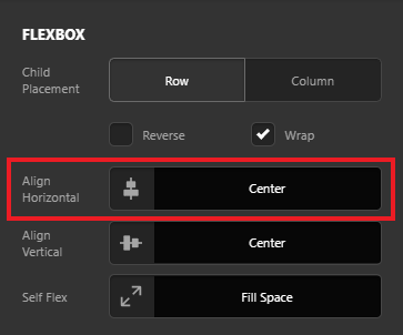
Inspect each of your Containers, under Flexbox > Align Horizontal select Center (see screenshot)

image

Let us know how this goes!

This topic was automatically closed 10 days after the last reply. New replies are no longer allowed.