Hi @streetlifebahrain ,
Thanks for writing in! Regretfully, a movable menu isn’t a feature offered by our themes. It could be possible with custom development, but this would be outside the scope of support we can offer. You may wish to consult a developer to assist you with this. Our themes are quite extensible with child themes, so there are plenty of possibilities.
If you’re using Pro, a floating menu is possible by setting the background of the bar to transparent leaving the navigation to look like it’s floating. You can position it inside the bar using the Flex options. See https://theme.co/docs/use-flex-layout. Note that what I said is “position”. I understand “movable” as the user can move it anywhere like the Facebook profile button on mobile. That one is not possible.
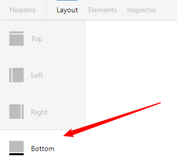
You can use the Bottom Header if you wish to position the floating navigation at the bottom part of the screen.
Hope that helps and thanks for understanding. Take care!
