Good morning,
I’ve been working on a custom stack, have a couple feature requests that relate to that functionality. If I’m missing anything with any of them, please let me know!! Cheers!
1. Support element parameter conditions keying off of theme options
I’m building a design system stack, where I’m building in dark/light mode support. And then complementary components that are able to pull in the values set up in the stack. However, I want to be able to support having a toggle at the stack level for enabling/disabling dark mode, and have the options in the element parameters change based on that.
- i.e. hide the dark controls in the elements when the stack-level option for dark mode is disabled. Currently, it looks like conditions in element parameters can only key off of siblings in their JSON structure. So, being able to somehow key off the stack-level setting for a conditional would be super helpful.
2. isVar for Theme Options
Down at the element parameter level, we can set isVar to enable breakpoint-specific controls for elements. However, it doesn’t appear there’s an option for that up at the Theme Options level for stacks. Rather than exposing 5 different fields to handle the breakpoints (like the stepped options for root font sizes), I’d love to be able to use the same type of controls for that as the elements.
- i.e. have a single field that I can click on to change the settings per breakpoint just like I could at the element level.
3. Padding in the ‘message’ panels
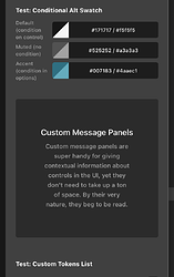
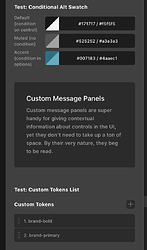
I noticed the UI of the message panels for the first time while testing actions in the new form builder, but I see that’s something I can put into my custom stacks to explain things to users. I really like the obviousness of this – however, they currently use a ton of padding, so it feels like they take up more visual space than necessary. So, could either that padding be reduced? Or, if it’s necessary to keep a lot of padding for where they’re primarily used, maybe we could pass along a value of some kind to tighten up that padding when we want to? (Plus, I think it’s generally best practice to left-align text when there are longer explanations of things anyway.)
- i.e. When I put the message panel next to my custom color repeater, I want it to be pretty small since users still need to scroll past it.
Update: I actually just noticed that I’m getting a [Warning] message can only be used as a top level control (app.react18.7.7.12.js, line 29) error in the console, so it appears that I shouldn’t actually use these at the moment – though they do technically render as you can see.
4. Picker pop-up UI in Theme Options
Down at the element parameter level, we’re able to have a nested group of elements pop up in its own picker to keep the main UI a little cleaner (e.g. make a group of controls that don’t need to be visible all the time) – however it seems like all Theme Option groups are always exposed. Would be nice to be able to tuck some lesser needed settings away to clean things up.
- i.e. I’m building controls for all the styling of h1-h6, and want to put their responsive font sizes, line height, tracking, etc. in its own pop up, rather than having exposed groups for all of them.
5. Filters for more of the basic controls in Theme Options
It looks like there are filters for things like cs_theme_options_scroll_top_group, cs_theme_options_fontawesome_group, but I didn’t see them for things like the breakpoint controls, OEmbed, or any of the other big ones that might not have it yet.
- Rather than extending blank or starter, I’m just starting from scratch and assembling things in the order I’d like – so it would just be handy to be able to put those things in the sub-group that matches how I’m organizing things.
6. Sub-Modules for Color Palettes
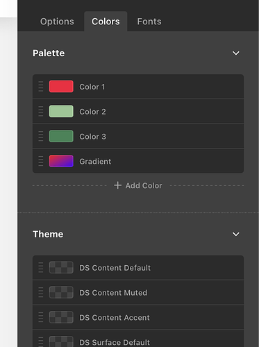
I know there are requests to allow us to group colors in the main palette in our own ways, so we could organize our workspaces a little more cleanly. This request is to also allow sub-modules for the colors that we can set at the theme level.
- i.e. when I’m programmatically adding colors to global colors, I’d like to be able to group them within the Theme section – for example, put all the accent colors in their own collapsible sub-group, all the font colors in their own group, etc.
Thanks for considering!!


