Feature Request: Styling for Element CSS / Conditions fields when they contain values

I’m testing the form stuff at the moment, and came across something that’s bothered me for a while, and figured I’d throw it in here for your consideration.

Basically, when I’m going into a page that I’ve previously built and clicking on elements, it’s not immediately clear when I’ve applied Element CSS or Conditions to an element. And I have to always click in to see.

For example, in the below screenshot, can you tell if I’ve got anything applied to this element?
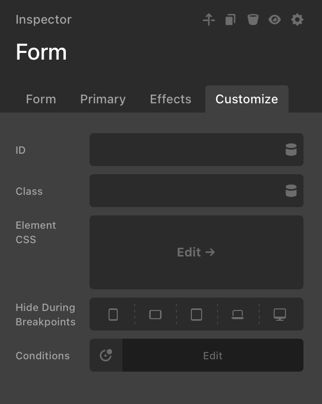
Of course I can see this in the Outline view, but it would be very helpful to have in the individual item’s inspector too. In trying to track down where I’ve put element CSS before, it’s been a nightmare to find where I put it occasionally.

I’m not sure what the appropriate UI would be within the inspector, but something like changing the styling of the words Element CSS or Conditions, or adding a badge or something.

3 Likes

Do you like the following UI better?

That definitely helps make the element CSS more obvious!

I had personally been thinking something simpler like one of the below (obviously styled more in line with your typical patterns), but would like for you to hear from more folks in the community before you go one way or the other. Tagging in @sparko @JvP @spedney who liked the original post.

1 Like

I do like the blue circle approach.

I like the blue outline from your second screenshot more than the dot. The dot reminds me of iOS where a blue dot is shown with app icons after they’ve been updated, signaling something “new”. The correct shade of blue would probably be --c-text-as-accent?

Perhaps a blue label could be shown attached to the input in addition to the outline? It could say something like “active”. Like this:

cs-group-label

1 Like

I gotcha. We are currently working on something very similar to your design. A “Control Modified” feature. It didn’t make it into this release, but I’ll try to have it ready for Cornerstone 7.9.

3 Likes

I’m with @JvP with the outline suggestion.

100% agree with what @JvP said!

Bringing this back up. Is this still being considered? :slight_smile:

The “Control modified” is hopefully ready in Cornerstone 7.9. There’s a lot of different controls and weird special cases that makes it difficult.

1 Like

Revisiting this post now since we’re getting this feature in 6.9.

I kinda like the dots inside the controls more than having them next to the labels, like it currently is in the beta. If the eventual implementation is going to be a dot that is.

After some more thought this colored outline on the control input isn’t bad either. It would have to be a different color though because a blue outline is already applied when an input is focused.

1 Like

I used a number of different apps with a “reset” feature and they all displayed them next to the control label. It looks nice in the Element CSS area, but that wouldn’t work in the “Hide During Breakpoints” or the other controls because the DC button is right there. The blue outline would also not really have a reset option.

Yup, I didn’t really think that one through :sweat_smile: