Hi Charlie,
Currently, when a Data Table’s filter panel has multiple filter groups (taxonomy-backed columns), they stack in a single column regardless of how many groups exist or how long each list is. For tables with several filterable taxonomies (for example, three or more), this makes the panel unnecessarily tall and pushes the “Clear” button a long way down.
Suggested addition: a “Filter Panel Layout” control in the Data Table element’s Filter settings, similar to the responsive column controls already used elsewhere in Cornerstone (Grid, Columns element), allowing:
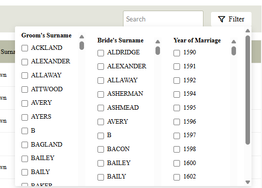
- Columns per row : a numeric or breakpoint-based selector (1 to 4, say), so users can set how many filter groups display side-by-side
- Per-breakpoint override : matching the existing Desktop / Tablet / Mobile responsive pattern, so a table could show 3 columns on desktop and collapse to 1 on mobile automatically, without custom CSS media queries
- Optional max-height per group with scroll : since some filter groups (surnames, years) can run to hundreds of terms, a per-group scrollable max-height setting would pair naturally with a multi-column layout, keeping the panel a fixed, predictable height regardless of term count
- Clear button placement : an option (or just a sensible default) to always span the Clear button across the full width beneath all groups, rather than sitting under whichever column happens to be shortest - or place it at the top of the panel
This would bring the filter panel in line with how other Cornerstone elements already expose column/breakpoint controls, and would remove the need for hand-written CSS overrides on .cs-datatable-filter-panel and .cs-datatable-filter-group for what’s likely to be a fairly common request, particularly for genealogy, directory, or catalogue-style Data Tables with several taxonomy filters.
Here is some sample CSS to illustrate what I mean, together with a screenshot of the result:
.cs-datatable-filter-panel {
    display: grid;
    grid-template-columns: repeat(3, 1fr); /* explicit column count, not inferred */
    gap: 24px;
    width: auto;
    max-width: 900px;
}

.cs-datatable-filter-group {
    max-height: 320px;
    overflow-y: auto;
}

.cs-datatable-filter-clear {
    grid-column: 1 / -1; /* spans all columns regardless of count */
    margin-top: 12px;
}

/* Tablet: drop to 2 columns */
@media (max-width: 1024px) {
    .cs-datatable-filter-panel {
        grid-template-columns: repeat(2, 1fr);
    }
}

/* Mobile: single column */
@media (max-width: 782px) {
    .cs-datatable-filter-panel {
        grid-template-columns: 1fr;
    }
    .cs-datatable-filter-group {
        max-height: 200px;
    }
}
I hope the suggestion makes sense!
Many thanks,
Chrisropher