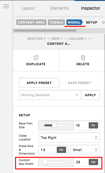
I have a row containing a grid with 9 columns set to 14em which contain a headline and a content area modal.
Content Area Modals appear (to me) too wide on the largest screens and way too narrow on XS.
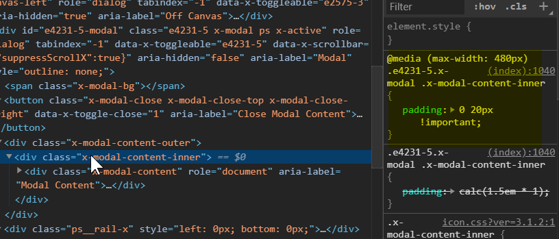
So I’ve set thd CSS below on the Row, but it doesn’t seem to be taking effect. (Once solved I will set the css to work globally for all content modals)
@media (min-width:981px) {
$el.x-modal .x-modal-content-outer {
width:50%;
margin:0 auto !important;
}
}
@media (max-width:767px) {
$el.x-modal .x-modal-content-inner {
padding: 0 30px !important;
}
}
What have I missed?
Steve