Hello,
I am using Cornerstone to design my homepage, but I am having some issues lining up the sections on my website.
Issue 1: The top image is not centered on Desktop. See the attached screenshot. Looks okay on Mobile.
Issue 2: I created two sections - Popular Categories and Trending Articles.
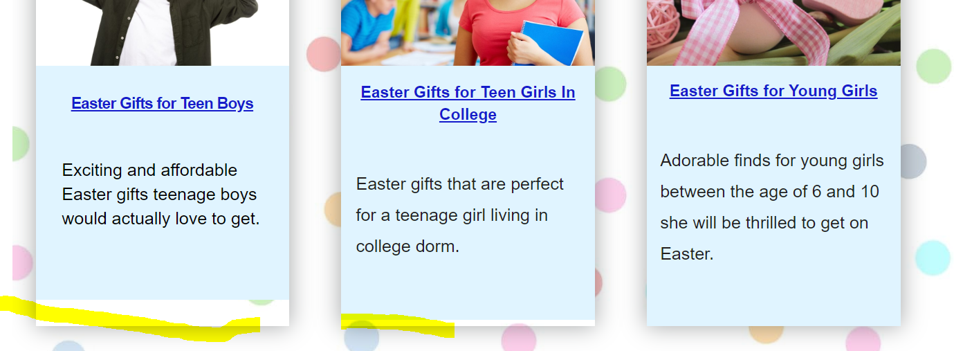
Below each category are three sections with images and associated text at the bottom of each image. The issue is that the text at the bottom of each image is spreading out of the container. See the image attached.
When I increase the Margin the space between image and text heading increases, which I do not want. The headline and the column container also misaligns.
See attached screenshots.
Issue 3: Section 9 I added an image. How do I increase the size of this image? If I use the ‘classic image’ element instead of the ‘image’ element, the image appears large but then I cannot add a URL link to it. To be able to add a URL link I have to use the ‘image’ element which is keeping the image too small.
See attached screenshot.
Under Flexbox, set Align Horizontal to CENTER
It looks center on mobile because the image occupies the entire column
Remove the negative margin. Then no need to add another headline tag h4. The tag is automatically added once you choose on TAG settings. See this headline element documentation. You can directly add links like this no other tags and style:
<a href="#" target="_blank" rel="noopener" >Easter Gifts for Teen Boys</a>
Use the headline element settings to design how it looks.
For the text below the link, use SUBHEADLINE setup. Set it to ON, then add the text. No extra html tags needed. You can also set how it looks on the settings. Refrain from using negative margins. Those extra tags that you were using adds those spaces because headline has margins by default. Basically, you are adding a headline inside a headline. So don’t add those tags. Add the text only. Please review element documentation for guidance.
Better to use v2 image element. Please check v2 image element settings here. The image will display 100% of it’s size or if it is more than the container size, it will follow the container size. There is WIDTH, MAX-WIDTH and RETINA & DIMENSION settings. It affect the size of your image display too so please check that.
thank you for the quick response.
I followed your suggestions, and I still see the following issues-
Issue 1:I switched on the Flexbox setting and set alignment to center, but it didn’t help. I set the margin to 0 and played around with Padding to somehow center the image, it helped, but not entirely. See the screenshot Issue1.
Issue 2: Thank you for the suggestions. I still notice large blank space between Heading and Subheading text.
I set the margin to 0 and played around with padding to align the Heading container and Column container but it is not working out. Looks like each container requires a different amount of padding but that affects the height of the other containers in the row and you can see blank white space at the bottom. Please see screenshot Issue 2B. I highlighted the misalignment in yellow.
Issue 3: I can’t find the V2 image element. The documentation link you provided did not help. There is no option to choose Type - Standard or scaling (per the documentation) for image settings. For now, I was able to center it, and that is okay with me.
Issue 4: I created a section with text and image layout but there is too much space between the image and the text on right side on Desktop. It looks okay on mobile because the text is pushed to the bottom of the image. How can I delete the extra space between? See screenshot Issue 4.
I also want to know if there is a way to display the image in a circle, like in the documentation here-https://theme.co/docs/image. I could only use the Inner Border Radius setting but that didn’t result in a circle.
To better assist you with your issue, kindly provide us access to your site so that we can check your settings and investigate the issue one by one. Please create a secure note with the following info:
– Link to your site
– WordPress Admin username / password
To know how to create a secure note, please check this out: https://theme.co/docs/getting-support
Thank you for the credentials, I see that you’re using negative margins and huge fixed padding to position things on your page. This is not a good practice, so the first step is to remove all the negative margin and padding you applied on Sections, Rows, Columns, and to the other element that you have applied negative margins and fixed huge padding, (leave only the default 45px top and bottom padding on the section). These may sound counter-productive, but it will help you in the long run.
This should normalize things and easier to edit. For example that Unique Gift Ideas banner you have should be easy to center by just setting the column’s Text Align option to center, but it’s not because of the negative margins. These negative margins also have something to do with those not-aligned headlines, not to mention the responsive issues that comes with it.
Regarding this white area issue,
Please apply that baby blue background on the Column, not on the text.