HI I know i’m missing something simple, some of my 2 column rows are stacking on mobile (home page) and some are not (golf page). What am i missing?
And my heading fonts don’t seem to be scaling to mobile as well, thoughts?
HI I know i’m missing something simple, some of my 2 column rows are stacking on mobile (home page) and some are not (golf page). What am i missing?
And my heading fonts don’t seem to be scaling to mobile as well, thoughts?
Hello @designbabe,
Thanks for writing to us.
I checked your site it seems that the Header fonts are working fine at my end. It might be the issue of the browser cache at your end. Please clear your browser cache and then check it again.
To change the column layout on the small screen I would suggest you please go to the Row—>Layout —>Click on the Template —> Now you would get an option to set the column layout as per your design.
Hope it helps
Thanks
Prakash,
thanks for your reply
i can do that, but i’m also just confused why the sections in the middle of the homepage are stacking on mobile but the sections are on the about page or the golf page see screenshots, I just would rather make them so tehy stackvs always have to make a 2nd section .lmk
Hello @designbabe,
I checked your setting it seems that the responsive setting is been not set there properly, I would suggest you please follow the steps I have mentioned in the above post to get the proper desired column layout for each breakpoint.
Thanks
prakash_s
thanks for your reply. I appreciate you help.
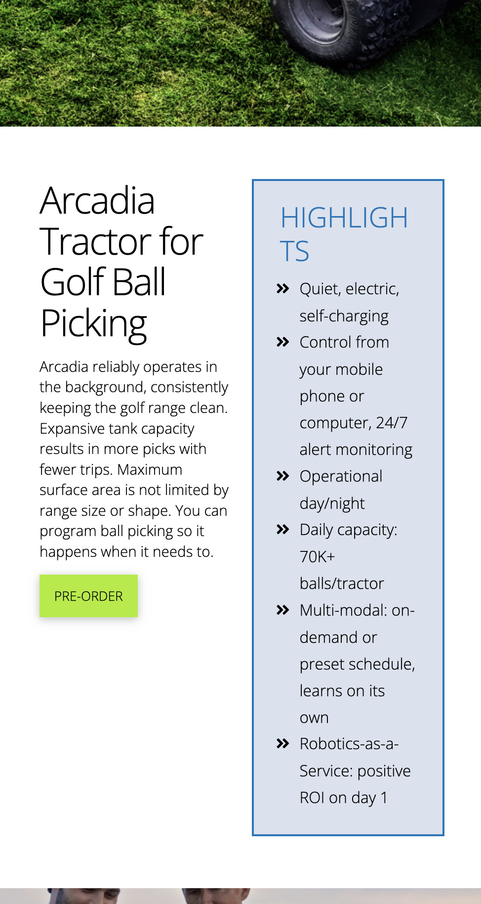
Yes i understand your instructions for making the alternative hidden row for mobile/small screens… i just have been using X for years and usually have to do this for some sections but not but not a lot and especially not simple text ox /image rows… so i’m just asking why is it working to stack without an alternative layout on the homepage middle section where it says “born autonmous” adn then not working on the golf page where it sys “highlights”? I was just seeing if there was a setting i could change those rows vs create all these alternative layouts for simple rows, bc i didn’t have to do that before.
LMK
thanks
Hello @designbabe,
The Columns did not collapsed because it has been explicitly set to display two columns in all screen sizes.
The correct and responsive setting should be like this so that the columns will collapse:
You will need to enable the Responsive Styling and then set the Columns Layout in your ROW element to just 1 when the screen gets smaller. If you are not familiar with the Responsive Styling, please check out this documentation first:
Or check out this video:

Hope this helps.
This topic was automatically closed 10 days after the last reply. New replies are no longer allowed.


