Hi there,
I thought that my header menu would automatically collapse into a hamburger on mobile, but it’s cutting it off instead. How/where do I adjust this?
Thank you 
Hi there,
I thought that my header menu would automatically collapse into a hamburger on mobile, but it’s cutting it off instead. How/where do I adjust this?
Thank you
Hello @artthescience,
Thanks for writing to us.
You to add the Navigation Dropdown element for the mobile menu. You need to hide the Navigation Inline element for mobile devices and enable it for desktop devices. You need to hide the Navigation Dropdown element for the larger screen.
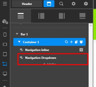
To hide and show you can use the breakpoints. Please have a look at our doc to learn more about how to hide & show content using breakpoints.
Hope it helps
Thanks
This topic was automatically closed 10 days after the last reply. New replies are no longer allowed.

