Howdy @theotcspace,
Thanks for writing in and for testing things out! I’m not sure I’m quite following what your desired goal is here. You say the text alignment eventually stops working? Is there any way you could provide a quick video of what you’re trying to do?
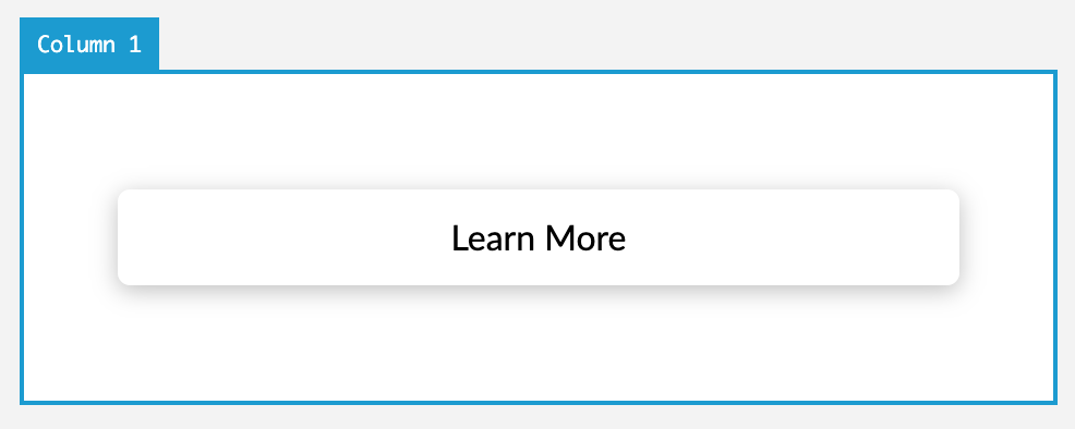
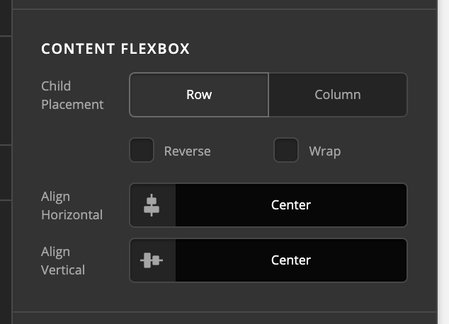
One thing to remember is that the Button Element uses flexbox to position the content within itself. The content within the button is “placed” to a particular spot (i.e. Start, Center, End, et cetera) and then from that placement, it can be aligned. And text alignment will only be visible if you have wrapping text. For example, this button is text aligned left, but it appears “centered” because its flexbox positioning is Center / Center:


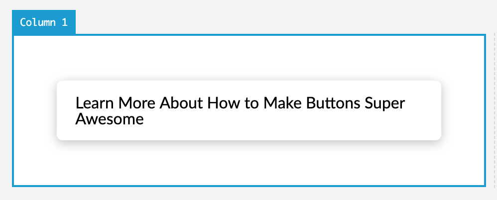
This is because the text is not long enough to wrap, so you won’t see any sort of text alignment. However, if I increase the amount of text, you will see that it now appears to be aligned to the left:

The text is now long enough to wrap, so even though it’s placed Center / Center with flexbox, it is filling all space and wrapping, allowing text alignment to visually take effect.
@Georgich, thanks for popping in to help out! Just wanted to clarify that all v2 Buttons in X and Pro use inline-flex as their display. And there is no need for using the classic row / columns and their “Marginless Column” options now, as with the new row you can define gaps directly on the row and make them 0px to be “marginless,” and then using the new flexbox controls on the Column you can easily center things vertically or position things just about wherever you want.
Hopefully that helps!
