Beta 6 columns on mobile ignoring layout choices

Thanks for the latest Beta, and I can confirm the rows within rows seem to be behaving now.

I’ve left this problem till now just in case it was fixed with all the row/column changes in beta 6 but this was also a problem in beta 5

I have various rows with multiple rows that are working perfectly on desktop chrome.
on the desktop and in the settings it displays 2 ‘rows’ of 3 columns until the screen is smaller when it displays 3 ‘rows’ of 2 columns.

Desktop ‘mobile’ view ^

on mobile (chrome on Apple XR) it only displays one column per row while also appearing to leave space for the next column

mobile view on Apple XR on chrome

Hi Scot,

This seems similar to the CSS issue that made nested rows work when corrected. It was actually a matter of rows using the row layout settings of another row on the page.

Could you try resaving these pages? Or you could go to Pro > Status in the dashboard and clear the style cache. Let me know if that corrects it. If now, would you mind if I logged in to take a closer look?

Hi @alexander I have cleared the style cache, cleared the WPRocket Cache, disabled varnish cache. gone in and resaved the columns and still the same

login details in this thread:
https://theme.co/apex/forum/t/header-editor-no-longer-previewing-any-header-beta-6/62799/4

Thank you! Ok, false alarm on the row styling being an issue. After a closer look all that is working correctly. The problem is actually that your mobile buttons are too big for the column.

If you for example add this CSS:

.x-col { overflow: hidden; }

That will prevent the contents of columns from making their size any larger. It’s not a great solution because it could lead to things looking slightly cut off. The widths of the columns themselves use flex-basis which is more forgiving, and will allow things to wrap like they do now under the condition that the column is wider than expected.

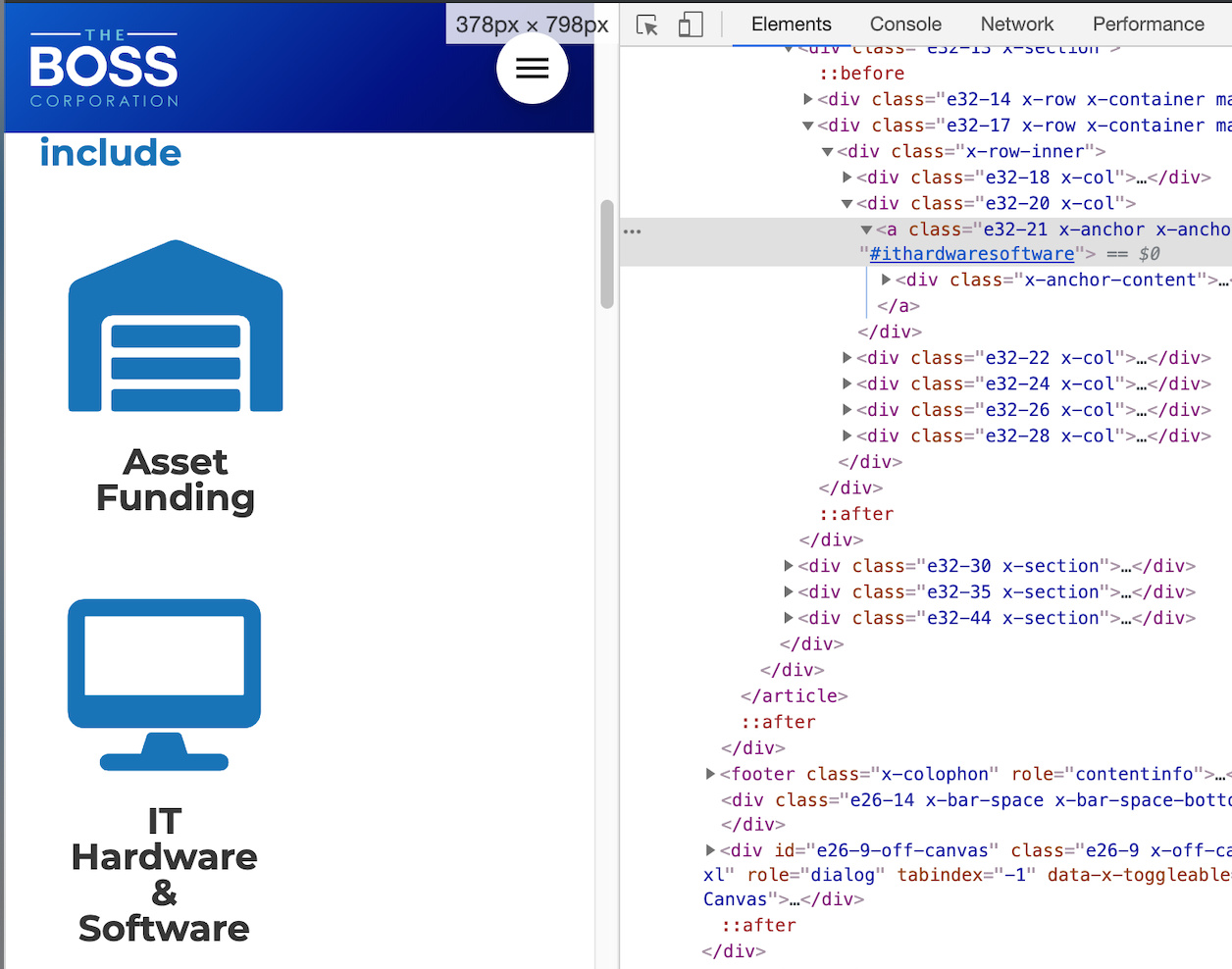
This issue starts to happen on mobile screens that are 410px or narrower. My poor man’s but super simple way of testing this kinda stuff is opening my browser’s developer tools and toggling it to appear to the side of my content. Then you can resize the panes and get experiment with crazy small sizes. For example:

Getting this to look right is probably just a matter of playing with the font sizes until it scales correctly. You’ve just got a bit too much for those font sizes at screens that small. Try this element CSS on the row:

@media (max-width: 480px) {
    $el.x-row {
        font-size: 0.5rem;    
    }    
}

That should shrink it down. This is a great example of how powerful it would be to allow changing any style (particularly font size) at a per breakpoint level. Definitely on our roadmap.

Yes yes yes… I catch this. If element width is more than row/column width it’s not wrapping, it’s shrinking )

In that case then i found it i start to use CALC everythere (headlines).

Thanks for that @alexander

This worked… well it worked once I’d made the media query !important. 0.7rem seemed to be my sweet zone

You’re welcome! Glad that it’s working now.