In the next beta, “Fullwidth” will be selected as the Theme Options default layout in addition to the “Blank - No Container | Header, Footer” template being set as the initial value for new Pages created. This will force a true fullwidth canvas for everyone and set things up more in alignment to what people tend to want / expect nowadays.
9 Likes
 - thank you!
No problemo, amigo.
Hi everyone! Just arrived here in the beta forum. I’m testing out the new beta and I already liked the new UI overall, I have just some considerations:
-
I’m missing the “Load template” and “Save template” buttons right above the page outline:

The same thing for my elements presets:

I see that now we can save elements as templates here:
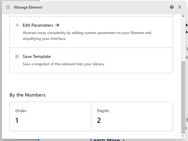
But it seems that the only way to load this template is adding a new element on the Elements panel. It would be great to have both options, like we had before. -
I understand why you made the changes in the UI to keep things organized between documents tabs, tools panel, breadcrumbs, etc. I already used a similar setup (but with breadcrumbs at the top and tools panel at the left side). What’s bugging me (and my “OCD”) is this black overlay when you open the Cornerstone menu:
While the tools panel is right oriented, it seems more “ok” to me, but as soon as I changed my panel to the left and saw this, I missed the way it was before:
I “fixed” this just by adding “.tco-content-nav-overlay {background-color: transparent;}” into my UI CSS in Dev Toolkit and, for me, it looks way better like this:
-
One last thing is the “Run” option in Page JS and Global JS that I use a lot when something goes wrong with the preview rendering. I see that now we can navigate between tabs to “reload” then (and we still have the “Run” option one more click away now), but I think it would be very helpful if we had a dedicated “Reload” button that would refresh just the preview to fix those rendering errors that occurs now and then.


And that’s it, those are my initial thoughts about the new UI, but as I said before, I already like it a lot and can’t wait to use the new Cornerstone to build, hope the final release comes soon!
Congratulations to the team and keep up with this great work!
congratulations for a new design and the added functionalities I love how it looks. I would like to be able to hide the left toolbar to be able to make adjustments from the mobile without activating the desktop version.
My current view from mobile https://ibb.co/DCLmP9v
If you can tell me the code to hide it and show it with a button from the mobile
Thank you
Howdy, @RDADALTE! Thanks for writing in and for you thoughts. Allow me to address them one by one:
- Please see my comments here on the application of Element Templates (formerly known as Presets). As for the “Save Template” / “Load Template” option for Section Templates, this is not currently present on the Outline pane but will be coming back before the beta cycle is complete.
- We appreciate the feedback here, the new menu will stay as is for now. You are certainly free to modify things as you wish using the custom UI CSS feature in Dev Toolkit as you referenced.
- I’ll see what we can do about a “reload” action on the tabs…it might be something that’s tucked away under a right-click context for them if we do it.
@jacquelinemq, thanks for writing in and for your feedback as well. We’re glad that you’re enjoying it overall! As for your request, we have never marketed Cornerstone as a builder that can be used on mobile devices for editing. The entire building experience is based around working on a desktop as all interactions from the ground up are thought of in that manner. For that reason, there isn’t a quick fix or way to easily add a button to show / hide the sidebar as you’re discussing here. For now, we ask that all users utilize Cornerstone in a desktop environment to fully take advantage of all the features it has to offer. Thanks!
3 Likes
Just wanted to send a kudos to the team after finally putting this up on a dev site to try out. Other than having to get reoriented to the layout, 6.0-b2 is fantastic. Well done!
Side Note: it’s running on WP 6.1-b3 and PHP 8.1.2 with zero issues.
Thank you for the kind words, @xRae! That’s wonderful to hear and we’re glad that you’re getting along well with things. 
Hi @kory! To continue on the thread, I have some more UX concerns.
-
Inside the Outline, we have a mix of Containers and elements. We can also rename the containers, at which point we have no clue about the type of the container. Is it a Div, A Column, Row or even the “Slider Container”, which is actually a specific container with additional options. I catch myself spending a lot of time trying to identify the type of the container I’m currently in.
-
Inside the Outline, “Add section” is replaced with “Add element”, making adding the new section a longer task. It requires a click, scroll and another click. I find this too much considering adding a Section at the top level is still the most common task.
Scroll is happening if we have favorite elements above, pushing the “Layout” part below the fold. To make things worse, Section is placed last on the list.
I believe that we need a quick way to add new sections inside the element pane. I’ve noticed that “Add classic section” is gone when we CTRL+click. If that was intentional, then perhaps CTRL+clicking “Add element” could insert a section directly.
Howdy, @Misho! As always, the feedback is certainly appreciated and we take everyone’s thoughts into consideration. Here are my thoughts on these things at the moment:
- One of the realities of adding more flexibility to the document structure over time (as people have requested) is the mixing of “Layout” Elements with “Standard” Elements. At this time, without completely rethinking some things, I’m not sure there’s much we can do in the Outline itself as this is simply the nature of working with multi-dimensional documents. Something I personally do in various builds is prefix / suffix things with a naming system that makes sense to me. For example, I might do something like “(SEC)”, “(ROW)”, “(COL)”, “(GRD)”, “(CLL)”, “(DIV)”, as a convention to give me more oversight from the Outline pane itself. As part of this Beta cycle, one of the biggest changes we’ve made to help with identifying Elements is on the Inspector pane itself. By default, the name of the Element is used in the title, but if you rename the Element, the “Inspector” title at the top of the Workspace is replaced with
{{element_type}}. For example, if you had a Button that you built out of a Grid with multiple Cells inside it, you could rename that Element “My Button” and right above it you will now see “Grid” to help you understand which Element you’re on. I know this isn’t on the Outline pane, but a naming system that makes the most sense to you paired with some of these other updates I think are a very clean way to do this. Other apps like Figma for prototyping basically do this…they offload much of the understanding of what you’re working with to the label itself, encouraging users to use a slash syntax to group and identify content easily (e.g. “Button / Primary,” “Button / Secondary,” et cetera). - We understand that this adds an extra click at the top-level; however, it also lends more consistency throughout the whole document. Now, clicking to add an Element is always the same outcome presenting you with the whole library to work with. Unfortunately, if you have a lot of Favorites as you mentioned, it might push down the new “Layout” group introduced in Beta 2, but this is a reality of surfacing those individual items. Additionally, the search field is highlighted by default, allowing you to start typing and find any Element and surface it even if it is quite far down the list. Finally, adding Sections are the outlier…I understand that at the top-level it is likely common to need them, but far and away once you move beyond that level, you’re working with everything else (Sections aren’t even allowed nested). Once you have one Section on the page, it is also possible to duplicate another and use that as a starting point. So I think all of the tradeoffs considered here and the consistency this experience provides, we will likely be keeping things as is for now as a big part of this update is trying to bring more consistency to how things are done and have less outliers.
Thanks!
1 Like
All right, I understand. We’ll get used to the changes.
I noticed a small issue in Beta 2:
When clicking “Add Element” in an area between sections, if that happens towards the middle of the list, the window opens upwards and the search gets cut off. (Chrome + Windows).

This happens only with two positions in the middle of the list. The rest forces the window to open upwards or downwards and it is all OK.
Hey, @Misho! So you’re saying the search is getting cut off by the browser window itself, correct? I can see that this does indeed happen for me a little bit depending on my page layout and where I click on the “Add Element” button. This isn’t entirely unavoidable due to the variable nature of different users’ screens, setups, et cetera. One thing you could try is adding the following to your UI CSS file:
:root {
  --d-picker-modal-is-elements-max-height:    360px !important;
}
This will allow you to reduce the max-height of the Elements picker modal. The default is 400px, so something like 360px may reduce it just enough on your device to keep the search from getting cut off and have a little more wiggle room going up / down.
Thanks!
Thank you @kory, I’ll try that.
I just run into a much bigger issue: I created a staging copy of https://www.optika-kobacic.hr/, to test the Beta 2 out.
Here is a WooCommerce category layout: https://www.optika-kobacic.hr/katalog/naocale/dioptrijske/
This is how it looks on Beta 2: https://www.staging11.optika-kobacic.hr/katalog/naocale/dioptrijske/
Basically, there is no Pro Layout. That’s the default WC archive.
I am not sure if the fact that Permalinks Manager Pro was used to get logical URL’s is the problem, but this isn’t happening in the current Pro version.
I’m adding the secure note with access to both websites.
Thanks!
EDIT: I just tried on a different website. All Layouts got the default WP sidebar. Then I deleted the Beta and put Pro 5.0.8 back, but the entire website was broken, including the homepage. I had to restore from the backup to get the site back.
Here’s another one:
Please try clicking the top navigation item called “Brendovi” on this website:
An off canvas shows up, with this design:

On Beta 2, it looks like this:

Thanks!
@kory, I forgot to confirm that the issue with the observer was resolved in Beta 2. I can edit pages on all Installs. 
1 Like
@Misho, thanks for sharing all of this.
- With regards to the WooCommerce layout not getting carried over, I have tested this out myself and can confirm I am experiencing the same issue. I have an old test site on the previous version of Pro and it had a Blog, Post, Shop, and Product Layout all built out and assigned. When I upgraded that test site to Beta 2, I can see that my Blog and Post Layouts are carried over, but my WooCommerce ones are not. So something is happening specifically to those post types, and we will look into what is causing it. My Blog and Post Layouts carried over fine and are outputting as I had them previously.
- For your navigation, was this an Off Canvas area with perhaps the Navigation Stacked or Navigation Layered Elements used within? I built out a test trying to mimic something similar, and while I did not have a seemingly complete loss of styling as you did here, I did get a few mixed up issues with my icons in particular when using those inside the Element. Everything else seems to be fine (even my close button retained it’s styling). If you could give a few more details here, that would be helpful so I could try and recreate your situation as closely as possible).
- Thank you for confirming on the “Edit Page” observer issue…I will mark you off there!
1 Like
Thank you @kory!
- The navigation is an Off-canvas element with the Navigation Inline added to it. It is just vertically oriented.
Got it, thank you!
1 Like
Hi @kory continuing on the original thread, if it is a problem to add a preference setting to display Copy/Paste JSON in the context menu, then it would be great if the Tools > Elements section was at the top inside the Dev Toolkit. This would make sense since it is such a useful and often used option.
Howdy, @Misho! I have noted this down, but at the moment we are working through other line-items to ensure stability with the main release features. Thanks!