Hi Zenia,
I see what you mean. I think your approach is not an effective one as you have a big image with those lotus images at the top left and bottom right. It will not work as the browser tries to accommodate the image within the container. So you see the issue here? For small devices, you want to force a 2000+ pixel image to cover both ways for a container of for example 600 pixel. That is not possible as you want to push both edges of the image shown. It doesn’t matter if you use Pro Editor or any page builder your approach will not work, and it is not related to the builder itself.
The reason classes page works are that the content height is small. If you add more content there and the height enlarges, then you will see the same problem.
Here is my suggested approach:
- Separate the backgrounds, have an image with a lotus at the top left and another image with the lotus at the bottom right.
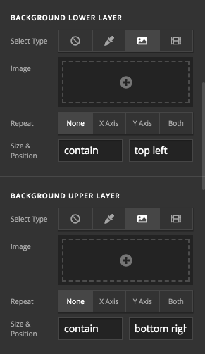
- Then, go to the section settings that you added by clicking the magnifying glass:

- In the section settings add the top left image to the lower background and set it to be positioned at the top left and make it contain the image in the container.
- Add the bottom right one in the top background layer and set it to be bottom left and contain in the container:
That should do it  .
.
Regarding the second question:
I am not sure if you are familiar with the Header Builder of the Pro theme, but you use that builder, and there is no image added to the builder to show in the first place. I suggest that you read more about the header builder here:
To add the logo, I suggest that you use the Image Element in the header builder.
Finally, I suggest that we keep different questions in separate threads, that will help us focus on each case, and it will help other customers to be able to focus on the issue if they have a similar question:).
Thank you.


