A few Issues to tidy up

Hi there,

I have a few issues to ask for your help please.

1.) Tagline underneath logo.
I opened this topic earlier but it had been closed. I’ve created a dynamic header but can’t find where to add a tagline underneath logo as @lely’s recommendation on this link.
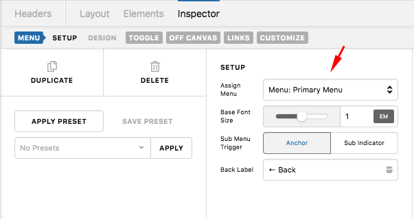
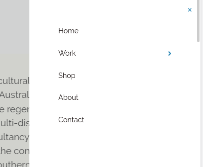
2.) Menu
I assigned the header to all pages. However, I’ve added the navigation layered for some devices later on and updated to the header. The navigation layered is not activated to the actual menu. It keeps showing the default menu that set by the template. See in the attached images.

Screenshot from 2020-05-26 17-55-45

3.) Text not responsive
I’ve added buttons over the images. The texts on buttons do not responsive when showing on tablet and mobile devices.

Thank you.

Hello Suwanna,

  1. Please make sure that you have the Dynamic Content enabled so that you can find those options:

2./3. Kindly provide us with the URL and admin details of your site in a secure note so that we can check your current setup.

Thank you.

Hi there,

Thanks for the question 1.)

I’ve provided the info in the secure note.

Thank you.

Hello Suwanna,

2.) Please edit your custom header. Click the Navigation Layered element and in the menu set up, assign the Menu: Primary.

zTI6Da54QJGMhMU3sniYhA

The Submenu Trigger should be assigned to “Sub Indicator”.

3.) The font size of the button inside the boxes are using 3.5em which is too big for smaller devices. You will need to resize it in smaller screen instead. You can add a custom @media CSS code to set a smaller font size when viewing the page ins smaller screen. To do that, please click the button, find the “Customize” tab, Button > Customize and insert this inline element css:

@media(max-width: 979px){
  $el.x-anchor .x-anchor-text-primary {
    font-size: 1.8em;
  }
}

Please note that custom coding is outside the scope of our support. Issues that might arise from the use of custom code and further enhancements should be directed to a third party developer.

This code above is just an example. You may need to adjust the font size that will fit decently to your phone screen. To know more about the CSS @media and font-size CSS property, please check this out:

By the way, please also check how you can set up the Root Font Characteristic so that the font sizes will be a lot more responsive in different screen.

Hope this helps.

Hi there,

Thanks for the suggestions. All work well.

Glad that we could be of help Suwanna.

Cheers!

This topic was automatically closed 10 days after the last reply. New replies are no longer allowed.