Thank you Paul!
Ok, so I solved almost all the issues so far  Let’s see what doubts /issues I still have
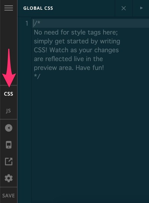
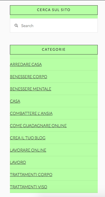
Point 2: It “half Worked”. Indeed now I get how I should place the CSS, but in my specific case, the result was a bit off. I wanted to either have the color inside the “box” or remove the box and just leave the rectangular “header” with the title colored. The Categorie title should be the one to be colored, not the rest. Just the titles.
I got this Instead, surely there is some CSS command I don’t know to try the 2 options I mentioned above and see which one looks best… any advice? What CSS should I add to the one I have already placed?
Regarding the related posts (by category is totally fine) I solved the issue as you explained and now it is working properly. Only one question, is there a shortcode for that so that I don’t have to put the whole thing manually every time? (Including the grey lines/gaps and the custom header I added?)
It should look like this:
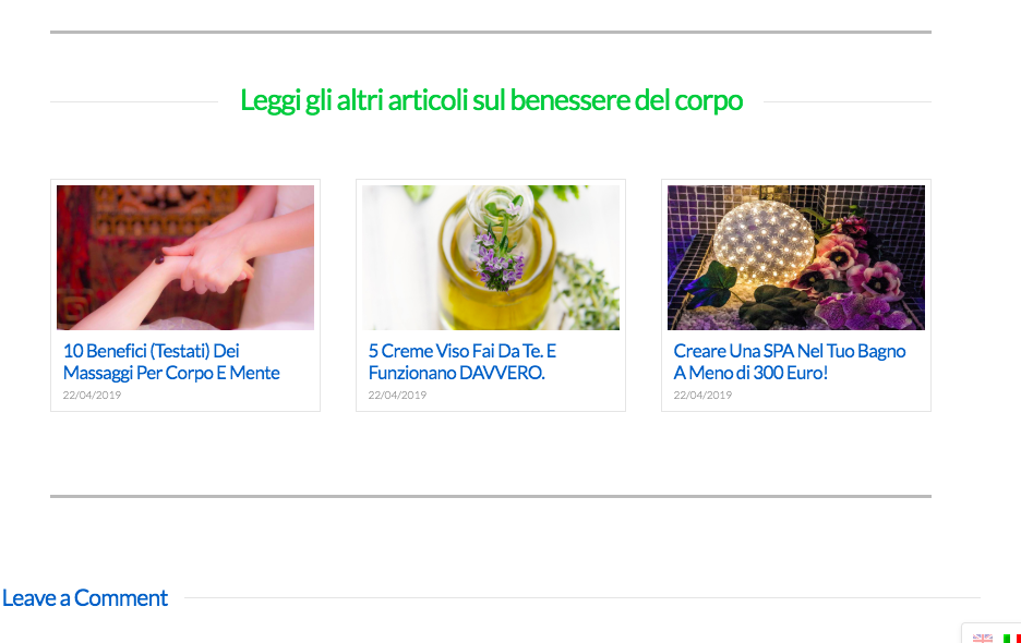
Not sure if it’s possible with a shortcode, maybe with the global blocks?I’ve never used those or even cornerstone on my other websites (always Visual composer) so I’ll have to learn of course, but maybe that’s a solution to avoid doing some boxes manually every time?
CHILD THEME: I added it, thanks! I have a question… now that I have that, what happens to the CSS I added to the Pro Theme? Should I move them to this Child theme? No idea on how to proceed but I don’t want to bother you at the next update if I lose all the layout edits
I have a couple of little things I also wanted to ask:
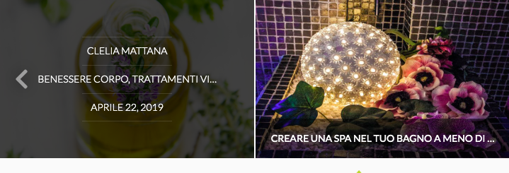
- The carousel looks beautiful but as for the recent posts, you can’t read the whole title in the lower bar. Is it possible to change it and/or change the text when you hover on it (where it shows the author’s name, category etc?) Maybe I could put the full Title there?
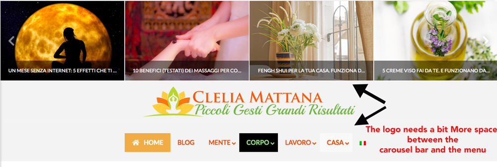
I’m referring to this:
- I was trying different settings for the menu but in between using the header from Pro, the normal header, the Uber Menu and the global settings I got so confused that I don’t know how to add some space to this logo (the one that’s in every article). The one in the main page is OK this one with the carousel is a bit too close to the other elements making it very “messy”, where was the tab to modify that?
There are also still things in English like in the blog slide it says “view post” or under the “cerca sul sito” there is the field with “search” and on each post there is “leave a comment”. Things like that.
How can I change those? I understand the buttons, I just need to edit them but the theme default things? I still don’t want to use the WPML for now even if it’s installed.
Thanks a lot for your help!