Issue with Cornerstone in Pro and Main Menu

Glad to hear that,

Yup, that’s right.

But did you know that Header and Footer builder has 5 types of navigation element for you to use.


Maybe on your future headers.

Ok, next issue regarding your home and blog page, have this setup on your Settings > Reading.


Homepage is the one that you can edit in Cornerstone, your actual homepage.
Posts page is the page that will populate your blog posts automatically (commonly named as Blog page)

Create the page named “Blog” if you don’t have that yet so you can assign it to the Posts page dropdown.
The reason you already have that “Home” and “Blog” page on your previous X site is that those are included on the Demo. Now that your site is not based on the demo, you need to do those things manually.

Regarding the demo content issue,

When it came to doing the same with content (demo content like price tables, sales page etc) It says I have no content uploaded while I indeed uploaded it, hence my confusion.

I need more context on that, please clarify which demo content did you use (you can refer here), and where did you see this dialog “It says I have no content uploaded” screenshot of the dialog would be helpful.

Cheers!

Thanks again!

I have one question regarding the blog page. I know I could easily create one, for sure, but the home page is the default from the Theme, I can see it in the pages. And on my other 2 websites also the blog has the grey line indicating that it’s a theme default page where, whenever I write a blog post it goes straight to that page.

This is the homepage and the theme added “Pagina Iniziale” (Initial page)

Then, if you go to a blog post, I can see the default breadcrumbs add this blog denomination, and if I click in there it redirects to the home page. I didn’t create that, I simply allowed breadcrumbs.

I now created the blog page but as I was saying, not being a default page for new blog posts, even added to the menu, if i click on it it shows just a normal empty page with the title, am I missing a step in here? how can that page become the default for blog post to go there automatically like in every theme? Usually every theme has at least 2 default pages: the home and the blog one. Hence my confusion.

Thanks

Hi Clelia,

I see that you created a Blog page (https://cleliamattana.com/blog/) but you did not assign it as the Posts page

Navigate to Settings > Reading. set the “Home” page as Homepage and set the “Blog” page as the Posts Page


I hope that’s clear.

You’re right, thanks. I fixed it.

Now I decided to go for the Ethos stack (the other 2 websites are on integrity. I wanted to know if it’s possible to remove the carousel from the blog page and the archive /categories pages as I added the other feature with the slideshow for the blog post and it’s super “crowded” like this. But I’d like to keep the carousel on the other normal pages.

Thanks!

Hello Clelia,

Yes, you can add following CSS under Pro > Theme Options > CSS:

.archive.category .x-post-carousel {
    display: none;
}

.blog .x-post-carousel {
    display: none;
}

Thanks.

Thank you very much, it worked perfectly!

I know it’s not your business to help me in figure out all the theme features and I’m doing my best to read as much as I can figuring things out so I’m trying to ask the minimum possible in here.

There is something else I wanted to ask:

  1. In the sidebar The titles are still in English, is there a way to fix that to the right language?

  2. Sidebar customization, is there a guide? What I wanted to do was change the color of the titles and being able to try them with or without a box around them

  3. (this is pretty annoying). When I use the “latest blog posts” from the builder, if I have long titles they get cut out (see image below). Is something I can fix?

  1. Does the theme have already a function (shortcode or similar) to display the related posts according to category/tag or whatever other criteria I choose? I know there are plugins for this but I am trying to reduce the number of external ones as much as I can.

  2. Very Important: On my other 2 websites I used the demos and somehow I was able to implement a child theme (I understand it’s important to avoid losing all the customizations after the theme updates. Do I have one now? Or should I create one, if so… how? It’s been a while since I did it for the other websites and I was using the demos so I don’t want to mess this up.

If you have some guide or article I can read about the Ethos Stack It would be great so If I have to solve other issues, maybe I can find them in there (example, I want to know if I can feature pages or categories on the carousel but I didn’t find the answer yet)

Thanks again for your help, Much appreciated!

Hi Clelia,

  1. Please go to Admin > Appearance > Widgets and change the title of your widgets. But, if you’re referring to translation using a plugin, then I recommend checking the plugin’s documentation. Example, https://wpml.org/documentation/getting-started-guide/translating-widgets/

  2. They are standard widgets came from Wordpress itself, please check this https://www.wpbeginner.com/wp-themes/how-to-add-custom-styles-to-wordpress-widgets/

  3. Sure, please add this CSS to Theme Options > CSS

.x-recent-posts .h-recent-posts, .x-recent-posts .x-recent-posts-date {
    overflow: visible;
    white-space: normal;
}
  1. Yes, it’s what you already using “recent posts element”, it has category option where you can filter the display. http://demo.theme.co/integrity-1/shortcodes/recent-posts/ (under Filter by Category). Though, there is no option for tag.

  2. Demos shouldn’t require child theme, and if you’re adding your customization within Theme Options and Builder’s CSS then it doesn’t require child theme as well. The child theme is only a requirement if you’ll do some template and function customization, or if you wish to use style.css for customization. But yes, I personally recommend installing child theme so it’s ready anytime :slight_smile:

And you’re most welcome, glad we could always help :wink:

Cheers!

Thanks for your help!

Point 2:

I tried to use the plugin suggested (I know nothing about CSS) and added my CSS but apparently, they are not correct as they don’t show any change.

This is what I put: (I just wanted to random change the color)

What am I doing wrong?

Also for the carousel, I tried to go in the theme options and Ethos to select “featured” but I don’t know how to make a post “featured” so that I can select only those for the carousel.

I go in here to try and change the carousel to “featured” because I don’t want a whole category to show up but only pick my articles as I want.

And for the blog slide… the same thing, So I guess I need to figure out how to make a blog post featured.

Point 4, I tried and somehow it doesn’t work as expected. I have 3 articles under “benessere corpo” category so I added this shortcode: [recent_posts count=“3” orientation=“horizontal” category=“BENESSERE-CORPO”]

This is the screenshot:

And this is what I see on the website in preview mode (only one instead of 3 and I’m 100% sure I have 3 under that category)

Point 5

I have no idea on how to proceed unfortunately. I didn’t use the Demo and I think I remember that when I did with my other website they already had the child theme and recommended to upload it and so I did. Now I’m totally lost.

Thanks again!

Hi Clelia ,

Point 2:

You only need to add the class on that field and not the css code.

Then add your css code in Theme Options > CSS

.cerca-sul-sito {
    background-color:#e5c9f8;
}

To mke a blog post featured, when editing your post, scroll down to ethos post settings and check the corresponding settings

Point 4:

Can you try using the recent post element instead

Can you provide us a screenshot of your category page

Point 5:

You can follow our guide below in setting up a child theme

Thanks

Thank you Paul!

Ok, so I solved almost all the issues so far :slight_smile: Let’s see what doubts /issues I still have

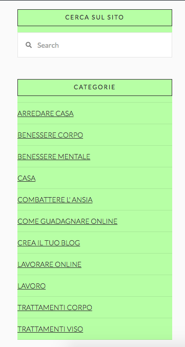
Point 2: It “half Worked”. Indeed now I get how I should place the CSS, but in my specific case, the result was a bit off. I wanted to either have the color inside the “box” or remove the box and just leave the rectangular “header” with the title colored. The Categorie title should be the one to be colored, not the rest. Just the titles.

I got this Instead, surely there is some CSS command I don’t know to try the 2 options I mentioned above and see which one looks best… any advice? What CSS should I add to the one I have already placed?

Regarding the related posts (by category is totally fine) I solved the issue as you explained and now it is working properly. Only one question, is there a shortcode for that so that I don’t have to put the whole thing manually every time? (Including the grey lines/gaps and the custom header I added?)
It should look like this:

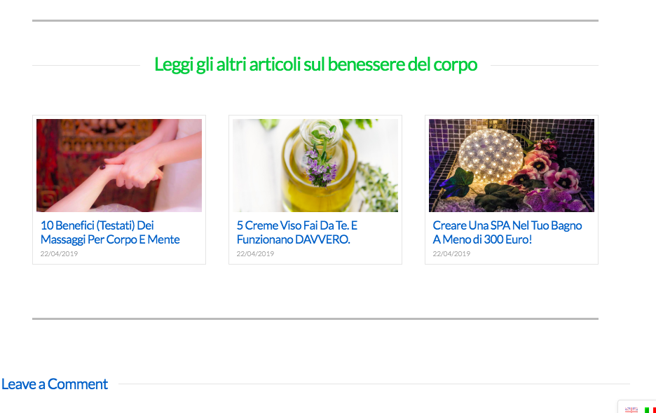
Not sure if it’s possible with a shortcode, maybe with the global blocks?I’ve never used those or even cornerstone on my other websites (always Visual composer) so I’ll have to learn of course, but maybe that’s a solution to avoid doing some boxes manually every time?

CHILD THEME: I added it, thanks! I have a question… now that I have that, what happens to the CSS I added to the Pro Theme? Should I move them to this Child theme? No idea on how to proceed but I don’t want to bother you at the next update if I lose all the layout edits :slight_smile:

I have a couple of little things I also wanted to ask:

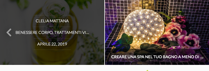
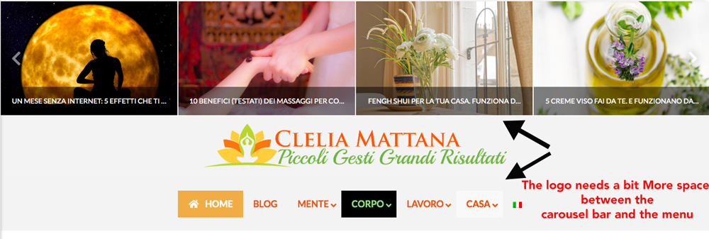
  1. The carousel looks beautiful but as for the recent posts, you can’t read the whole title in the lower bar. Is it possible to change it and/or change the text when you hover on it (where it shows the author’s name, category etc?) Maybe I could put the full Title there?

I’m referring to this:

  1. I was trying different settings for the menu but in between using the header from Pro, the normal header, the Uber Menu and the global settings I got so confused that I don’t know how to add some space to this logo (the one that’s in every article). The one in the main page is OK this one with the carousel is a bit too close to the other elements making it very “messy”, where was the tab to modify that?

There are also still things in English like in the blog slide it says “view post” or under the “cerca sul sito” there is the field with “search” and on each post there is “leave a comment”. Things like that.

How can I change those? I understand the buttons, I just need to edit them but the theme default things? I still don’t want to use the WPML for now even if it’s installed.

Thanks a lot for your help!

Hello Clelia,

Do you want something like this?

If that is the case, please remove this css:

.cerca-sul-sito {
    background-color: #C8FAA6;
}

.categorie {
    background-color: #C8FAA6;
}

And use this custom css instead:

.x-sidebar .widget .h-widget{
    background-color: #C8FAA6;
}

And if you want to remove the box, then you can use this:

.x-sidebar .widget .h-widget{
    background-color: #C8FAA6;
    border: none;
}

For the related posts: Recent post element is used to display the recent posts and not the relaeted items of the current posts. Since you are using recent posts element shortcode in displaying related items, you will have to do it manually.

1.) To display the full title, please use this:

.h-entry-cover {
    top: calc(100% - 6em);
}

.h-entry-cover span {
    overflow: visible;
    white-space: normal;
}

2.) To adjust the spacing above and below your logo, please go to Pro > Theme Options > Header > Logo and Navigation and set the “Logobar Top Spacing” and the “Logobar Bottom Spacing”.

3.) Those keywords that need to be translated can be found in the pro.pot file. If you do not use WPML, you will have to translate your site using the language file. For more details about how you can properly translate the Pro theme, please check this out:

We would love to know if this has worked for you. Thank you.

Thank you so much, I solved almost everything. I played with some more CSS and adding to yours I was also able to make more changes.

For the related posts (I know I use the recent posts with categories so no shortcode available as I guessed), but what about the global blocks? Not a chance with them?

Regarding the Child theme, what should I do with the CSS I’madding now? Do I need to take any action? I put the child theme after I added a few CSS in the theme option (Pro Theme, not the child theme) so I’m worried im gonna lose them after the next update.

I have some few questions as I found out there are a couple of issues in the mobile version.

  1. The menu for the home page I’ve created below the image isn’t showing properly on mobile. This is what I see:

While for the other menu bar in the normal headers, the menu shows perfectly on mobile. Like this:

What is wrong with the one I created with the header builder? How can I fix it?

  1. Another Issue is the Logo on the home page (header builder) is super small on mobile, so small that you can barely see it. Did I set it up in the wrong way? In the other headers (not built with the header builder) they are totally fine. Below the super small logo on the home page:

3)Another strange thing on the mobile version: The secondary menu inside the header (“Su Di Me” “lavora con me”) is totally different and in English. I like the colors of the English version but I have no idea why it doesn’t pick up the Italian version?)

  1. In the blog, I remember that there was an option (not sure if it’s available anymore) But there was a filter on top, by categories and people could choose to filter by category. I just checked on my second website where I had implemented this cool feature, but it’s not there anymore and I can’t remember if I deleted it or you guys changed something.

Below this slide on the blog page there were all the categories and people could click on the one they wanted.

Thanks a lot!

Hi Clelia,

Both recent posts element and global block element has shortcode, example, if you create a global block, it has a corresponding shortcode you can copy

Then this for recent post shortcode

http://demo.theme.co/integrity-1/shortcodes/recent-posts/

No need to move your CSS from Theme Options to the child theme, it should be okay since it’s saved in database.

  1. It’s due to 100px padding and 50px margin you have added to the container. Please remove it , or just add another container for mobile without those spaces. You can then utilize the Hide During Breakpoint option under the Container’s Customize section to hide your specific container for each device.

More information here https://theme.co/apex/forum/t/hide-during-breakpoint-explained/17378

Plus, it’s a different menu that just a dropdown, dropdown don’t need a wider container since it’s just a toggle.

  1. Since you have applied a 25vw max width then yes, it would only take 25% of your device screen. Please try removing that max-width through your logo’s setting. Or similar to #1, please add two logo with different setting and hide each from specific devices.

  2. I don’t see “Su Di Me” on mobile view, even on your screenshot. Would you mind providing a video recording? It’s only visible on desktop view.

  3. I just tried it and it works well on my end even with active Pro header. Would you mind starting a new thread about this and provide the login credentials in the secure note? It’s best if we can discuss one issue per thread so we could easily track them :slight_smile:

Thanks!

Hi, Thanks for the info and help.

So

  1. For the child theme all good then.

  2. For the global block given that it’s also a shortcode I can’t use it and I will have to do everything manually for the related posts part.

  3. The menu all messed up on mobile. I’ve tried. EVERYTHING I could think of (also removing the padding and margin as you suggested, trying to add a dropdown menu only visible on mobiles in the same bar, modal content only visible on mobile, you name it… nothing worked).

I think I need help with this like a step by step actions to have a toggle with the menu (like the one in the header, only with white background and keeping the Uber menu settings/colors). Or just have the same effect I have on the normal headers menu bar in the rest of the website. I have no idea how to do either of those. I’ve been trying for 2 hours. And I couldn’t find a responsive container (i’ve read all the documentation about the hide to break point)

  1. Image too small on mobile : Same with the image. I followed your instructions and I’m not sure on what I need to do. I tried to add another one bigger, close to the first (and hide it from the bigger screens) but even if it’s png i got a white horrible background, no idea why as the settings are the same as the other. Go figure.

  2. Menu in the header on mobile: Yes you don’t see the Italian version, that’s why I put the screenshot. Being an italian website, everything should be in Italian but I can’t see it on the mobile version even if I changed the names on the menu. That’s exactly why I was asking for help as I don’t understand why we still see the English words in the mobile version.

  3. I will open a new ticket as soon as I solve this Menu and Image issue, they are more important for now

Tanks a lot!

Hello @klelietta,

You are using UberMenu. Please make sure to hide the UberMenu in smaller screens and use navigation collapse or navigation modal element. If you can set your ubermenu to display nicely in a smaller screen, then that would be a good idea too.

All other of your issues should be posted in a new thread to avoid getting off topic and create confusion in this thread. For now, we’ll just focus on the menu.

Please let us know how it goes.

Hi

As explained already, I have tried everything and it’s the first time I’m using Pro combined with the page builder so I asked if you could tell me exactly what the step by step process is to solve the issue on mobile.

I tried for hours before asking your help but to no avail. I don’t know what smaller screens are, I’ve also tried navigation collapse and modal and nothing changed.

I gave you the credentials as I think it would be super quick for you to do that or to give me a step by step plan to reach that goal and understand the process for creating new headers (for mobile as well) if needed. At this moment is all very complicated if you are not a developer.

Thanks for your understanding

Hi Clelia,

You already did it, but please let us discuss one issue at a time for each thread. For now, let’s tackle #1, #2, #3 (from my previous reply).

  1. It works, you have removed 100px and 50px and it works, but since there is no further information of what’s not working properly on mobile and the width is already fixed, then I assume you’re referring to height. Please set th header bar’s height to auto

  1. It’s now bigger, but not much since the header width is narrow and divided.

You can’t have the image larger than its container, the solution would be placing your logo to its own container, on top of the menu and search. And similar, use Hide During Breakpoints feature and since you’re already familiar with this feature then I’ll skip providing the steps how to do it :slight_smile:

  1. I thought it’s intentional since you already utilized the Hide During Breakpoints feature. It’s not displaying on mobile since they are different menu element displayed for reach device. If that’s the case, just display the same menu on all devices :slight_smile:

As you can see from the screenshot, you assigned different menus. And utilized the Hide During Breakpoints

I just thought you’re expecting to see the same text to a different menu that you have intentionally added, which isn’t gonna work since they are different.

Thanks!

Hi,

so for the first point, I solved it (only partially)

It looks ok if you open the menu and DO NOT SCROLL down.

It looks like this:

If you do scroll down, it’s ok up until the “lavoro” category and then I have the same issue for the rest of the menu.

For the rest of the points, maybe I wasn’t clear enough. I didn’t do anything by myself. I used a demo header and played with it so all the hide after break point and all the other stuff is not done by me, hence my immense confusion.

I am trying to understand but these “issues” are part of the demo I’ve used, and I find it very difficult to learn these things in 2 days… hence why I asked you if you could give me a step by step plan of action. Otherwise I am going to mess around with the dozens of option, ruining even the things that were right.

Another thing inherited from the demo… if you search something on desktop from the search field in the header is ok, if you go to the mobile version and click, it says "search for an expedition (it was a demo for travel or something).

So I’m trying to do my best, I just want to finish this Menu issue and maybe if I could have more documentation to read it would be great. I can’t even create a full width content element within a full width bar… (that’s for another ticket for sure)

Thank you

Hi Clelia,

I see, sorry to hear that. And yes, 2 days wouldn’t be enough and I’ve been there. If you wish to check existing features and functions then you may also check our knowledge base. And I recommend creating a copy of your site where you can mess with and do some trial and error for the options. I personally do that when I’m studying some features, the experience is the best teacher, at least for me :wink:

As for that issue, please turn off the Sticky option as well, that’s meant to overlap the header and content.

May I know which demo you’re currently referring? But yes, most of them uses Hide During Breakpoints since not all content displays fine to all devices.

Thanks!

This topic was automatically closed 10 days after the last reply. New replies are no longer allowed.